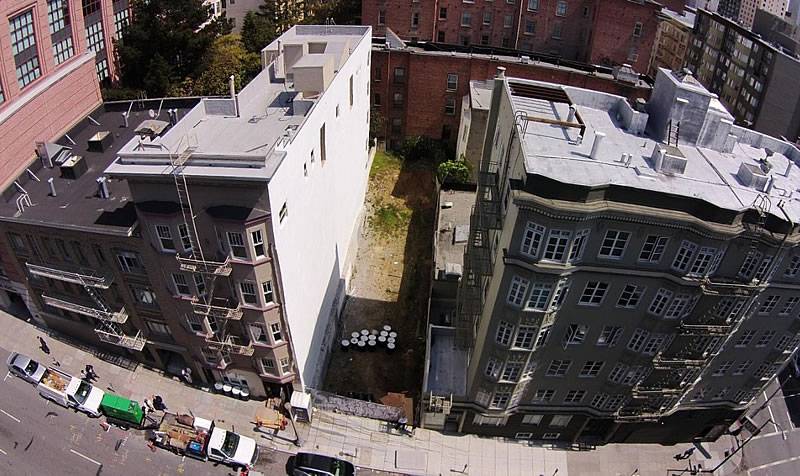
Five years ago a fire ripped through the four-story Chatom Apartments building that had stood at 824 Hyde Street since 1915 and the damaged eight-unit structure was subsequently razed.
Four months ago the vacant Tendernob parcel sold for $1.8 million.
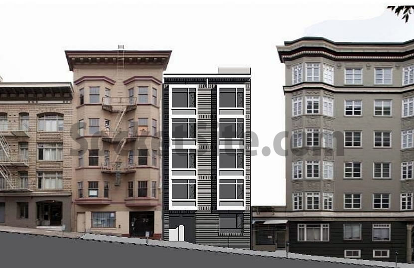
And if approved in January, a five-story building with fifteen (15) residential units, a mix of nine studios and six one-bedrooms, could soon rise up to 55-feet in height upon the site.
While zoned for development up to 80-feet in height, building over 50-feet on the site, which sits within the Lower Nob Hill Apartment-Hotel Historic District, requires special approval (Conditional Use) from the City’s Planning Commission. And existing density limits would not allow for building more than 15 units on the site based on the parcel size.


Drums laying around on the site are often a really bad sign. What was here before that needed environmental remediation?
[Editor’s Note: See the first sentence above.]
Unless just a placeholder rendering, terrible design. I would want something much more in keeping with its neighbors.
You mean like a super exaggerated cornice and fire escape stairs between the bay windows?
Yes! Anything more representative and less unattractive.
If it were a carbon copy of its neighbors, it couldn’t get much more unattractive. But you can always step in, buy them out and make whatever modifications your heart desires.
While as ugly as possible, this building at least has not a single space for “cars” those horrible contraptions that keep people from enjoying our wonderful MUNI. Also, think of the splendid walkability! Overall, a treasure, a credit to the city.
Merry Christmas!
This rendering brought to you by MacPaint in glorious 4-bit grayscale.
It was rendered on a foggy day.
It poses an interesting question. How *do* you design new buildings for a historic district with a distinctive architectural style?
with taste and knowledge of architectural history?
With no architectural training whatever I could design something that fits with the surroundings a lot better. Start by putting on some kind of cornice. Then add bay windows. Then use a flat and un-variegated exterior material. finish up by painting it with a complementary shade. I hope history eventually wakes up from the postmodern period. And that these faceless blank boxes are finally reviled for what they are. as things stand now it’s just a by product of cheap developers and the emperors new clothes. There’s no There, there.
So just a copy of the building next door?
So these’ll be rentals? Otherwise why make so many small units. And affordable units will be on site? This doesn’t sound like a condo sell project to me, but wonder how it will pencil out as a new construction rental? (incl. affordable component.)
UPDATE: Tendernob Rebuilding Rendered and Slated for Approval.