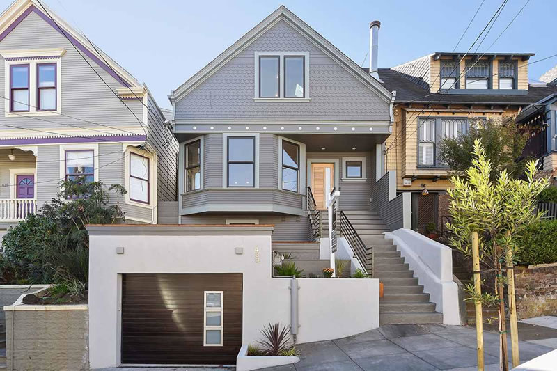
Purchased out of probate as a contractor’s special with three bedrooms, one bath and without a garage for $850,000 in 2008, the then 1,164 square foot Noe Valley home at 439 Clipper Street returned to the market with plans for $1,295,000 in 2014.
Having failed to sell the vision, the home was raised, expanded and completely remodeled to include four bedrooms, three full bathrooms, three half baths, and a two-car garage. And the ‘modernized and re-invented’ Victorian was listed with 2,763 square feet for $3,550,000 this past October.
Reduced to $3,250,000 last month, the marketing for the home was updated to note that there was ‘no competition‘ (emphasis theirs) for the ‘best priced home in Noe Valley’ (characterization theirs), and to separately warn that the ‘seller [would be] moving-in in January 2016 if not sold.’
This morning, the listing for 439 Clipper Street was withdrawn from the MLS without a reported sale.



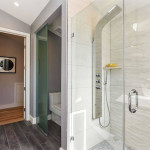

Oh my! Soffit-tastic.
I think my favorite detail is the clear glass panel over the door from the kitchen so you don’t fall into the patio below.
seriously WTF? Forgot the deck?
I think they ran out of money and couldn’t figure out how to resolve the pit and some sort of kitchen deck without spending a lot more cash. You’d think they would put in some sort of Juliet balcony at least. Maybe they think they did. And, also, those bath fixtures and vanities are totally all Sincere Hardware.
that’s what I thought about the deck/pit issue. Insane.
I don’t think it’s that bad. So shoot me.
What a mish-mash of styles. The garage is contemporary and the rest of the exterior traditional.
Three half baths? Why?
I found it most fun to review the listing pics pretending you are pacman gobbling up all the various dots in and around this house, starting with the odd dots on the exterior trim and the interior can lights, glass support holders on stairs, and many more.
Someone will have to explain to me how on a remodel like this home they couldn’t figure out how to install the Nest thermostat (another dot) without using the trim cover plate? This is what happens when you undertake a remodel and take the easist solution every single time you’re met with a design challenge.
No architect, apparently. Builder Special
Also, I’d like to take this moment to thank our host as we end 2015 for keeping the site alive and all of us plugged in. Cheers and Thanks!
Haven’t many of these design choices- the waterfall kitchen counter, the zebra wood cabinets, the kitchen bar stools, the all-in-one shower spray unit, the wood-look ceramic bath tile, etc- all been done time and time again?
Seems like if you have $3M to spend you might want something that looks different than all the other neighborhood remodels from 3-5 years ago. A couple more years and these features may look as dated as harvest gold and avocado green appliances.
See my reply to Eddy, above.
Agree, & way too much grey which seems to be the avocado green color of this decade. Can’t stand grey.
I’m hoping 2016 will see the death of these horrid style choices. Perhaps in this coming year people will finally realize that tearing out original interiors of Victorian homes isn’t the best thing in the world.
On that point, I do not agree. I like Victorian exteriors and some of the usual details inside (trim, etc.). But the chopped up tiny rooms, lots of hallway space, and even tinier kitchens are awful. They may have made sense 120 years ago, but not today (unless you never want to have more than 3 people in one room). Our place was opened up and re-done before we bought it, and I’m really glad they did so. They kept a lot of the nice detail, which is a bonus.
I would say that having 3M to spend on a house does not imply wanting something different. Heck, I wonder how many people accumulate that much money without a close relationship with the mainstream.
I hate island cooktops… but the deck off the master is sweet!
Can anyone explain this particular piece of the Noe market? Looking at SocketSite’s archives, a fixer 3 short blocks away sells for 2.8 mil, another house with similarly bland and modern design choices sells for $5 mil, but this one sits.
Does 6 months of design fatigue or 3 blocks distance make that much difference (if the 3 blocks is up a hill, maybe)?
All I can think of is that it looks fine in pictures but not so nice up close. I remember walking into an open house excited by the pictures but turned off by sloppiness in meeting corners and bad grouting and little stuff visible only in person.
I was confused by the same thing. Shouldn’t this sell in Noe Valley at this price?
Clipper Street is a very heavily trafficked thoroughfare, which may make it less attractive than quieter streets in Noe Valley.
Just noticed the kitchen door issue. OMG.
I’d say the main knock on this house is location–Clipper is the freeway through Noe and being on a steeper part of Clipper ensures engines will rev louder. This plus the obvious design/build flaws that everyone else has mentioned make this a good value at perhaps high $2mm’s but probably not low $3’s.
Maybe they can add (even) more baths, towers – kind of like the Winchester House – perhaps a drone bay, and put it back on the market for $8-10M.
Perhaps this is the beginning of the end of workingmen’s cottages all tarted up with minimalism, removing any historical element, and asking the price of a mansion on the Philadelphia Mainline. It cannot come too soon if we are to preserve the architectural interiors of SF. This flipper got what he deserved; hope he likes living in a Sofitel.
I so hope you’re right!
stripped, yes. badly, yes. minimal, hardly.
far too many pop lights and angles and mismatched surface treatments and oddly competing nods to hollywood glam and midcentury and traditional for this to be minimalism. and “tarting up” is maximalism, not minimalism.
Did you see it before, Conifer?
OMG, the pics on the real estate listing…. that back yard is such a disaster. They must’ve intended to have a stair down from the kitchen originally, and just left that door hanging off in space. So much wrong……
I would guess that the idea was for a bridge, which I’ve seen in a few listings over the past few years.
that makes more sense. permitting issues or money issues is the question.
A ‘bridge’ to the rear yard could not have been that expensive in the context of the rest of the remodel.
Something tells me this was have been a rear-yard setback encroachment issue. The developer could have let the listing agent (nudge nudge wink wink) suggest that a buyer might be able to add that bridge at later date. But then for safety reasons he/she had to add the tempered glass railing for the back yard, so even going back to add the bridge later becomes more involved process.
Would it have been better to have framed this as a large operable window? You would still get fresh air and the chance to harangue people in the backyard.
Oy vey!
1381 Sanchez has similar kitchen door issues: two doors in the kitchen that open to a railing overlooking backyard. Doesn’t look quite as bad as in this case, though, since they used French doors and the symmetry kind of makes it feel like windows. Looks like it is not an uncommon issue in Noe!
I looked at it when they wanted 1.295M for it. But the plans called for such an odd layout, I doubted it would be worth 3 million. I was told there was so much design pushback from DBI and neighbors that they would have had to try for a variance in order to create a better floorplan. But they didn’t want to do that. So it wound up being built along the lines of the path of least resistance. During the build, the market went wild. Then it calmed down last September. Then this one hit the market. I feel like it would sell for high 2Ms pretty easily. Anyway ….
Even if it isn’t the planning department will mandate so much steel in your house (as part of the seismic retrofit) that preserving interior original detail will be prohibitively expensive.
MDV – More Destroyed Victorians
I asked Conifer this before, but I’ll ask you too, since it seems to be some sort of meme on here. What’s up with the holier than thou judging and hand wringing? More specifically, why do folks who do not view properties in person assume that there was anything worth saving within the interior of the property when the last person bought it? Because I can assure you, in this case there certainly was not. Think about it. Often these Victorians are 100 years old or so. They’ve undergone numerous styles shifts and tastes within those decades, and various owners. Numerous remodels. The detail you assume to have been there is often long, long gone. Does it make you feel good, just saying rote judgments?
The issue is an opinion about design. Before you even enter the house you see a garage that would look great on a mid-century-modern home, but the design clashes with the fundamental architecture of the house. It gets worse on the inside, which displays no consideration of the exterior design. These considerations matter to some people, while others are OK with architectural chaos as long as the interior is comfortable and convenient to live in.
No, actually, that’s not what I’m responding to, nor speaking of. The issue at hand is the recurring notion which is the presumptive judging of Victorian interiors destruction. Your point is another point entirely. (Taking your divergent points, I agree with what you said. Sometimes a stark clash works, though. Maybe that’s what they were going for?)
Maybe so. It’s all a matter of personal taste. You can’t please everyone. I guess I’m one of the displeased ones. Not that it matters to the sellers … my opinion is not even relevant to them!
I think it’s just kind of a local sport. Original Victorians have floorplans that by all accounts can not (easily) accomodate contemporary use, so the ways in which these houses are renovated provide plenty of grist for judgement. In other words, *something* always has to be done with these places to update them, so we continually get opportunities to judge the results. Suffice it to say that a best practice for rejigging the floorplans of Victorians has not evolved so far.
What contemporary use is not accommodated by Victorian floorplans? Running down the hallway with your arms out like an airplane? Riding a hoverboard? Wheeling huge palates of oranges and other fruits from room to room? I mean, how exactly has life changed, at least in the last ten years, because we all grew up around here in Victorians?
Maybe it was destroyed in 1980. In either case, destroyed it is. The ruling stands.
What if it was very poorly/shoddily done Victorian in the first place? (and lol @ “ruling”)
I guess it’s a possibility. But the idea that the exterior of a house is just a casing for whatever goes inside is not really my thing. I also find it extremely offensive to see the cases in which the inside was impressive and was torn out (like the recent Queen Anne) – just as someone who values aesthetic consistency. I don’t think this house is an abomination or anything, and of course they have the right to do it. But I have the right to think it is unattractive.
of course you do. In this case it was a hovel.
Wasn’t the Queen Anne you refer to the one that had a lot of the wood ruined by decades of cat pee? Or was that another one?
I don’t exactly want to argue with someone who is in a combative mode. I’m sorry you didn’t like my opinion of the home you wrecked. Maybe you should take a break from the internet.
Funny. I agreed with you that of course you have the right to think it’s unattractive. I also was not remotely combative, never using strong language once. I asked a question about the Queen Anne. And as to having a hand in this remodel, no I did not, and I’ve said that. I am sorry if you took offense for some strange reason. I feel as if it’s OK to disagree without going into popular internet jibes such as the fill in the blank conclusion you’ve employed, and things of that nature. If you read the comments, it’s quite clear I both passed on this one, and panned it. Have a nice day.
You were sarcastic/snarky, which is combative, in my book. I don’t need to argue about just how destroyed this Victorian is and didn’t I see the inside before. It seemed like a fairly uncontroversial fact that the inside is gone. I would try to think of a metaphor, but the metaphor I would come up with would be to say ‘You don’t just take a Victorian and redesign the inside to look like an Apple store.’ Why not replace the Arc de Triomphe with something that looks like the Gateway Arch? I mean what does anything mean anyway? I hear they got rid of the Blackhawk Museum and it’s just a roomful of 2016 Priuses now. It’s great, they’re so cool and efficient, they all look like children’s toys and they use half as much gas!
yeah well each case is different and that has been my point since the start. as to snark, I lol’d at “ruling,” still do, and asked about the Queen Anne you referenced, which I thought maybe I remembered. I don’t feel as if those are snark attacks. It’s really easy to snark. It’s harder not to snark, you know.
Maybe they should hang a sign on the outside of listings like these that says “The inside had already been destroyed.” It would save us malcontents a lot of steam.
hahaha. Good one.
It seems strange to gut an older home like that and then remodel the interior like a modern high-rise condo. And the garage looks like it was designed for an entirely different home. I find it unsettling and distasteful.
Did not even notice the garage till you mentioned this! Wow, you’re right. Really awful.
It seems strange, true. Unless you saw the interiors before. Garage finish critique though? OK. Fair.
The garage looks like it was stolen from 100 Palo Alto.
How did they get permission to build a garage in the front setback? I thought Planning didn’t allow this anymore.
Existing
Not according to Google Street View.
You’re right. My fault. I think the answer is that Planning generally doesn’t allow this any more. But there’s an exception if the lot meets a certain vertical ratio? anyone know?
I would have listed at 2.9M and expect 3.2M in an offer. I would change out the garage door to a traditional style and depending on the details of the kitchen door access permit one could either have the owner fix it before move in or have the new homeowner take over the permit process. The staging is really, really bad in this listing. I would have brought in more traditional furniture to play off on the contrast of styles to soften the interiors.
I would list an intact victorian at 2.9. One with a destroyed inside I would have a hard time asking that.
What is the POINT? Why are they buying VICTORIANS if they don’t want VICTORIANS? I mean what the hell is it with these people??
Um, because inventory is limited? Because most houses in that part of SF are Victorians on the outside? Because remodeling the house on the inside AND outside costs more? Because if you change the exterior, you probably have to get additional Discretionary Review and that would add to the costs and time
Sometimes people like exteriors to look a certain way and interiors another (think all the Sunset homes with identical 1950’s interiors but exteriors ranging from Art Deco to Tudor to castle to stucco box). You make it sound like buyers have unlimited choice. They don’t. They want a nice clean updated house in a nice hot family-friendly neighborhood. There’s one that matches their budget that happens to have a decent Victorian exterior that matches the neighborhood. Boom. The end.
The buyers are bipolar – you may have a point.
A few thoughts and facts:
1. The house was a total disaster prior to this remodel. I visited it.
2. The home needed a garage, but the new garage is certainly ugly and does not coordinate with rest of the house. However, it probably would be a bit of a design challenge to markedly improve on the looks of the garage, which does not change the fact that it is ugly.
3. The interior mostly looks just fine, and very, very similar to that of numerous other renovations done throughout Noe over the past 3 years, most of which sold very quickly. However, I have not been in the home since the remodel, and I do not see any problem with the kitchen door from the photos, but a personal visit might enlighten me. If folks are commenting on the terraced “garden”, then I would remind people that this is a steep, uphill lot which formerly held a small home without a garage, which was then raised and infilled, just as every other renovation in Noe.
4. The backyard needs serious help.
5. The market is not as frenzied as it was a few months ago, and this property is on Clipper, a fact the owners may have hoped that buyers would overlook, and these factors prevented a pricey sale.
6. I doubt that very many of today’s buyers want a Victorian interior. My parents did not like them, and they are a lot closer to the Victorian era than I am. Victorian exteriors can be charming, as long as you do not have too steep or long of a front stairway to climb, but a Victorian interior? I doubt that many folks would pay over $1.5 M for one.
7. Historically Noe was not Pacific Heights or St. Francis Wood, where nearly all homes were historically in good shape and of grander size. Many homes in Noe had become fixers by the 2000s, sorely in need of help, and most were originally much smaller than today’s buyers desire, and owners have been busy remedying these two issues over the past 10-15 years, with varying degrees of success. It appears that this home has a few design flaws and is on the wrong street for the price the owners were hoping for.
I live around the corner from this place on Diamond.
This block of clipper gets A LOT of noisy constant traffic. With noisy little cars struggling up the steep hill.
It’s really a crummy street to be on. The closer you get to the stop sign at diamond and clipper, the worse the noise gets
UPDATE: Never Mind in Noe Valley as 439 Clipper is reduced again and listed anew.