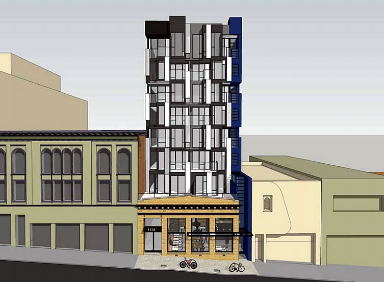
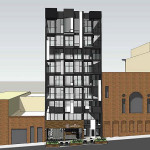
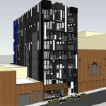
The refined plans for a modern 9-story building to rise behind the one-story façade of the G&R Paint Company store at 1238 Sutter, between Polk and Van Ness, are slated to be approved by San Francisco’s Planning Commission next week.
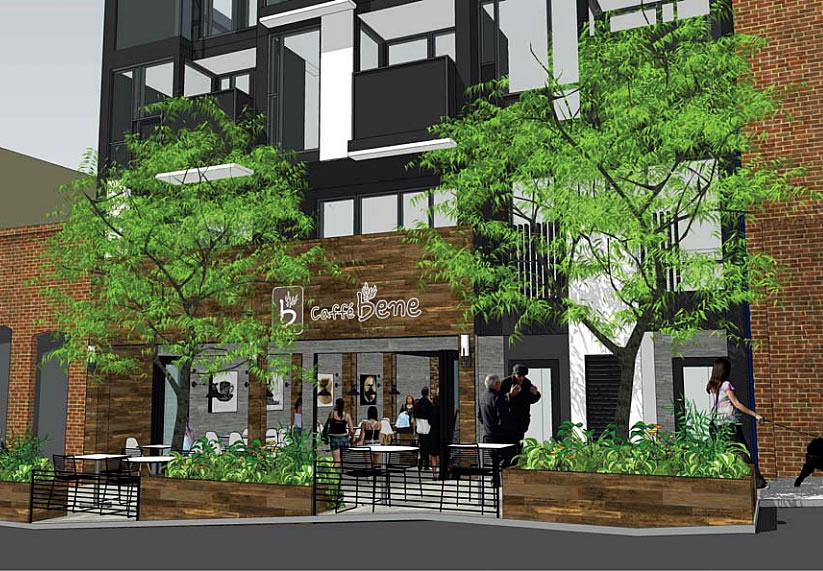
As designed by D-Scheme Studio for Celtic Development, the proposed Polk Gulch building includes 37 condos units (a mix of studios, one-bedrooms, and twos) over two retail spaces, with a two-story retail space fronting Sutter Street and a smaller café space fronting Fern.
The project doesn’t include any off-street parking for autos (versus six spaces as originally proposed). And in fact, a proposed bulb-out along Fern would even re-purpose a bit of on-street parking to serve as an active public space in front of the café.
From the Lower Polk Neighbors community association with respect to the project:
Enriching and bringing life to our alleys is LPN’s top priority in the neighborhood and this project fronts Fern alley in an excellent way, including the bulbout design, vegetation and lighting.
Fern alley is one of our especially troublesome alleys for homelessness and unsavory activities so this in an important step for this particular alley.
While zoned for development up to 130 feet in height, as are the parcels on either side of the lot, the proposed building at 1238 Sutter Street would top out at approximately 90 feet.
San Francisco’s Planning Department recommends the project be approved as proposed.
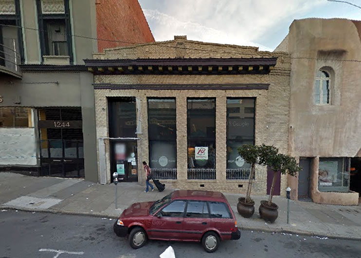
I support historic facade preservation – and this is a horrible example of it. That’s one fugly marriage of jarring architectural styles.
And without sounding negative … hard to believe any business, let alone a cafe, can survive on a glorified alley like Fern. But I’m betting the homeless will enjoy those latrines, er, planter boxes.
Agree, regarding the slim chances for a business surviving on Fern Alley until the City cleans up the illegal activity and homeless problem.
I’m sure the thought is to try to replicate the ambiance of Blue Bottle Coffee on Linden Street alley, but it was never as bad as Fern Alley.
I don’t think most people will experience it as a “marriage”– at the street level, the historic part is all you see. As long as the interior of the space doesn’t clash too much with the facade, I think it’ll be fine.
It’s also a nice example of what can be achieved when you don’t need to use the ground floor for a garage entrance.
What makes it bad is the design of the new building. It simply does not fit. Why not do something like 77 Van Ness? How about 101 Polk? Or what was planned for 150 Van Ness? All of those would fit the well with the existing facade.
Regarding Fern: I think that it can be cleaned to look like Linden at Gough (where the Blue Bottle is).
i’ll just go ahead and say it to get this out of the way: should be 130′, not 90′
There is a similar “save the facade” thing going on at a building on Pine between Van Ness and Franklin, across the street from San Francisco Towers. The new construction is huge, save for this little bit of brick facade which looked wrong being there.
Somehow that one on Pine St. makes more sense to me, as the facade fronts a lower building / courtyard area.
But this one on Sutter just looks idiotic.
What a joke, it’s like that scene in The Fountainhead when they try to slap a Greek temple onto one of his skyscrapers. It isn’t even a nice brick building! This is why we can’t have any nice things.
Your description reminds me of the RR Donnelley building in Chicago.
Take a deep breath. It will all be ok. The building will be a good supporting character along the ever densifying Van Ness / Polk corridor. Nothing more, nothing less.
Why would the developer stop at 90 when 130 is possible? Change in construction technique? Egress issues? Or just avoiding NIMBY issues? Seems like extra floors are just easy money in this market.
Kind of curious as to from where the idea to preserve the facade may have emanated, but since the current owner – operator is also the developer, it might be a case of his fondness for the original business.
At any rate, a very nice project and addition to the street.
Am I the only one who hates this design of building? It looks like static interference and is very disconcerting.
You’re not the only one. It’s an architectural abortion.
You people always complain about not getting, new innovative, edgy architecture.
So now we get some and you hate it. Make up your mind.
Great project. I like keeping the small brick façade.
“You people”. Uh huh.
This thing doesn’t even look like a building. It looks like a contraption. And the color palette is awful. What’s black and white with blue, brown and yellow all over? It’s a bad joke.
Yea, that’s YOU people.
Let the architects do their work. They (we) don’t need to please the masses.
“we” people hire the architects and live with their work for decades, so we actually do have a right to critique it – just as I may quite legitimately opine on what music I do and do not like, without having to be a musician myself (or even be versed in music theory)
Sierrajeff nailed it. Architects don’t work in a vacuum. Their work affects everyone around them for generations to come. To say that they do it solely for themselves and the client is an insult to the general public.
Of course architects don’t work in a vacuum. And Yes, architecture does affect those who live and work and thrive near any building. Yes, of course.
There is no insult meant when I say they design for “themselves and the client”. Yes, the architect does and should listen to community meetings and public input. And they do. But when the final design solution is wrapped up and construction documents are completed the VISUAL design and expression still comes from essentially the core group of designers.
Architects don’t attempt to please everyone, because that’s not possible, and I would not want that. Ii want buildings that show a unique expression, a specific point of view or ideology. And, of course the issue then of who likes it or not can be debated forever.
But, ultimately it gets built (we hope) and then becomes part of the ever changing urban fabric.
Futurist is more used to kitchen remodels, so just keep that in mind guys. He’s not used to real architect work.
Oh please anon. Spare us your babble. Sure I’ve done a few “kitchen” remodels, as well as complete homes for wealthy people, as well as major hospitals, high rise housing, building for Apple and IBM and mid rise urban housing.
Stick to what you know, not what you like to gossip about.
I was thinking about that while reading through some of these comments — how it became so personal for everyone involved? Obviously there are architects here but I didn’t know people could be so thin-skinned. The best way to get clients is to put out excellent work and when your work is a public building, this means the majority of the public gives it a big thumbs up.
@ Amewsed: Yes, I agree 100% completely.
Really the bigger question is “what is excellent architecture”? How do we know it’s excellent? Is it a feeling? Is it when MOST people “like” it? Is it when it wins awards by leading professional organizations? Is it when it “offends” the least amount of people? Do people know excellence when they see it?
This is the crux of the entire thread here. I would wager that many people don’t really have a grasp on what makes architecture “excellent”. But they know when they like or dislike a project. And usually it’s when the design falls “outside” their particular personal bias of what they “prefer”. And most people prefer something they are comfortable with already. It’s safe, non threatening and not challenging to their definition of good and/or excellence.
The debate is largely just about personal bias and not much more.
Would the editor please remove the personal attack, as well as the retort?
This is one of the few places on the internet to find on-topic, reasoned discussions. Could we please keep it that way?
Is it too much to ask for something that isn’t ugly?
Also, “you people” — wow, that’s a bit obtuse, dontcha think? Architecture and art are made to be judged not just by architects and artists. They are for everyone to enjoy and also criticize. The architects who design this may never have to see it in real life ever again, but the people who live in this city and those who will be here in the future have to live with the dreck that is being churned out right now.
Let me guess, you’re going to defend the Richmond/Sunset special mid 70s apartment buildings, too? How about Brutalism?
Architecture like this is going to be resigned to case studies of how not to design.
PS: I don’t want anything new, innovative, or edgy. I want something that fits. For instance, 77 Van Ness, 101 Polk, 150 Van Ness. Those aren’t any of the what you claim “[us] people” want.
I think your criteria of “fits” is a little open ended. I don’t think 77 or 101 fit at all… They look superficially like older existing buildings, but they are fakes. I, personally, feel that they actually detract from the buildings they copy; simplify the icons of past era into a kit of parts… base, middle, top! Don’t forget the cornice!
Ok cool. Those are all valid comments but I would ask you:
Yes, architecture and art can be judged by all, but it’s NOT designed by all. Never was. Singular projects generally relied on one person or one firm. Did they listen to the masses or the man on the street? No. I don’t get your notion of the architect actually never seeing this in real life. Huh?
I get that you (and others) may not “like” this project. That’s your opinion. As for something that “fits” that’s a pretty safe, boring, and mediocre approach to urban design. And how would we measure what fits against what does not fit?
Architecture, art and design are not easy subjects to assign to “right” or “wrong” solutions. But mark my words, architects do not (by the very nature of our profession and skills and ideologies) listen to the public, nor care what the public thinks about their work. It just doesn’t matter.
What matters to most, but not all architects, is simply designing infill, urban projects that solve a problem, a budget, owner goals and planning and building codes, while making a particular “design statement” that is very subjective and can be wholly self serving. And there’s nothing wrong with that.
St Peter’s Basilica and the Eiffel Tower, as examples, simply reflect the beliefs of the designer and client and not the people.
You make some valid points, but that doesn’t mean others are not entitled to their opinion on it. As I mentioned in my post, they are for the enjoyment and criticism of others. Architecture, just like industrial design, affects people daily and those who use it can voice their thoughts (my definition of “use” is broad).
An architect would of course see their work in real life, but will they work across the street from that building? Walk by it every day? A firm can design something in a city that they never have and never will set foot into (not saying it applies to this instance).
It doesn’t have to be safe or boring. It also doesn’t have to be “edgy” and “cool” just for the sake of it.
Whether or not architects care what the general public thinks of their work, does not mean the public is by any means pleased with it. Back to my initial comment about 70s Richmond/Sunset district specials. At the time, those were probably the greatest thing since sliced bread to some architect (apparently every architect during those years). Fast-forward to now and those buildings are loathed and decried.
St. Peter’s Basilica was made in the Renaissance style, which didn’t exactly go against the grain of architecture in that century. Eiffel Tower on the other-hand did. I think a better example (instead of St. Peter’s Bascilica) for your point would be the Transamerica Pyramid.
Giuliani: By that argument, any new building with architecture that is not contemporary is superficially fake. Beaux-Arts buildings were still constructed in the 1900s, did they somehow detract from those dating back to the 1600s? For example, does the Palace of the Legion of Honor hurt the original in Paris? Or someone building a brand new Craftsman home insult those constructed in the late 1800s next door? Likewise, any form of Neoclassical art or architecture should be criticized as detracting from originals.
I don’t believe architectural styles have to be bound to the time period they were most popular in.
Serge: Great points… and a very interesting discussion could be had around the topic of “fitting in” or “style”. I don’t agree with your position, but concede it’s also possible that there is a middle ground, or a more nuanced position not possible to convey in a comment section.
Giuliani: I do like your points as well. I thinks this is one of the more interesting discussions on Socketsite about architecture that I’ve been involved in. Luckily we’re able to have debates and discussions in an adult manner here, as oppose to most comment sections/forums.
this is not “new, innovative, edgy architecture”.
Another cheap piece of watered down architecture. Deserves to be raged against and protested out of existence.
The Lower Polk Neighbors community association should be pressured to reject this design and hire an architect who isn’t cheap and actually cares about making good architecture.
NO. Not gonna happen.
No matter what is designed, someone will complain about it. “Too jagged” “Too boring” “faux historic” “not historic enough” “it doesn’t look exactly like an 1893 Beaux Arts mansion” “It copies old architecture too much” “I hate the materials-they are too modern””the materials are too bland and cheap”
And on and on and on
Armchair Ada Louise Huxtables who just KNOW what the correct architecture for ANOTHER PERSON’S PROPERTY is! Even if they disagree 100% with yet another critic.
But we all do it. And sometimes buildings DO deserve to be criticized. Heck, as an evil planning bureaucrat, we made a proeprty owner rework his block long facade on the city’s main street to be something other than a blank walled windowless box. But a lot of this discussion seems pretty silly.
+1 good sir.
I agree to a certain extent, but I’m uncomfortable with characterizing the architect as “cheap” or that they don’t care about good design. I don’t know them, but we don’t know the history of this project either. SF’s process / planning / appeals does not make it an easy place to do great work.
Yes.
I hate this design, but – WTF right does a neighborhood community association have to tell a private landowner what to do on their private property, as long as it’s within code.
You haven’t been paying attention if you are asking that question.
Well, it’s quasi-rhetorical. Obviously I know that under S.F.’s ludicrous planning code, any quack with free time on their hands can go so far as to file an appeal that brings to a complete halt any well-thought-out, fully-vetted construction proposal.
But that doesn’t make it right, and the planning system here needs to change.
i agree. the attack on landowners right in SF is just insane.
The new part has a certain appeal; the facades remind me of the De Stijl movement, Rietveld Schroder House, and canvases of Mondrian. Kind of a radical building, but in that part of town, well, not exactly a vast architectural legacy left and right to pay homage to. Hopefully the project will look as good in real life. The old facade, while relatively well proportioned, granted, is no prize rose bush; it could go. There comes a time to let go, and perhaps the lil brick facade’s had it’s day.
I think the design is rather sculptural and varied.
Its success will depend a lot on the quality of the materials and skill in detailing and construction.
Regarding some comments to why the developer didn’t go higher since the height limit would have allowed it (in the proposed design the top occupied floor is at +74′-11″), this is probably due to the economics of construction with a building that has such a small footprint. Basically, having any occupied floor at 75 feet (or greater) kicks in “high-rise life-safety requirements” that would add about $750K to the cost of construction. The handful of units that one could get building to the max., probably don’t justify the additional cost.
Michelangelo, Donatello and Rodin were sculptors. This is just a series of boxes stacked in varying degrees of protrusion. By that definition, a casual game of Jenga is a work of art.
Deliberately ignorant of over a century of art history. Mondrian made great art from simple rectangles. You want Rodin to design a building? Louise Nevelson is a sculptor too.
Do you want to a live a building designed by Mondrain or Nevelson?
See: http://designlike.com/wp-content/uploads/2011/05/interior-design_styles_mondrian-4.jpg
Point is, this building is not a sculpture.
95% of buildings are boxes stacked in some fashion on top of each other. Unless one is Gaudi or a honeybee or living in a round thatched hut.
Wow, that’s one dumpy brick building. They’ll “preserve” anything these days.
Not really a big fan of the “randomly piled boxes” look of the new part either but to each his own, I guess.
This type of mishmash of old facade and modern back is an “architectural mullet.” Disjointed. Half-assed. Unappealing.
Jesus Chr**t almighty! Just build the god**mn thing. It’s not ugly and as for “jarring”, just don’t get out of bed in the morning if your sensibilities are so delicate.
Come on! The Polk Gulch corridor is such a pleasing and harmonius classical ensemble that this will OBVIOUSLY conflct and contrast! It is A CRIME, I tell you! A CRIME!
Why aren’t there larger windows on the sides of this building, given that they would have unobstructed views? Seems like such a waste.
There are building codes and fire codes that define the extent and type of windows allowed on property lines. In many cases those must be removed if the adjacent owners choose to build up.
I like it for the increased density and contrast.
Off-topic trivia: The building to the left of this development had hosted the most recent San Francisco season of MTV’s “Real World” last year.
We need more housing – but this thing is scary looking.
Who are they marketing to? The Borg collective?
Hopefully it will look better in real life than it does in the renderings.