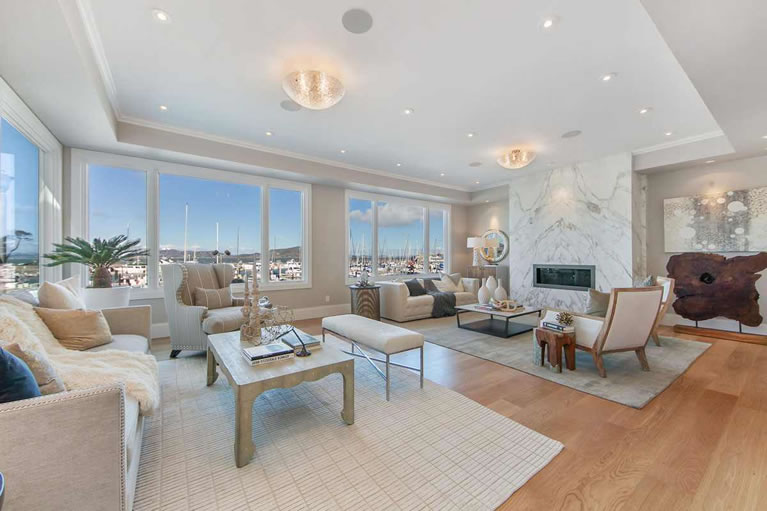
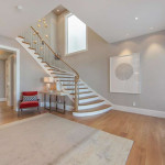
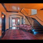
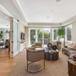
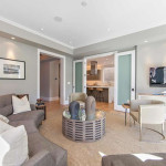
Purchased for $4.25 million two years ago, when listed as a vintage “trophy estate” with an upgraded foundation on an over-sized lot, the 5,400-square-foot home at 663 Marina Boulevard is now back on the market having been remodeled, with contemporary fixtures and finishes throughout.
And they’re now asking $9.5 million for the six-bedroom home.
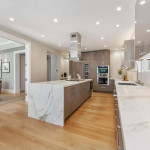
Fabulous location. Seriously bland interior.The instruction label on the commode was the only pop of color.
I think foreign investors will buy this and it will be mainly occupied by the caretaker. I wish I were her.
Beautiful house and great remodel, the interior is on the boring side but can easily be fixed. great family house!
Whoa! My new home office uses the same kind of marble and lower cabinets as this new kitchen. Also same ceiling style in the living room except I have nice crown moulding and multi-zonal LED lighting. Bland, eh? Fortunately I have nice oil paintings to add punch — the artwork, should be the focal point with function closely behind.
Not to mention the view.
“Bland” and “boring” interior? I think that when one has an amazing view like this, the interiors should be neutral. Don’t compete with a $9.5 million view.
Very well done. It will be interesting to see how Marina Blvd fares once the GGB and surrounding work is completed in the next few years. Can’t figure out if more or less traffic will be routed onto Marina Blvd.
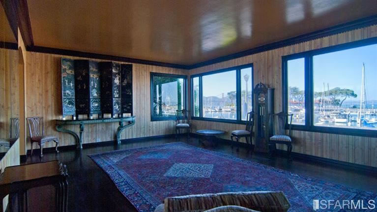
Interesting to see the lighter wood floors making a comeback. Wonder if that was a strategic decision given the pounding light those rooms on the water get. I think I still prefer the darker wood floors overall especially give the light but I like all the well thought out details in this place like the recessed walls for the door to set back into. Bedrooms seem kinda small. Don’t think it’s $9.5 materials but not much else out there with those views. I’ll go with $8.2 but this could easily be sold in a month at ask if someone falls in love.
“Before” was a bit of mishmash, but I would have tried to keep the stair rail. It sort of goes with the sleek modern look.
Holy Grey Ghost Batman! Nice remodel, but hopefully the buyer will put a little color in it.
Leading candidate for (grayish) White Box of the Month.
Even if some brokers are starting to mention original interiors, SF is still overpopulated by flippers interested in lots of little white lights stuck in the ceiling. How many do they have here?
“When will it ever end?”
no way. One should always stay neutral color palate wise when dealing with a big view property.
Instead of 50 shades of gray, it is three. I would have liked subtle variation in the color scheme differentiation. Upstairs vs. downstairs, bedrooms vs. other rooms in the house. Easy fix for new buyer.
I am trying to figure out how they lit the back of the marble piece w/ glass shelving behind the bar sink. LED strip light. That is a cool looking shelf. I think I have the tastes of a foreign investor, namely a Russian one. Without the love of vodka.
The window over the kitchen sink is pretty upsetting. They really could have done a better layout to avoid that. The new stair railings are fairly awful as well. Otherwise a Nice flip in and a great location.
why upsetting?
Because it is overlooking at some kind of bland textured wall outside? You almost want to remove the window, paint a masterpiece on the wall before putting the window back. Or how about a flat screen with a feed to HD photographs of the most iconic scenes of the world?
naah, forget about the texture of the house across the way. what it is, it’s more natural light. it’s a property line window that was grandfathered in, most likely. no one in his or her right mind would or should remove that. “upsetting” it isn’t. it’s just a window over a sink. people get too critical on here over minutiae. it’s fine, and it’s bottom line more light, which is what you want.
Absolutely horrendous can lights everywhere. Add in speaker grills in the ceilings, as well, and the ceilings are just a mess. At least the white and beige can be more easily remedied.
What is the big objection to light cans? Why is the ceiling a “mess”? And how would you do it differently? I’m genuinely curious, not trolling.
Some recessed lights are a bit over done in each and every room. A few more chandeliers or nice wall scones would break up the monotony. A coffered ceiling might add depth and avoid the Swiss cheese ceiling look. A light strip embedded in a wall or two would create more of a glow.
There do seem to be a lot of them. But with the low ceiling, there’s not much choice — you can’t have stronger lights cuz they’re too close to people’s heads.
It used to be that ceiling lighting in the LR was considered gauche. It was classier to use floor torchaires (sp?) facing upwards and illuminate indirectly. So long as you don’t need operating room level of illumination in the LR, that strategy works great.
I prefer dimmable LEDs and zone lighting for that reason. I have the option of performing surgery or having a subtle soft glow. Lighting experts know when, where, and how to have upwards vs. downward, spot, light. As a rule, as occupants age, clear and bright light will be necessary.
UPDATE: The list price for 663 Marina Boulevard has just been reduced $520,000 (5 percent), now asking $8,980,000 for the newly remodeled home.