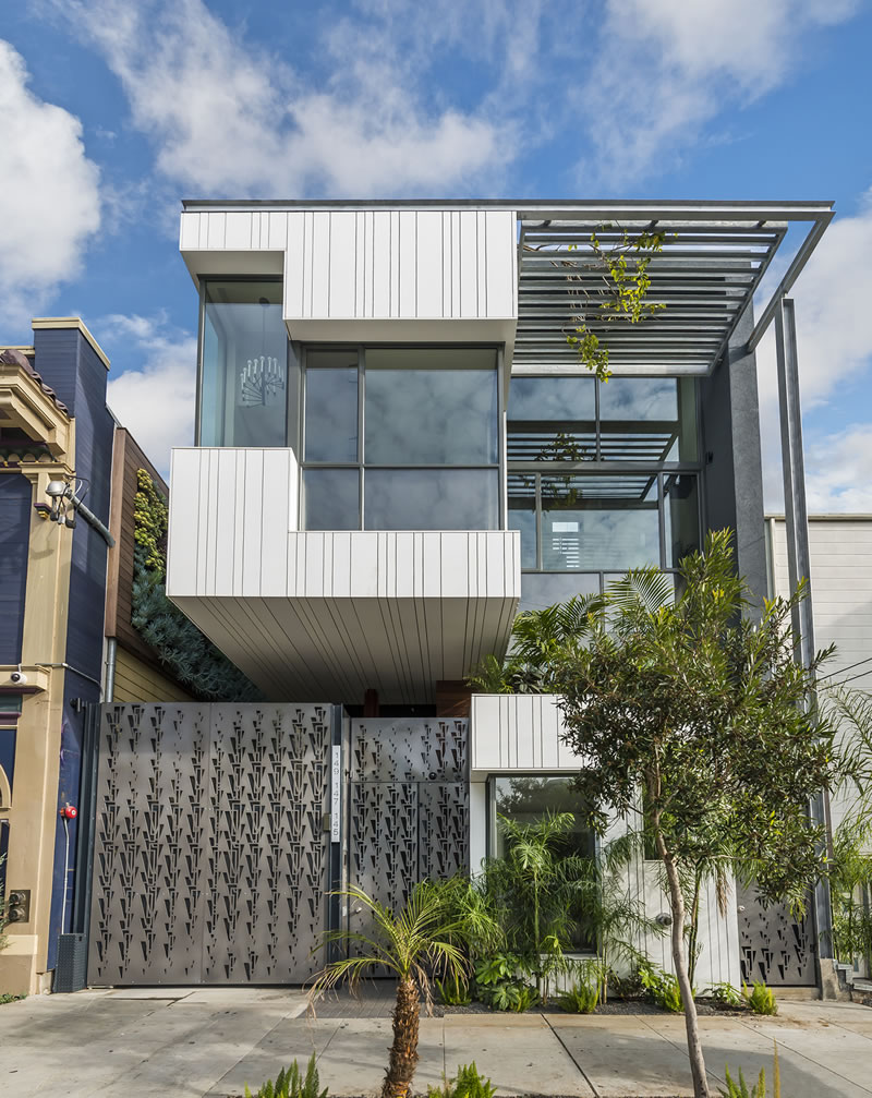
Three new condos designed by Owen Kennerly have risen on Albion Street, in the heart of the Mission between 16th and 17th.
And 145 Albion, the 2,185-square-foot “townhome” unit, has just been listed for $2,950,000 or roughly $1,350 per square foot.
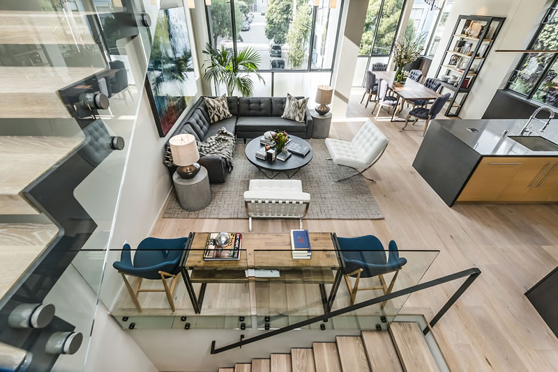
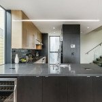
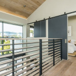
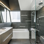
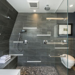
Features and finishes of the three-bedroom include DuChateau wide-plank white-oak floors and radiant heat; a Bertazzoni range and CesarStone counters in the kitchen; and a modern master bath above.
The “garden” unit, 147 Albion Street, measures 1,698 square feet and is similarly finished but hasn’t yet been listed. Both units include a parking space in the new building’s garage behind the security gate.
This is really nice.
That is a nasty block
Brutalism 2.0
This would be a wonderful condo if only two things in the area were different: Delirium Cocktails and the Albion Hotel. As best I can tell the clientele at Delirium consists of mainly folks from the Albion Hotel and people that are selling them drugs. That said, you can avoid all that by walking south to 17th instead of north to 16th. Having a parking space for the units is going to make these suckers fly off the market at well over asking.
none of that is accurate. the Albion Hotel denizens are more interested in what’s going on down at 16th and Mission. The Delerium crowd are after their own thing.
This may be the nicest house since the SteelHouses in Noe. My first thought when I saw the pictures above was: where can I sign?
gorgeous
A nice bit of Los Angeles style up here for a change! Reminds me a lot of friends places down in Santa Monica and West Hollywood that I have admired.
So nice: honest, strong, modern architecture.
Love it from the street. I wish there were more of this mixed in with our classics.
Like all of it minus the fences at the bottom – they look like they are made of the wrong material for the purpose.
They make the facade look cheap
So what would be the “right” material? And how does the existing material make the façade look “cheap?
You mean those perforated steel panels? That’s one of my favorite features.
Looks to me like a barbed-wire fence.
Super nice places…not much privacy though
I like it. Is this a sparky-b product?
It is not one of mine, but happy to hear that you would associate my work with something you like.
“Features and finishes of the three-bedroom include DuChateau wide-plank white-oak floors and radiant heat; a Bertazzoni range and CesarStone counters in the kitchen; and a modern master bath above.”
Or, as Steve Martin put it 38 years ago, “I got some pretty good stuff…I got a fur sink.” (namelink)
Sorry, but it looks horrible from the street. There is something just out of scale with the design. It probably looked good on paper.
And how do they get away with hanging all those bromeliads and such on the neighbor’s wall?
It looks to me like they’ve erected a trellis that is flush with the neighbors wall that the foliage is mounted on.
And even if they didn’t, and attached them directly to the fence, what’s the issue? i’m not forced to look at a neighbor’s ugly fence (the neighbor certainly isn’t going to perform upkeep on my side!), and bromeliands are pretty much the least invasive and destructive plant they could attach to a wood fence.
If that was the case, I should walk around town with a trellis mounted on my head. The blinders I currently wear don’t seem enough.
good foliage makes good neighbors. also, looks like they ran the mains through the structure with the trellis
the security cam on the neighboring building at that corner has changed since the google street view. I wonder if they have an agreement with the nextdoor neighbor.
A good friend of mine lived that block of Albion. She moved after several bullets hit her building.
$3 million on Albion? I wouldn’t pay that kind of money for the Taj Mahal in that spot. One of the great things about having that kind of money is you don’t need to live in locations like that. There is a reason why the security gate is needed. Maybe they’ll get someone with more money than sense to pony it up.
I’ve lived on Albion for nearly 9 years. It’s like night and day from when I moved in. I wouldn’t be concerned about safety or loitering anymore, and they’re on the T intersection with Camp and get the long view down the street instead of looking at the front of a building.
This is some of the better modern architecture I have seen here, at least recently. The location may not be amazing right now (understatement) but if the recent trend for this area holds we could be looking at a very different situation within the next 10 years or so. Should be interesting to watch…
Very nice. Modern, great natural light, but warm with some personality.
What are the flush squares on the kitchen peninsula countertop? Outlets for code reasons?
I’m not sure about their purpose but doubt that they are outlets facing upwards from the countertop. That would be a shock hazard if something got spilled.
Those (appear to be) outlets with a cover you remove to use them. Also you can see that the plates themselves are raised above the counter surface, to keep liquids from getting in the outlet. All islands must have electrical outlets within certain code distances from the surface.
I’m shocked (pun intended) then. Seals can fail but gravity never does. Island outlets are usually installed on the vertical sides and protected by the counter top lip, away from the risk of dripping liquids.
A number of manuf. offer these: Among them Carlon, Hafele, Lew Electric and Evo-line. they are UL approved and really much safer than having a power cord dangling over the side of the counter.
A great solution.
I don’t know. In addition to the spill issue, the elevated outlet makes the surface a bit of a pain in the butt to clean. I would personally much rather have outlets on the side and live with the “risk” that someone is careless and gets his/her arm caught on the cord, or whatever is allegedly “less safe” about that set-up.
I don’t have anything architecturally or socially constructive to add, other than the observation that the toilet paper seems to be a little lengthy. Or perhaps that’s a paper towel?
That’s good old photo perspective distortion at play. Whenever you see stuff stretched like that you can be assured that the real room is smaller than it appears in the photo.
I don’t need special lenses to enhance my attributes.
If you really like the interior, get a copy of the plans and re-create it in your desired location. If the Chinese have figured out a way to build entire housing developments with a 3-D printer now, everything else should be a cake walk.
The interior is bright and gorgeous. The front facade seems a bit too much.
UPDATE: The three-bedroom “garden” unit, 147 Albion, has been listed for $2,195,000 ($1,293 per square foot).
UPDATE: Modern Mission District Condo Fetches $2.85M, $1,300 Per Foot