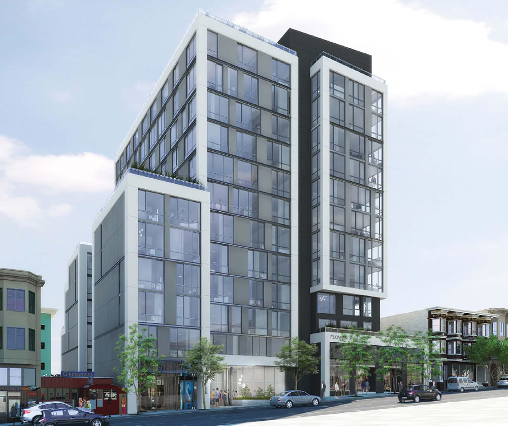
The latest renderings for the 1545 Pine Street project will be presented to San Francisco’s Planning Commission this week, with the Planning Department’s recommendation that the Polk Gulch development be approved as proposed.
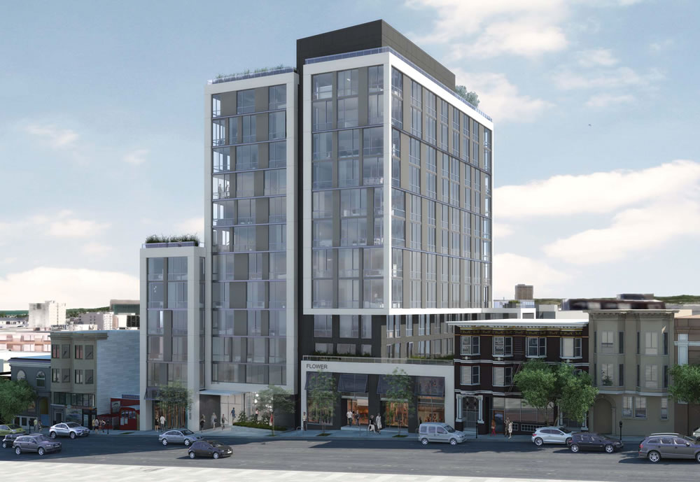
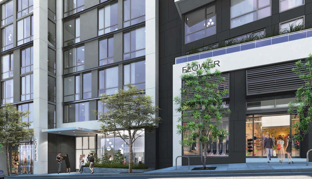
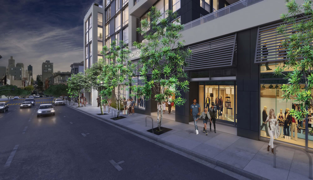
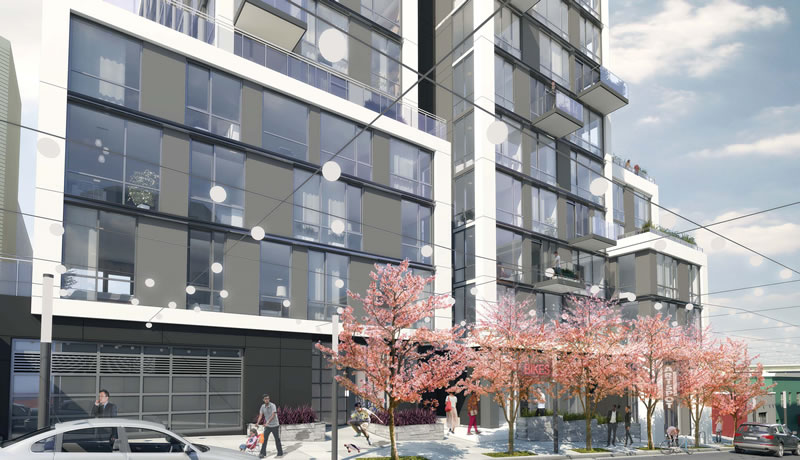
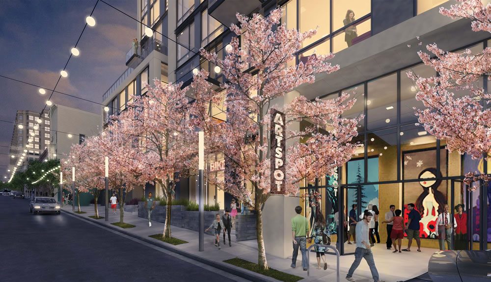
As designed by Arquitectonica for Trumark Urban, the 12-story building should rise on the south side of Pine Street between Polk and Van Ness Avenue – adjacent to, but not upon, the Grubstake site – and includes 103 condos, with ground-floor retail along Pine (as rendered above) and a little art gallery space along Austin (as rendered below):
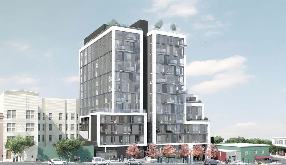
The Planning Department has received 18 letters of support for the project, and none opposed.
Not my cup of joe. What’s the height limit in this area? Need something like this in western SOMA.
honestly, i really love this. and youre right. there should be about 30 of these added in western SOMA. again the Western SOMA plan is one of the most embarrassing things ever created. it was way out of date when it went into effect. its very central area, and not properly developed.
Love it. Too short for western SOMA though, probably would need to be double the height there.
I like it. Boom, go, get’r done. The Polk Gulch is going to be a hot spot for development – this is my neighborhood and it is well amenitized and while getting down to Mission/Castro is tough, it is otherwise well served by transit (Van Ness, the 1, 19, 38, 2, 41, etc).
There is another tower crane about to go up at Washington/Van Ness and one already up at Broadway between Van Ness and Franklin. More proposals on the table. Peskin/Agnos clearly pick and choose what they care about because there is a lot of development in my neck of the woods and it goes so unnoticed. I think most of the new designs are quite progressive, for SF, as well. This is a high quality project, and it will offer amazing views to the East and to the North.
I think it looks out of scale compared with its surroundings. And why does Arquitectonica specialize in designing particularly ugly structures. A real missed opportunity to design a building that fits into the neighborhood.
The building looks fine and seems designed in an honest functional style. It is taller than the buildings immediately next to it, but it is not out of scale compared to many buildings in the general vicinity. Also, none of existing buildings on the block are particularly interesting or lovely. They are mainly dull squat boxes, and 80 years ago some busybody was probably lamenting how these then new structures were “ruining” their beautiful city. (San Francisco does have some very attractive historic buildings, but they are found elsewhere).
As for repeating the past, Victorian architecture went out of style in the early 1900’s. The later styles of architecture that certain people seem to always reference stopped after the 1910’s-1930’s. Civilization moves on, and you cannot keep repeating the past–it looks cheap and boring. If you want to see Disney World historical pastiche, then fly to Orlando and buy a ticket to the Magic Kingdom. There everything is flimsy and fake, but if you squint hard it all looks very pretty and inoffensive. Outside of Micky Mouse land, buildings are constructed for the real world.
The Holiday Inn across the street is 330 feet tall.
Yeah, there’s no way at all that this building is out of scale with the area. There’s a bunch of equally tall buildings in that area (and more proposed for it), and there’s the much taller Holiday Inn right around the corner.
Oh wait I forgot, this is SF, where a bunch of morons think that anything taller than 3 or 4 stories is a crime against humanity.
The really sad thing is there are some great old, taller buildings throughout the City. Just last week I was walking above Cow Hollow, and there are some great 8, 9 and 10 story Art Deco buildings (west of Gough, a few blocks above Union). They could never be built today, but I think they’re beautiful examples of urban architecture that are completely appropriate.
(That said, one thing that struck me about them is that they were not lot-line-to-lot-line walls of glass; they were set back, with light wells and indentations and ornamentation. Those sorts of things make these older all buidlings so much less imposing, and more welcoming, that some of the monoliths being built today.)
The issue is really about striking the right balance between adding all the little details and extra touches and building a cost-effective structure. Preliminary sketches like the one released give a general sense of the massing and structure outline, and they are not meant to represent the final product with all the little details worked out–colors can change, ornamentation can be added or removed, cornices can be pushed out or back, etc. But, even based on the initial sketch, there is nothing inherently wrong with the building. The focus should just be putting on the right amount of finishing touches to make it a good building, and good does not have to mean extraordinary.
I love Art Deco buildings, too, but I do not want to see cheap imitations of Art Deco (there was a trend in in the 1980’s with Post-Modernism aping Art Deco and other older styles and it resulted in some very tacky and unattractive buildings–with a very few exceptions that actually worked). It is not that a new building cannot ever reference the past, it certainly can and this can be done well. But, there is a world of difference between a tasteful reference and a chintzy imitation, which is the result one usually gets.
As for all glass buildings, they can be done exceptionally well, too. The Seagrams Building is considered a glorious architectural landmark. Of course, building something as fine as that building would be extremely expensive and require a developer willing to put in an immense amount of time to get all the little details right. I think this is an unreasonable standard to hold every new building to. But, one can certainly find a happy medium that results in an attractive and well-designed structures that are not necessarily landmark worthy, and still cost-effective to build.
I notice this all over SF. You see it in the Mission on Valencia around 25th. You used to see it on upper Market. There is even tall old residential buildings out by the beach on Geary
love it. a good example of how mixing up heights of buildings won’t cause the world to end. it’s nice having some old and new- the open space on the second floor provides a nice setback.
Arquitectionica needs a color consultant. Their buildings look so ugly because they decorate them with those wide white boxy borders that look totally out of place. For example if the building at Buchanan had the borders painted a dark grey they would blend in with glass walls for a smooth look. Of course then it would not look like Arquitectonica
oh look. a staggered window/spandrel pattern. again.
The same could be said for the existing buildings adjacent to the proposal. Each of them have an identical facade.
LOVE THIS!