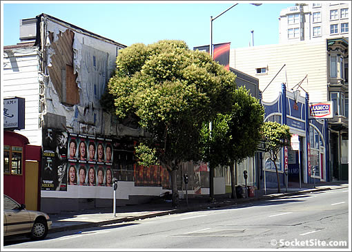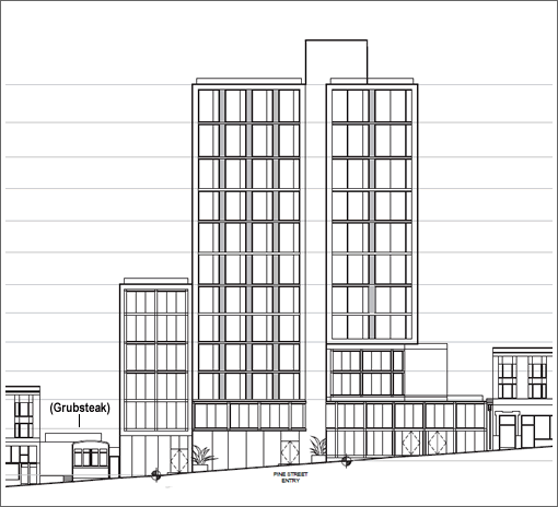
Across Van Ness Avenue from the two proposed 13-story towers to rise on Pine Street, Trumark Companies is working on plans to raze the five one and two-story buildings between 1527 and 1545 Pine Street and construct a 12-story building designed by Arquitectonica on the site rather the Stanley Saitowitz design which was once on the boards.

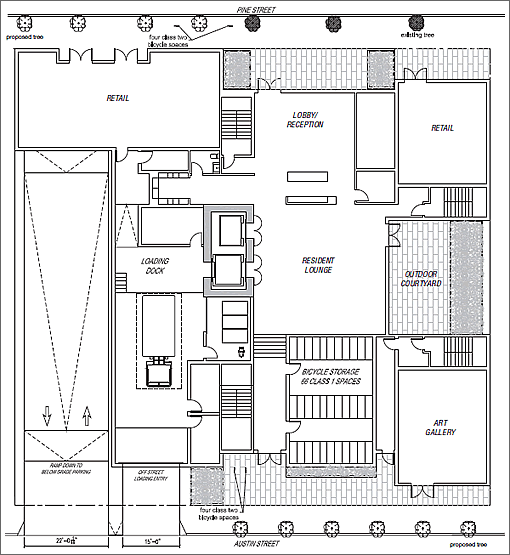
As proposed, the new Polk Gulch building would yield up to 107 residential units with 2,844 square feet of ground-floor retail and art gallery space along Pine and Austin streets and parking for 82 cars and 106 bikes in a two-level basement below.
The main entrance to the residential portion of the proposed building would be through a lobby located in the middle of the project site along Pine Street while pedestrian access to the residential units would also be available from Austin Street. The retail spaces would be located to the east and west of the residential entrance on Pine and a public/private art gallery space would be located on Austin at the southeast corner of the site.

Vehicular access would be provided from two separate vehicular exit/entries on Austin; a 22-foot-wide driveway would provide access to the automobile and bicycle parking spaces while a 15-foot-wide driveway would provide access to an off-street loading space.
One potential sticking point, the building at 1545 Pine Street is considered an historical resource for the purposes of environmental review. And don’t panic, Grubstake would survive.
Good news, I like Arquitectonica way better than Saitowitz.
In this case I must applaud. That Saitowitz monstrosity would have been very out of place in this neighborhood and I doubt could ever have been built for that reason. The Aquitectonica design fits much better.
A project that size going up right next door can often doom a small business like Grubsteak.
But hopefully the Contractor’s crew will appreciate their hours of operation and they can cut some catering deals, set up some standing lunch orders, and this might even be good for Grubsteak’s bottom line.
Totally agree with lyqwyd, I’m sure anything that Arquitectonica comes up with will be better looking and more livable than the cast-concrete-and-frosted-slabs-of-glass Saitowitz design.
And BTinSF is correct that it would have looked out of place in this neighborhood; indeed in most neighborhoods in The City.
Oh god do I love Grubstake. So few places in this town to get a good meal at 3 in the morning.
Just to get in a comment from an actual person vs. paid hacks: Saitowitz is one of the few un-provincial things about San Francisco architecture and planning. Plus this illustration couldn’t be less complete. So stop lying.
The Saitowitz design was unique forwarding thinking design but instead we will get a building that could be in Sacramento ….
I actually loved the Saitowitz design. I can’t comment until I get a better rendering, but generally I support infill on either side of Van Ness. Franklin already has some nice density, and a couple of the projects slowly coming up the pipeline will add to that. This side could work as well, Polk really is a great commercial corridor, even well into Polk Gulch/Tenderloin, frankly. I box near this location, and while there is plenty of seedy stuff still, there are also some good bars, restaurants, etc.
Arquitectonica comes up with some truly inovative modern design, and has
Saitowitz is a one trick pony who’s designs haven’t even withstood the test of a decade, much less be iconic for the ages.
Let me predict the next Saitowitz design: rectilinear glass sheathing and metal louvers…
It’s one thing to have a signature style, it’s another to simply repeat the same thing ad nauseum.
Whats funny about this ,
my 1st thought about the project had to do with the Grubsteak and how much I wanted that biz to be protected and able to continue.
I have no issue with the scale and size of the project as now being presented by Arquitectonica a company that has shown it can design smart for the San Franciscan market.
But , this means i now very much expect to see on the boards a request to extend the height of the existing buildings that border Van Ness between Pine and Bush.