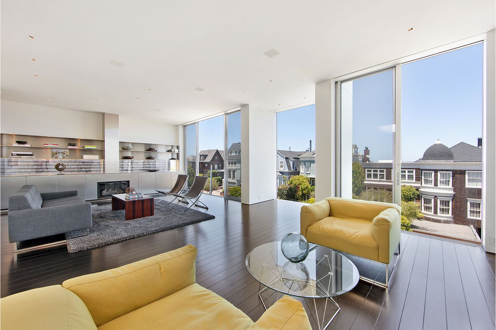
Gutted and remodeled by Sheinholtz Associates in the 1990’s and then rebuilt in concrete, steel, aluminum and glass by Stanley Saitowitz/Natoma Architects in 2006, the modern Cow Hollow home at 2555 Union Street was purchased for $7,950,000 in November of 2012 having been listed for $9,250,000 the year before.
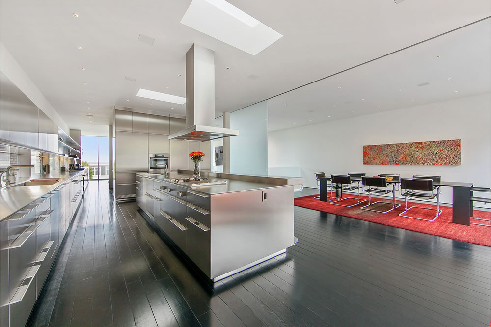
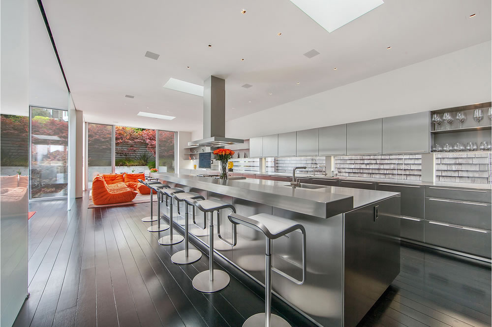
Measuring roughly 6,000 square feet across four floors, at the heart of the home is a showpiece stainless Bulthaup kitchen with Miele, Gaggenau and Subzero appliances and opens to the dining room, family room and terrace behind.
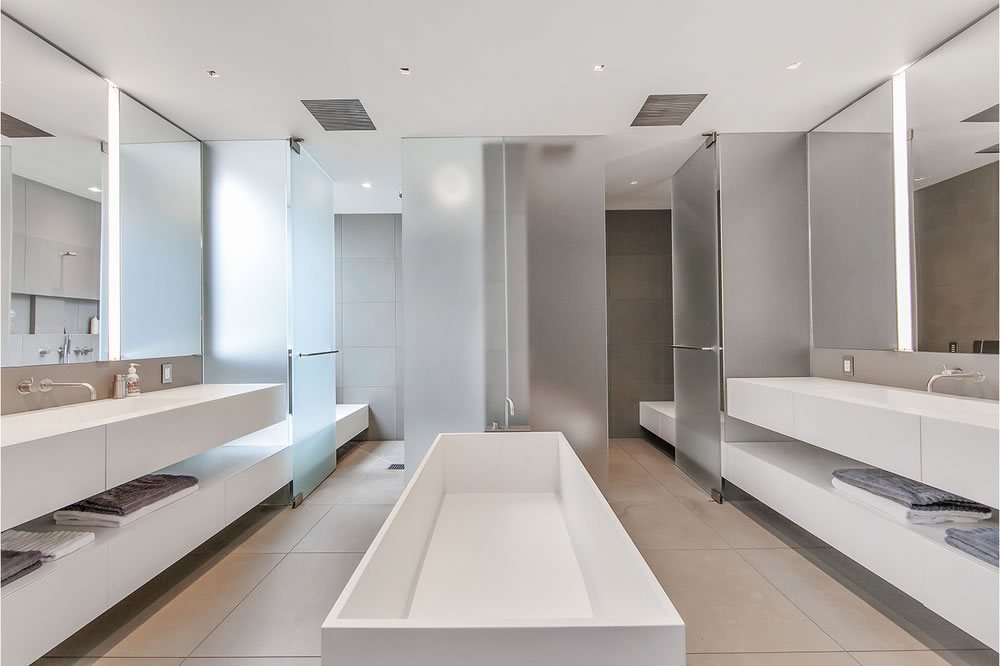
The modern master bath below features a soaking tub, steam shower, and dual vanities.
And while not officially listed for sale nor inventory, the designer home is back on the market for $10,500,000.


Is that a “home” or a convention center?
Why do I somehow feel modern homes by builders such as Eichler feel “comfortable”, but projects like this do not? Whenever I read about a mid-century home in Palm Springs the images of those residences make me feel that I could live comfortably in a relaxed domestic carefree environment, but this residence makes me feel like the only items that can be left on the countertops are test tubes!
How many startects does it take to screw in a $10 mil. crash pad?
two to screw “in”, one to screw “up”.
Right, if I can throw $10.5 million at home, I want the social spaces to center on an industrial-scale, industrial-looking kitchen… with drawer pulls designed to annoy passers-by and kitchen users in equal measure… an a backsplash consisting of glass panels showing the neighboring home’s shingle siding.
If anything, these pix are the best of the lot – those on the website show a cold, barren space more suited for a museum than a nest. Pass.
I wonder how you’re supposed to get the horse up the stairs to that trough.
That is not a trough for horses. It is a pissoir.
This is a great example of the Saitowitz aesthetic and a nice piece of architecture. But, unfortunately, this is too cold for me. While I like Richard Meier and Hugh Newell Jacobsen – two famous architects who also have clean, modern designs – this crosses the line to being industrial and almost repellant. There are also some architecture choices that leave me scratching my head. The horizontal windows that look onto the neighbor’s siding? The kitchen cabinet handles that jut out like knife blades?
Some tech billionaire will love this as a showplace property. It wins the, “I am cooler than you” competition.
Hated it the when it was on the market a few years back, and somehow hate it more now. In addition to all the comments here on how utterly cold the place feels, it’s just the absolute *wrong* location for a property like this. It’s is super out of place on that block. Imagine having Marilyn Manson guest star in an episode of Full House… it’s something like that. Just feels super off.
Or Julie Andrews as the opening act for Marilyn Manson.
This place always seems to find a buyer. After a few reductions.
that style kinda had it’s day. needs to more flowers for the staging and those giant windows that let the neighbors look right into your home? i’m not feeling that at all. too sterile.
Are we playing “Home or Surgical Theater”?
those stainless counters make me think of a morgue
Too sterile for my tastes.
Unusual layout with the kitchen on the top floor.
Not to jump on the bandwagon or anything, but this place is awful. That facade is just brutal from street level. The concrete terrace looks so cold and dull. I’m sure the finishes are all extremely high quality when you’re seeing it up close, but the overall package is extremely off-putting.
Gutted in the 90s, and then again in the 00s. Looks like it’s ready for it’s once a decade makeover. it sure as hell needs it.
Who thought a distorted image that makes a bathtub look like a coffin is a good idea? Srsly — who? Fire them. I love in may ways the church of modernism and Stanley’s diocese and all. But in SF the Church has been ruined like everything else.
I think they should let all 800,000 plus residents of San Francisco spend a night there for free, one by one, because that would be the only way they could put an ounce of humanity into the place.
If anyone has 10 million to spend on this place they would be better off giving it to the SF/Marin Food Bank or Project Open Hand. Then they should take the remaining $500k and buy a California bungalow in Oakland.
Sorry I know this is a loaded comment, but everyone seems to be having fun with this travesty of a “home”.
The art on the staircase wall that says “LOOT” is a nice touch.
i don’t like it! Looks like a cold hotel. Started off nice in the living room but then all went down hill.
I have dissected a cadaver in a room reminiscent of this kitchen.
UPDATE: While quietly on the market for the past two months, the modern home at 2555 Union Street has just been listed on the MLS without any adjustements to the asking price ($10.5M).
UPDATE: The list price for the Stanley Saitowitz redesigned home at 2555 Union Street has just been reduced $605,000 (6 percent), now asking $9,895,000.
Back @ 9.895