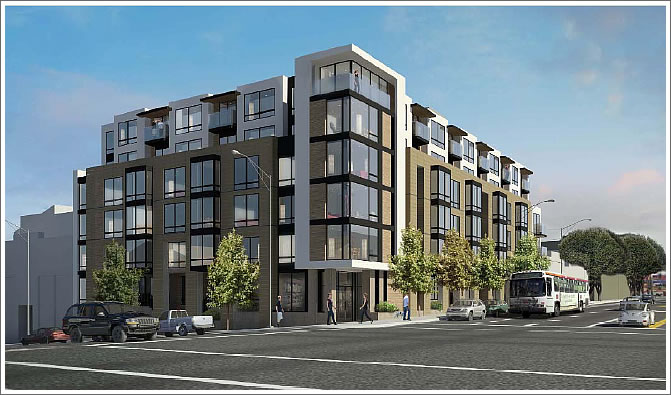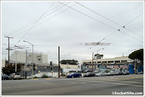
Having sat underdeveloped since 2005, the development of 480 Potrero Avenue was approved by San Francisco’s Planning Commission this past August but then appealed two weeks later, an appeal which was denied by San Francisco’s Board of Appeals last month.
Since a rehearing request was not filed within 10 calendar days of the Board’s decision, the project approval for 480 Potrero Avenue became final on December 3.
As soon as a building permit is issued, construction on the six-story building rendered above with 75 new residential units over 970 square feet of ground-floor retail and 47 parking spaces at the corner of Potrero and Mariposa can now commence on the site.


About time. Next battle: 1601 Mariposa St.
Oh no! The scenic vista of the trash-strewn empty lot will soon be lost forever!
Great news, can’t wait to see this built.
Building more needed housing is a very good thing !
I am loving all this new density!
All for this development, but – that rendering is ridiculous. So all the overhead Muni wires and poles are going away as part of this project? LOL. Renderings should be required to be more accurate – easily feasible in this day and age.
@Sierrajeff: I agree, but I think the focus is on the structure itself, rather than clutter around it…like the rendering of the building on California St. minus the clocktower…notice many of the highrises in the background are missing.
I still feel it could use more retail on the ground floor, but it’s better than an empty parking lot.
Is every last one of you architects a derivative hack? Are you architects because you weren’t smart enough for engineering, nor talented enough for art?
Why no imagination? Why is everything you guys produce so godawfully ugly?
I weep for this once-beautiful and unique city.
Here we go again.
I’m not sure how many of us here are actually architects. Some probably are. Everyone knows me, at least, as a genuine, bonafide (sometimes full of himself), certified architect.
I would ask you, two beers, why do you think ugly? share with us your design commentary. Saying something is just “ugly” is a purely quick subjective opinion, and doesn’t really tell us what you think and why.
I think this building is a “good” example of appropriate, urban, modern architecture:
+ corner expression enhanced ( part of the Residential design guidelines)
+ the two upper floors set back from the bottom 4 to minimize street impact at the sidewalk.
+ not too busy, but a good repetition of the square bay windows; uniformity and rhythm.
+ glass balconies to visually lighten the edges.
+ upper level sunshade projects to enliven façade.
+ upper level façade is lighter in color to minimize impact.
+ 2 value color scheme is simple and understated.
I don’t think the building is “ugly”. It may not be wild and crazy like a Gehry building, but that does not make it inappropriate or lacking imagination.
@twobeers, true there’s no shortage of unimaginative architecture in SF these days. But when each building proposal spawn hordes of pitchfork-waving critics of every element of its design, it’s hard to blame developers for wanting to play it safe (and bland). Blaming (and insulting) the architects is unfair (and rude).
@two beer: It’s copy cat architecture. This building looks like the Canyon Market condo development in Glen Park. I hope the façade is not beige like every other suburban strip malls.
@two beers: yes, please elaborate. Also, at what time in history did SF lose its beauty? Pre- or post-quake? 1950s? Gold Rush? Today? And are we merely going by your elusive definition of beauty?
What makes a city unique is its ability to transform and reinvent itself in response to internal/external forces and the simple rotation of the earth’s axis. Yes, there will be hits and misses, but it’s called change which may or may not bring with it progress. Hey, I think Twitter is a useless form of communication, but that doesn’t mean I close my eyes and long for the days of b/w TV with 3 channels and rabbit ear antennae.
@ Mark:
I think we just have to accept plenty of commenters here who like to complain. Constantly. About design. Without offering any serious critique.
Do I expect a lay person to comment and critique the same way I do? No, but it would be nice to hear more than just “ugly”, “fugly” and “copycat”. Those words offer no enhancement to the thread.
I think a lot of people do not like change, period.
I just don’t understand why every building needs to be all right angles with no ornamentation at all? I guess that is not the vanguard but I believe the previous 2000-3000 years of human history would indicate that humans like beautiful things
San Francisco is a city that often lays on a backdrop of grey sky. Having a plethora of bright and varied color on houses and other buildings lightens the spirits on all of those grey days and gives vibrancy to otherwise dismal landscapes. Beige, white and grey buildings disappear into the grey background here and provide no visual interest close up, or from afar. To me its not the design here that is bland, but the colors.
I’m just glad the project is finally approved and that the ridiculous objections were overruled. It would have been better if we had a system that didn’t allow for such frivolous delays, but oh well…
I got news for you architects, you design building for us non-architects. Us, mortal everyday folks are the final judge of a building’s aesthetics, not you starhitects, sorry. Just like food, movies, and cars; the potential consumers, not the cooks, actors, or engineers; make the final call.
I wouldn’t call this building ugly, I’d call it cookie-cutter and uninspiring. This thing is the “Weekend at Bernies II” of architecture – I’m pretty sure I’ve already seen it many times before and done better. Now, a movie industry person would probably marvel at “Weekend at Bernies II”‘s acting, direction, and production; but remember, the audience is the final judge and that movie sucks. Just as this building, while probably designed by competent architects, sucked by being lame and typical. At the very least, make the color interesting; the existing color theme is just… meh.
If this thing is build in Stockton or Bakersfield, I don’t think anyone would have a problem with it. But we call SF a uniquely beautiful city and we just got to have higher standard than this. Every new construction is an opportunity to enhance and beautify this city, this is an opportunity lost.
@ mas: I’m trying hard to understand some of your comments; not sure why you want to come across as harsh and rather judgmental. What’s with the “I got news for you architects…”?
Architects are mortal, everyday folks too. Just to let you know. You seem to feel it’s an us vs. them approach to design. Well, it’s not.
Without knowing every single factor that went into the design of this building, including the budget, the client, the contractor, the developer, the Planning Commission, the codes, the appeals and on and on; we cannot say that they made poor decisions.
They probably made decisions that didn’t please YOU or many others, but that’s really not the concern of architects. Some will agree. Some will not. Architects, quite frankly do not care about the opinion of the “man on the street”. Not as any judgment or putdown, but simply BECAUSE they other others to answer to. And every man on the street will have a different opinion.
And let’s be clear: “everyday folks” have their own definition of aesthetics and “beauty”. It’s all very subjective. So, say this building was bright blue and orange, and YOU love bright blue and orange. The next everyday guy doesn’t.
So what? Your idea of opportunities to enhance and beautify this city are very different from others, or mine for instance. It’s subjective and it’s a personal opinion.
I would ask you to define your definition of “higher standard”. I get that a lot of people here on SS just love to trash every new building design proposed. Which almost implies, they really like nothing new.
Could that be the real San Franciscan speaking?
You see, that’s the problem, you ask non-architects to define what’s aesthetic and most of us laymen can’t; as least not to the depth that a professional like you would deem useful. A beautiful building is a beautiful building, you know it when you see it. That’s it. That’s the extend of my definition; which I can tell you, is not all that different from most people’s.
While individual certainly has his/her own opinion and taste, there also exists a collective opinion formed by the vast majority, the consensus, if you will; and from the very first post on socketsite, the majority opinion, actually vast majority, pretty much echoes what I said here.
What an architect’s concern is is irrelevant, it’s a free country, the public has every right to judge a building. There may be valid reasons why this building turned out like this, and maybe it’s not entirely the architect’s fault, but a cookie-cutter building is a cookie-cutter building. It’s just calling a spade a spade. An architect could potentially fulfilled his job to the client and at the same time, designed a crappy building. Those two are surely not mutually exclusive.
I’ve seen a few pictures of new ~5 story buildings going up in Berkeley, and I generally like them. They seem to be both more classically attractive and more creative, at the same time, than similar buildings in SF. I don’t know what they’re doing right over there, but it would be nice if someone figured it out and brought it here.
The Planning Department staff is fixated on “new”. In their attempt to create “new” and to not rehash the past or what most people think of as San Francisco architecture (Victorian, Edwardian, etc) they are sticking with the “new” even as it often becomes derivative and boring to some of us. The other problem is that it is often crappy construction and this type of design only accentuates the crappy construction. I saw one thing recently in a very expensive house, where the frame of the window and the window did not meet. In other words there was a gap. In a three million plus house no less!
Architects are often treated as, and some of them seem to think of themselves as, rock starts, but if this building were a rock group, it would be a Bob Seger cover band at a Holiday Inn off the Ohio turnpike.
On a side note, I wonder if the builders know about the creek running directly under the lot?
I don’t get all the gripes. The building is perfectly fine. Not every building needs to be beautiful, just pleading enough and functional, which this building is. Unlike, most people posting on this site, I am a long term resident of San Francisco. The truth is that MOST buildings in SF are not beautiful, and this is the case even with 100 year-old structures. Most buildings are simply functional and they copy the style that was popular when they were built. Even the loved Victorians, considered flashy and often ostentatious when they first came into style, were simply an architectural trend of their period. SF’s Victorians were the tract homes of their day. And, by the 1920s, they were considered hopelessly old fashioned and fussy.
Yes, there are some truly lovely commercial buildings and homes in SF, but they are in the minority. Most buildings are fine simply being functional and reasonably attractive. This apartment building is perfectly fine.
It’s useless to criticize the architect here.
What you’re seeing is what the Planning Department demands– some kind of corner tower, a setback at around 40-feet, and bay windows. In the long run, I think this kind of uniformity will pay off visually.
The construction techniques are strictly mandated by seismic, fire and health requirements.
The finishes are controlled by the developer, who apparently will want to make a profit on this multi-year project. This is spec housing, not art.
This discussion on design is interesting, and I appreciate the differing thoughts, however:
@mas: I don’t see this as a “problem” as you do. You seem defensive. You seem dismissive. Not sure why. You use different words than I do. That’s fine too. You use the word “beautiful” as a broad definer of “good”. I don’t use that word, because I have no idea what beautiful is. Ok, so I think that Half Dome at Yosemite is beautiful. The Grand Canyon is beautiful. That’s how I think.
@ noe mom: Ok, I get that you don’t like the policies of the Planning Dept. I, personally, don’t think they are “fixated on new”. They help define and shape what is “appropriate”. But your comment about crappy construction is somehow misguided with this project. How do you know the construction is “crappy”, unless you have already made up your mind from one digital image?
@ two beers: Huh?
@ Chris: Sort of agree with you. We do have some truly incredible Victorians, and Edwardians.
@ Rocco: I don’t think the Planning Dept. strictly “demands” what you say they demand. There are design “guidelines”. Up to the develop/architect team to interpret those guidelines. But, the finishes are not “controlled” by the developer. They are often decided by a combination of factors: the budget, appropriateness, ease of maintenance and installation, and longevity. And what developer/owner would not want to make a profit from the project they build? Is profit a dirty word to you?
What’s wrong with bob seger? Seriously, can we turn the page on this boring conversation?