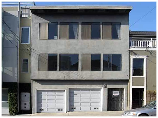
A little over a year ago, 392-394 Eureka Street was purchased for $875,000 with a vacant lower unit, an upper unit occupied by long-time tenants, and a total of 2,856 square feet.
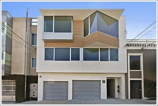
Having since been emptied, expanded, and contemporized, the now 3,605 square-foot Eureka Valley building is back on the market and listed for $3,690,000.
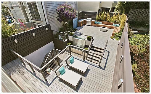
Or if you’d prefer, it’s available as two condos, with 394 Eureka listed for $1,495,000 and 392 Eureka listed for $2,195,000 with exclusive use of the new multi-tiered yard of deck:
∙ Listing: 392 Eureka Street (3/3.5) 2,200 sqft – $2,195,000 [392eureka.com]
∙ Listing: 394 Eureka Street (2/2) 1,405 sqft – $1,495,000 [394eureka.com]
Finishes are fine.
Very clever split. Larger one gets the two levels and larger outdoor space. Smaller one gets top floor, view and roof deck. Equals their desirability.
The facade is really horrid–worst I’ve seen in a long time.
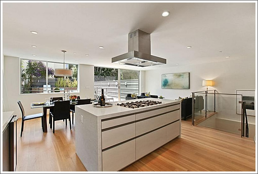
The fact that the upper level windows reach to the ceiling is also awkward,emphasizing that the room is only 8′ high.
That is the ugliest facade I have seen in a long time. Nightmarish.
When will today’s architects realize that most windows built today with nail on fins put the plane of the glass in the plane of the building, thus resulting in zero articulation and interest in the facade of a building? I live in an area of older homes and you can pick out the new windows from 200 yards: they are white and they make the house look cartoonish.
Great façade. Love the composition and play with triangles and rectangles. Beautiful approach to re-designing a pretty ugly original façade.
I also like how the windows reach tight to the ceiling. It seems to make the ceiling actually float. Very nice detail.
Excellent remodel and beautiful finishes.
Not my favorite new facade nor finishes. Ok but looks generic, not what I’d expect for a thousand a foot. Should change the garage doors to match the remodel.
@djt: Perhaps you need to understand the one of the beautiful tenets of “modernism” is minimalism.
The fact that the façade windows have zero articulation and are very flush with the exterior finish is precisely the elegance of the front. There are times, especially with modernism that the architect does not WANT to articulate details, but rather minimize them.
Beautifully done.
Not sure what this developer was thinking about or smoking regarding the pricing. The contemporary three story single family home next door sold last year for less than the 1st floor condo in this place. My guess is that the lower unit will sell for $1.5m and the top unit $1.2m
The facade definitely an improvement on prior facade. Apparently not for everyone, but it symbolizes current trends. One day (30 years later?) someone will walk down the street and say, oh, look, minimal, squarish, with horizontal wood trim. How very 2010.
I like it (now) because it’s still just a little novel to me, but whether this ages well will be interesting. Modern clean lines can be hard to maintain and show age worse. A Victorian or beach-cabin-like style can still look quaint when a bit dilapidated, but this Dwell-ish esthetic may require an OCD like maintenance…which tech workers might actually have.
Very nice finishes, clever split, nice location.
Its got the Benihana island with the stove on it. That is a deal-breaker for me.
That wood trim that seems to all the rage today doesn’t last very long with our weather. Homeowners around me that had it installed only three years ago are redoing it.
The solid concrete-scape is just so inviting.
@notail
Ill take that bet.
I’m with futurist and jenofla, the new facade is a huge improvement over what was there before.
I, too, cringe at the lack of articulation in the facade — more because I know such facades often fail to keep out water and soon begin to deteriorate and rot. I have more than one friend/neighbor who is faced with maintaining this kind of detail. The handy ones order epoxy in bulk; the unhandy ones scream at the contractor (if they can find him/her) and continually have to repair it all.
Traditional buildings were constructed to offer maximum protection from the weather — this is what the ‘articulation’ was for — and to stay comfortably within the limits of traditional materials (i.e., cantilevers were kept short, and window openings all lined up vertically). These kinds of practices were followed in early modernism as well — thats why old 1920s modern buildings look so classic. These buildings last a long, long time.
Today, many architects and builders will tell you that modern, synthetic materials are weatherproof and perfect and so the traditional building rules can be disregarded. Conveniently, they are not on the hook when it all starts to go bad in 15 years or so. Anyways, by then the house has been sold once or twice again, and its time to gut and re-build something fresh.
This building is better than many — there is at least on overhang over the top — the remnant of another traditional detail, the ‘cornice’. If the builders were really all-in Dwell-contemporary, they would have skipped it and really left the new owners out in the rain.
Articulation in a façade has nothing to do with maximum protection from the weather.
Correct detailing, quality flashing, drip edges, head flashing over doors and windows, and compatible materials does.
And yes, when a building leaks, which does happen, it is more often than not, a case of poor assembly and execution, than a lack of “articulation”. And no responsible architect or builder ever says a material is “perfect”. that’s just bs.
Cornices, overhangs, lots of wood trim slapped on have nothing to do with making a building water-resistant.
Maybe ‘around1905″ has had some bad experiences, and I get that. But generalizing about lack of articulation is not addressing the real issue.
Include me in the “love it” camp. A really interesting design that is clean yet has enough visual interest to not be bland. The wood is used sparingly and provides some textual difference. One of the nicer facades.
This isn’t minimalist and it isn’t modern. It’s just awful. The garage doors are off a 50’s rancher. There is no line, form, or unifying shape that would signal this as anything other than traditional hodgepodge. Look at google images for minimalist and modern architecture and you can get an idea of what those terms mean. For the planar walls/windows concept to work, it needs to be part of a building that expresses an extremely simple form: simple forms, simple fenestration. I built a modern house designed by an architect and they have much stronger unifying lines and create a coherent concept that is evident to the observer. This is random cheap windows over 1950’s garage doors. No more.
I am an Architect, so I know we can spend too much time meditating on a building elevation in a 2-D elevation view and imaginery viewpoint renderings and not enough on what you actually experience when you see the building on the street.
So while I am more or less indifferent to what changes they did on the upper level, which is more a problem for across the street neighbors to puzzle over, I am disppointed that the ground level received little more improving than a fresh coat of paint.
I can see the soffit at the entry is a bit higher, but that only means that the head of each opening is now a different height. There are times to respect the grade but this grade level doesn’t respect the imposed geometry of the upper levels. Those garage doors appear to be the same garage doors, just repainted.
If I lived near by, walking home from work on the sidewalk each evening, from my pedestrian sidewalk perspective, this is what you would see up close – still just another stucco box.
I do live nearby and walk by this place regularly. It isn’t very impressive or memorable from the street. That said it is a big improvement over what was there. I like the interiors – except for the windows. While they look cool in the photos at some point you are going to want shade or privacy and this design doesn’t seem to lend itself to typical window treatments…
@djt We get it, you don’t like it. However, how do you know these are “cheap windows”. Kind of hard to make that determination from these photos, don’t you think?
Anyway, I think they did a good job maximizing value, but I do think it is overpriced by 10% especially as it is not really configured as a single family so therefore is likely 2 buyer TIC deal or one buyer and rent other unit.
Looks to me that the entire building including lower level got a new stucco. I agree that it would look better with more modern and not cheap looking garage doors.
Re Condo or not. The units are condos with 392 HOA dues $450 and 394 dues $300.
Looks like condo conversion in process, but map not yet recorded.
Current Phase: Proposed Final Review
Current Status: Pending Senior Review
This is interesting since this was purchased by current owners on 3/2/12 and their condo app was submitted on 5/13/13. Rules for 2 unit bypass is that both owners must live continuously in the units for 1 year. Hard to see how this was possible with this level of reconstruction. Must have been lots of dust in your bowl of Cheerios in the morning…
Our condo conversion laws are ridiculous in my opinion so I am all for the conversion and wish the sellers the best of luck.
The askew bay window and wood paneling will look as bad in 30 years as Memphis-style triangles and stripes look now. I’d rather modernists just keep it pure and simple modern. The jaunty angled window is trying too hard where flat and symmetrical would have been more striking overall. What functional benefit is there to it?
jeezus; more comments showing people in SF are so resistant to change, or something slightly different.
What a provincial place we live in.
Both before and after are horrifying.
Is that a Bertazzoni cooktop in the kitchen?
This reminds me of the show “Pimp My Ride”. It’s basically the architectural equivalent of a 1988 Daihatsu with BBS wheels and a $20k AV system.
It was utilitarian vernacular when it was built in 1960, and dressing it up in a random assortment of 2013 luxe tropes doesn’t really ruin it, or make it much better, just more expensive.
It’s hilarious to see anyone ascribe “Modernism” to it, or dismiss criticism as being provincial. If anything, a sure sign of provincialism is giving undue praise to hometown mediocrity.
Modernism, schmodernism. You want that, look to Wurster, etc. This “thing” is the continued restaurantification, the W Hotelization of the San Francisco housing stock.
Who do we blame? The Planning Department? The architects? The developers? The workers with tech money that don’t always know what to do with themselves and all that cash?
If some developer wants to do something really new and advanced they will try some American Colonial Revival with a real dining room next time they do a remodel! I am sort of kidding but sort of not! I mean how are you going to create any sense of privacy in that place? At some point the buyers will ache for privacy and coziness, but they will be stuck.
Maybe, however what really makes me mad is the hubris in the asking price. I wonder how much they paid the long term tenant to get out?
Exterior is better than before (but anything would be better than the before look). Inside is definitely nice – but the pictures make me claustrophobic with that low ceiling.
All in all priced $1m too high for the building.
I won’t weigh in on the aesthetics of the facade – I don’t really care for it, but that’s neither here nor there.
This is simply not a $1K/sqft home. The finishes are very middle-of-the-road and some are downright cheap. The tile work is uninspired – poor color choices and poorly integrated choices of different tiles. Low ceilings and lack of trim are indeed found on “modern” designs, but they’re not what we would call hallmarks or desirable. Finally, the all-hardscape rear yard flush up against two neighboring structures is not just undesirable, it’s unwelcoming and unlikely to be a space where people would want to hang out for any extended period of time.
This property just has too many negatives to end up at the $/sqft they’re asking for…
Wai Ahead LLC. Nice touch.
This is the same team that converted 827-829 Castro.
Looks like 8′-6″ or 9′ ceilings in the upper unit, compared to 8′ for sure in the lower (compare the soffit height above the non-built-in refrigerator in each kitchen). They sure are not underpricing these, are they?!
god that’s an ugly front for a house. at least they could spend some money on the garage doors. that triangle window needs to go …..