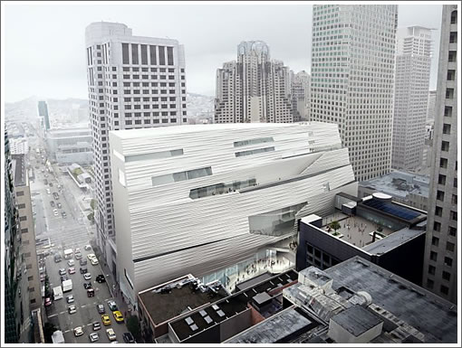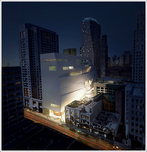
SFMOMA’s Snøhetta-designed 225,000-square-foot expansion officially broke ground this morning. Tomorrow, a free four-day public countdown celebration begins. And starting June 3, the museum will be under construction and closed for two and a half years.

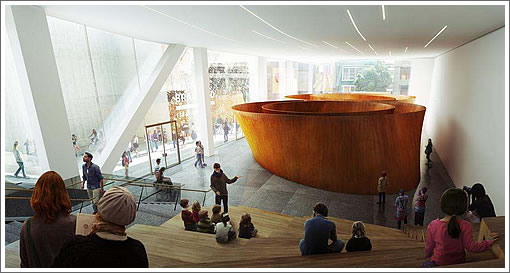
When SFMOMA reopens in early 2016, the museum’s gallery space will have more than doubled, including a new glass enclosed gallery facing Howard Street to showcase Richard Serra’s monumental sculpture “Sequence” which has been on display at Stanford’s Cantor Arts Center since 2011, on loan from the Fisher Collection:

∙ SFMOMA Expansion Design: New Details, Renderings And Video [SocketSite]
Couldn’t you post a rendering of what somebody with, say, an 8th floor room at the W will see? Will it be nothing but flat, blank whiteness?
[Editor’s Note: Actually, we have: SFMOMA Expansion Comments, Responses And Simulation.]
They should have taken the next three unimportant buildings to east, even if by eminent domain. There is too much here for such a small site.
The removal of the staircase in the original building will some day be seen as an architectural crime.
It’s much more interesting than I expected, and I generally dislike contemporary architecture. It seems to fit in well.
The building looks like our BOSE Wave stereo.
I love it. Great new building and space for the rapidly expanding collection.
“The removal of the staircase in the original building will some day be seen as an architectural crime”
Where did you hear that?
[Editor’s Note: As we detailed back in 2011: “The design of the interior spaces synthesizes the current Mario Botta–designed building and the new Snøhetta expansion into one seamless whole. Two main entrances (the current entrance on Third Street and a new one on Natoma Street) will lead into a central space that will serve as the public entry point to all galleries. To create an expansive, flowing space on the entry level of the museum, the original staircase will be removed from the Botta atrium.”]
All of SF’s major museums have gone through significant expansions since I moved here 25 years ago, and I find it remarkable that SFMOMA will have grown this much since its home on Van Ness Ave. when I moved to SF 25 years ago. I have to agree about the Botta staircase. Art historically speaking, it will not have been around but for an instant, and I’m glad to have known the building as a conceptual whole. Am open to the idea that the synthesis of the new with the old will be something successful, though, which will make the sacrifice of the atrium and staircase a thoughtful progression for the museum.
I love the aesthetics of the new building, my only issue is the nearly featureless wall facing Howard street, generally an urban design no no. I wish they would have continued the design of the side wall around to the front.
But it’s still a beautiful building and I look forward to seeing it in the “flesh”, as well as all the art it will house.
@conifer, what do you mean “next three unimportant buildings”? Surely we must preserve the landmark that is the Gold Club.
It is odd that such a robust sculpture like Serra’s Sequence is being placed indoors. Why not site it outdoors (Crissy field anyone 🙂 and use the valuable indoor space for something more fragile which needs protection from the elements?
The real bummer is having no sfmoma for 2 1/2 years. They say they are loaning art and doing special exhibitions in other locations, but we will have to wait and see how serious that is.
What they should have done is what moma in NYC did; find a temporary bldg and continue hosting exhibits there. It’s very disruptive for a museum to disappear for so long.
@49yo – Absence makes the art grow fonder?
It is different but I’m not a fan. It resembles the Federal Building with a white sheet thrown over it. All those awkward angles are jarring. Is this the best we can come up with?
I love the way this building looks like it just nudged its way between all of these stuffy, typical city boxes. It’s very much like art in a city. It’s intrusive. It’s elegantly obnoxious. It reminds us that art matters.
Rendering as architecture seems to be the new way to design. It is not what the building will actually look like but how it glows in a rendering. I will wait 10 years after completion to see what this really looks like. City dirt and pollution as well as weather and water staining could make this concept troublesome. Building designs should be able to age gracefully and not only be attractive at completion.
Even before construction is finished there is an enormous amount of staining on the facade. It looks really dingy already.
This building is incredible.
Thankfully, the negative critics here had no hand in the design of this building.
They don’t seem to get it. This is going to be world-class iconic addition to our SFMOMA, designed by a world-class, highly respected, highly talented firm.
The “nearly featureless wall” so called, is actually a strong, modern composition of solid and negative spaces. Look at the wall again; it’s actually a wonderful relief from most of the facades, especially the ugly W hotel that are full of busy-ness and overly “featured”.
Like Sam says: this is an incredible building. So looking forward to watch the construction progress and the ultimate completion.
Interesting you quote me in your comment about negative critics, when immediately before the portion you quoted I said “I love the aesthetics of the new building”
While I agree the W is ugly, being different from it doesn’t make a blank wall into a masterpiece.
“Surely we must preserve the landmark that is the Gold Club.”
Yes we must, where else would I go for lunch?
Despite the fact that Snohetta is a hot, international architecture firm, I think that this is a poorly conceived building.
To all those who admire the sculptural element of the facade,
I have a question: How are you going to see it? From the drawings,
the view is looking down from a fairly imaginary point. What will most people see from the street? Not much. It’s shoehorned into a narrow space with no way to get the distance to see the front.
However, the facades that people will actually see are, if not bad, certainly non-descript. I feel sorry for the guests of the W. Suddenly, hundreds of rooms will have a view of a glorified air shaft.
Lastly, why does this building seem to dislike the original building? If there is a “conversation” between the two, it’s the new building saying, “Shut up” to the old one. There is no relation at all. And removing the central staircase, removes the main architectural feature of the Botta building. “Eviscerate” might the accurate word to describe this change.
I hope that I am proved wrong. At this point, it seems to be a big mistake and a missed opportunity. But what do I know? I only studied architecture design for a couple of years.
As for Snohetta, if the Embarcadero arena gets built, we will have a much better example of their work.
Definitely one of the ugliest buildings I have ever seen.
jlasf: I agree-
Always be wary of renderings taken from impossible points of view. It means the probable views will be un-appealing…
It seems this design has been rammed through w/o enough consideration of the alternates:
a. completely replace the original building (which is to be gutted and closed for the duration anyway);
b. acquire more parcels along Howard; or
c. build taller on Howard and let the rest be more relaxed.
The result is not a little awkward, served up with endless fawning over the NY/Oslo architects, and proclamations of being “World Class”.
So un-World-Class.
The Botta stairway was always overbearing in the lobby. The main feature is (and will remain) the cylindrical skylight, which the removal of the stairway will actually open up. Anyway, I’m not sure how a new addition could be “respectful” to an overstyled piece of postmodernism. You want more bricks and stripes? BTW, there are plenty of street-level renderings if you just bother to do a Google image search.
It looks like a poorly wrapped present which looks better in the dark. Overall, I don’t like it. I think it will receive numerous accolades (as these buildings often do), but it will start to look uglier and uglier as time goes by. The white on the outside will be tarnished by the soot and dirt from all of the traffic on the street. It doesn’t even look artistic enough to be a museum. Rather, it looks like a grocery bag split on one side by misshapen contents. Thumbs down.
@ James: I have seen the street-level renderings. They reinforce my opinion.
To be respectful, it could provide subtle echoes of the other design. Instead of the virtually blank white wall on Howard,
how about some pattern of B&W stripes? They could be broad or narrow, many or just a few. That would, at least, acknowledge that this is part of a greater whole.
Here is the statement of Craig Dykers of Snohetta as they approached design of the new SFMOMA:
“It’s a bit like creating a marriage. If you meet someone, and you want to be with them and make a union with them, you would probably prefer that they have a strong character than no character at all. Then again, you don’t want to just copy them. So we’ll be complementary and I hope create a situation where the union is stronger than the individual parts.”
Do you think that this building accomplishes their own stated goals?
A few thoughts:
1. Opinions are fine, but saying it’s ugly, or you just don’t like it has little substance to stand on.
2. I feel sorry that the museum did not buy the land where the W now sits. Hotel guests hardly have a say as to the view or not of the new building.
3. The new building was not “rammed thru” the process. there was a long vetting period interviewing the best of the best world architects. The museum board chose who they thought would deliver the best solution for THEIR project.
4. The entire existing building is not going to be “gutted”. Some modifications will happen to improve circulation and optimal use of gallery space.
@ jlasf: did you “study” architecture for a couple of years, or also have a degree?
@ futurist:
I took courses in architecture history, beginning with Palladio; architecture design, including Louis Sullivan and the evolution of the skyscraper; and an overview of contemporary world architecture, including works by Nouvel, Koolhaas, and Holl.
If the question is whether I am a licensed architect, I am not.
But I can hold my own in any discussion of architecture. Of course, that doesn’t make my two cents more valuable than anyone else’s.
Actually, my “pie in the sky” thought had been to re-purpose the Metreon building as the extension of the MOMA.
Gut and re-skin that building, but keep the movie theaters, which could also be used for lectures, films about the art, as well as classic cinema. That would keep the integrity of the Yerba Buena Arts District concept rather than simply becoming another retail mall. It would also have been more efficient to build; parts of the existing structure could be re-used and it wouldn’t require the environmental reviews that are required of any new building.
I thought that should have been the fallback after the CAMP idea fell apart. The Fishers had the retail and construction experience to help make that happen.
Instead, we have a Target store and a questionable Snohetta addition.
Oh well.
Ok, well that is somewhat pie in the sky, but ok.
I don’t understand your disdain for “retail mall”. you can certainly have your opinion, but it smacks of classic (and overdone) San Francisco attitude of the mall haters, the car haters and the hipsters. Retail AND malls are part of the American culture, including SF. They are a significant part of downtown, bringing in money, jobs and people. What’s the problem?
“We are superior and know what is BEST for others…”: mall, car haters and hipsters galore.
You can question the Snohetta addition all you want. I like it a lot; the museum made a great choice; it will be an interesting and powerful addition to our community.
And it will get built.
@ futurist
Whoa, big fella! : )
I have nothing against retail malls. The Westfield Mall/s are great. From the Bristol Farms at the bottom to the movie theaters on top. I simply wish that Target had gone into Market Street Place, aka City Place. It needs a strong anchor store and now that JC Penney is floundering, that is probably out.
I think that if the Metreon space had become an extension of SF MOMA, it would have been part of the museum mix in that area. As more museums go in around Yerba Buena, it would have kept that area as a cultural zone.