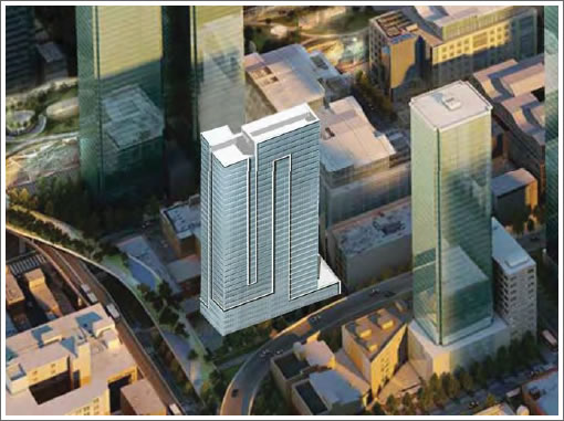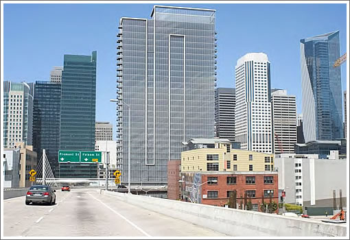
As we first reported a few weeks ago, the original plans for a 550-foot tower designed by SOM to rise at 41 Tehama have been shelved and Fritzi Realty is moving forward with new plans for a 342 foot tower designed by Arquitectonica to rise on the site.

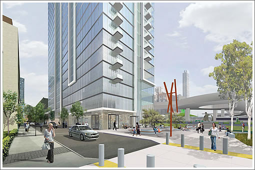
The proposed tower would be set back approximately 59 feet at ground level from the western property line, the vacant space created by the setback would be occupied by a 4,460-square-foot common open space plaza:

As plugged-in people should know, the site is adjacent to Oscar Park:
Up for approval by San Francisco’s Planning Commission this week, the construction of 41 Tehama will take approximately 24 months and yield 325 units (20 studios, 205 one-bedrooms, 100 two-bedrooms), 49 of which would be Below Market Rate (BMR). The number of proposed parking spaces is down to 241 with parking for 104 bicycles as well.
∙ Reaching Out For A 32-Story Residential Tower To Rise At 41 Tehama [SocketSite]
∙ 41 Tehama: Fritzi Sees The City’s 350 Feet And Raises It Another 200 [SocketSite]
∙ Oscar The Park: Designs For An Acre Of Outdoor Space Downtown [SocketSite]

More housing in the nabe is welcome but not my favorite Arquitectonica design, looks a little stubby with those proportions.
Needs some tweaking. Looks like a wall.
Agreed. Not the best design out there, but more housing is welcome. It’s also nice to block the view of the off-ramp from the rest of the city.
Embarcadero South.
How about a little color or texture? If you’re going to build a wall, at least make it a nice wall.
Did Arquitectonica leave their playful side in Miami? This is so bland, and a little too contextual with a fog bank, IMHO.
Agreed, it looks boring and stubby from ground level. It does look good in context in the aerial shot. There just has to be more interesting architecture.
Would of course prefer a taller building and less mass. That will inhibit many views. Wholly wrong for that site. And yes this could be an opportunity for something very fun and playful. For starters
http://www.dezeen.com/2008/09/14/56-leonard-street-by-herzog-de-meuron/
Looking forward to this addition to the Rincon neighborhood!
Who’s to say this will get built as designed since the bland look of Trinity Place started out with a great Arquitectonica design that is no where in site these days. That latest addition would be right at home in Sacramento but really misses the mark from what was proposed. Maybe SF really is doomed to mediocre condominiums. Let’s hope this one isn’t value-engineered into an even more block-like slab.
So, who do we blame? Arquitectonica or SF? Arquitectonica was once a brash, innovative firm that was responsible for some striking buildings in Miami. Have they become boring? Or does SF simply legislate the innovation out of new buildings? Yet great residential towers are still being built. Just look at the Aqua in Chicago. Is there any way to get that quality of design here?
I’m convinced it’s SF. We’re an extremely conservative city unwilling to take risks – and that includes designing by committee/commission so that no one is offended.
Completely agree with Steve- it’s SF. Not that innovative stuff doesn’t get built (Jewish Museum, MoMa addition, DeYoung), but that SF’s crazy NIMBY’s intimidate developers into mediocrity. Note that the good stuff tends to be public and/or cultural. SF scares the bejeesus out of Developers.
not a pretty building (it’s ugly). it looks like a concrete wall. there’s got to be a better design from the creative minds of arquitectonica.
UPDATE: 41 Tehama Street Tower Seeks To Add More Stories And Density.