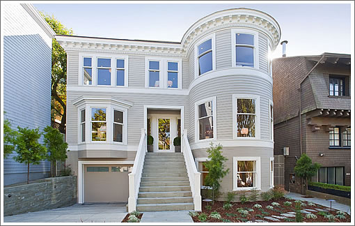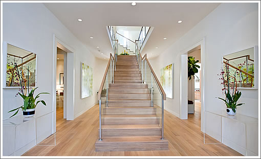
As plugged-in people knew, the preview party for the completely rebuilt 2615 Union Street was two weeks ago. And while the listing still doesn’t offer any interior photos, a tipster directs us to a website for the property which has quietly moved into production.

∙ Listing: 2615 Union Street (6/5.5) 6,800 sqft – $7,995,000 [2615union.com]
∙ Behind The Rebuilt 6,800 Square Foot Home At 2615 Union Street [SocketSite]

Not impressed. Finishes look cheap for this price point, too many awkward rooms. Those wine cellar racks are horrible! I like the yard…
The wine on the racks is worse than the racks. Easily 200 recessed cans.
My comment on the first thread, based on only 2 pics, was that it looked cheesy. After witnessing the slide show in all its horror I honestly think cheesy would be a compliment.
I actually did drive past this place the other day and it has wonderful street presence. Better than I expected. High hopes. My first indication of a problem, besides those two pics from the listing, were the major gaps on the stone work on the driveway where the stone meets the slab. Very poor attention to detail. Image 49 in the slideshow pretty much sums up my feelings for this place. Empty with no soul.
At least Teed/Haze/Tabooni deliver properties that are well thought out with high end finishes and solid attention to detail. This place, not so much. $1k psf would be a generous outcome here. I’ll go with $5.6 for a final selling price but I don’t expect this will be flying of the shelf.
whats wrong with 2 buck chuck on cheap racks in and 8m house?
What happened here? Too much emphasis on cool and not much thought to how a family would live here. Fireplaces in every room? Would you really want your kids coming down that staircase? Fabulous open kitchen however I would not pay 7 million for fabulous open kitchen. 4.95?
What an oddly uncompelling house. The rooms are uncharismatic and blank. It doesn’t even seem modern, jusr totally without any design style. A good interior designer (which the staging does not exhibit) might be able later to make this place feel more comfortable and chic, BUT the best living spaces, IMHO, exhibit a happy marriage between structural and interior design. This just looks like a few high-end products thrown without thought into empty, boring white boxes. I mean, there are actually interesting white boxes out there…these are not those. For $8 mil, there should’ve been better bones and at least SOME personality. Ugh.
@sparky-b.
Recessed cans. I sort of agree. But what else can use these days to provide even lighting that extends to corners of rooms? I’d love a solution in my next project. Architects spec them , and they can be dimmed or turned off, but aside from a ceiling full of larger fixtures, what’s an alternative?
What to make of that staircase? It makes me cringe at the waste of space that comes with having two adjacent hallways. It looks like they were trying to implement a grand staircase like you might see in a mansion…but instead it just looks poorly designed. It would have been sweet if they pushed the stairs to one wall and opened up a double height (or triple, I can’t tell) foyer.
been there,
Cans have their use and lighting corners you want lit is a good one. They are good task lighting in kitchens as well. I like to have a few in the bathroom.
But having 12 cans in the master and 10 in other bedrooms and 20 in the living room. I would just rather see some fixtures. I don’t like the light that only cans gives off. I like some light that is getting directed back up to the ceiling.
The house in question would look better too with some more decorative lights.
My husband and I toured two weeks ago when it was open. He loved it and I hated it. I agree it is not a good marriage of classic and contemporary. I felt it was very one note. And there are still small chopped up rooms at the front of the house with no purpose. The backyard is filled with dangerous pointy angles all over it. You would have banged up kids everyday. It is just a strange amalgam of space and style and wildly overpriced.
I agree that an array of cans make for good kitchen task lighting. But as noearch points out they provide bad light in bathrooms particularly for the task of applying makeup. Aside from that I agree with sparky-b that indirect and/or decorative lighting is much more appropriate for LR, DR, and BR spaces.
The future of cans? I think cans will be replaced by wired 4×8 slabs of sheetrock with color adjusted white LEDs embedded in a four by four inch matrix. Just make sure that the sheet rock crew doesn’t drive a screw through the wiring.
I too hate cans (and skylights) in bedrooms, if I didn’t make that clear above. Except when you have a desk area or wall art on a separate switch.
Also those cans are about $100 each plus the electrician did a lot more work. Probably a bunch of carpentry time fire rating as well. I think that about 100 cans could be removed and they would have had a budget of $15000 for bedroom and living room lights.
Agree with many here that this house feels significantly over priced for what it is. Will be interesting to watch this one.
Thanks for your lighting input everyone
This house has a bus stop right in front of it… there are 2 lines of buses, one each 5 minutes of so.
Silicon Valley – I take the 45 from Greenwich/Lyon all the time and trust me, it’s not “every 5 minutes”. The 41 only runs at peak times as well. It’s also an electrical line on cables, so it’s not really that noisy.
Say what you want about the house, but you can’t argue with the location: It’s probably one of the nicest in the city.
The style and taste of a cruising bachelor pad in a wildly over blown setting. Whoever did this should hire in some people (even women! gasp!) with experience designing for families. Cozy is not a 4 letter word. Why would anyone who likes the exterior want this interior?
Went to the open house on Sunday. It is an amazing renovation. Mitch & Gary must have spent $3M+ on it. The high ceilings and clean finishes make for a very appealing house. Small details like recessed kick boards matching the inlaid door patterns make it very appealing. Unfortunately, no filling of the bathtub from the ceiling, as in their 3577 Pacific project. The two buck chuck in the wine cellar must be a joke.
There is a premium on brand new, so I predict this will go for close to $7M.
[Editor’s Note: Inside 3577 Pacific which was originally listed for $7,700,000 but quietly sold for $4,900,000.]
For those unfamiliar with 3577 Pacific, it included the ultimate pimped out modern Temple of Bathing. Because when you’ve reached a certain level of wealth you look silly driving a car with a gigantic spoiler and ground effects.
In Escrow
Fell out of escrow apparently; but the price was just reduced to $7.5
The sale of 2615 Union Street closed escrow today with a reported contract price of $7,350,000. Call it 8 percent under asking but still $1,081 per square foot.
Move along. Nothing to see here. Actually, this is a pretty amazing outcome. Maybe 3481 Washington that came on over the weekend has a shot at getting $7.5.