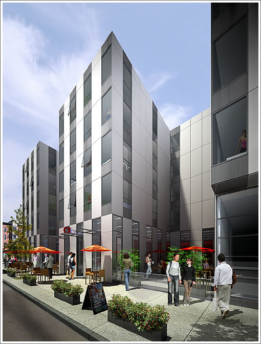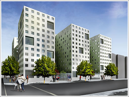
As the five-story Stanley Saitowitz | Natoma Architects designed building that’s proposed to rise at 1501 15th Street raises the hackles of a few hecklers in the Mission, we offer a bit of additional background and perspective.
In 2008, the project sponsor proposed to build a car wash, not condos, on the site. Noting that “due to the project site’s close proximity to the 16th Street BART Station, a mixed-use project offering both commercial and residential uses would be strongly encouraged,” the car wash was disapproved by San Francisco’s Planning Department on the grounds that such a use was inconsistent with the intent of the Eastern Neighborhoods plan.
And in terms of the project’s proposed design, while the Planning Department “realizes that from the architect’s perspective, the design is very cohesive and deliberate, forming a minimalist façade” and acknowledges that “any attempts to change it would [therefore] compromise the integrity of the design,” the Department still has a few concerns:
If the courtyards remain, in all likelihood gates will be needed to secure the outdoor activity areas after the retailers close in the evening. [Planning] would like to see the proposed treatment to address this issue in the design.
The Department would like to see the use of the neighboring property’s light-well preserved, such as matching the light-well.
The recessed wall on South Van Ness Ave. presents a blank wall above the ground floor and should have additional detail and fenestration to provide scale and interest.
Save the few concerns, however, the Planning Department recommends the Planning Commission approve the project sponsor’s proposal on Thursday. And yes, for better or worse, the design has evolved from what was originally on the boards:

∙ 1501 15th Street Now And As Proposed [SocketSite]
∙ Development at 15th and S. Van Ness Raises Hackles [missionlocal.org]
∙ Eastern Neighborhoods Plan, It’s Not Just For Policy Wonks Anymore [SocketSite]
∙ 1501 15th Street Request for Large Project Authorization [sfplanning.org]
Kinda looks like SOM’s One Bush Street Crown Zellerbach Headquarters downtown…alas, Stanley, there is nothing new under the sun…
What’s with all the women stalking out the windows? I count 4.
Good god, that sure is ugly! Looks like a medical office building from the 70’s. Oh, and it fits right in. I guess its better than a Shell station, but not much!
This is really awful.
As the late architect Joe Esherick would say:
If you’re just drawing lines…you fail to see.
Love it. Build it. Really glad the tweaked the original design.
It needs a few more doo-dads.
http://en.wikipedia.org/wiki/File:Portland_Building_1982.jpg
Absolutely gorgeous, and will provide some nice variety to the street.
Build it now.
Dear planning department – get a clue.
Official policy: Personal access to light and air are not protected resources
request from planning: The Department would like to see the use of the neighboring property’s light-well preserved, such as matching the light-well.
Surely this doesnt at all contribute to the overall sense that planning’s decisions are arbitrary.
Like the first design quite a bit; the second — agreed looks like a (mundane) medical office building. Nothing but a serviceable, anonymous dental office for that pesky root canal work.
Ah! Finally, more much-needed prisons! Oh. What do you mean they’re not prisons?!
More cheap looking schlock designed for a developer intent on banking as much profit as humanly possible, at the expense of the community this kind of garbage is supposed to be enhancing.
Bet this would get this much traction in Pac Heights: zero. Too bad none of the land use attorneys live nearby to shut that pos down.
“Bet this would get this much traction in Pac Heights: zero. Too bad none of the land use attorneys live nearby to shut that pos down.”
But isn’t that the real tragedy? That no one is allowed to experiment with buildings in Pacific Heights?
Look, however you feel about this, the comments sections both here and on the previous thread both have comments for and against this design. Some people think it’s ugly, some people think it rocks. There’s nothing really wrong with that.
If you don’t like it; don’t live there. I don’t know why some sort of NIMBY comment about land use attorneys even belongs here. Why must some people’s first thought be something about litigation? Maybe that’s what’s wrong with this city — if you don’t get your personal preference, sue. That should be the last option when it’s a non-frivolous complaint, not when it’s merely a personal preference/aesthetics question. What is wrong with you people?
Nice. I’d take it over a Victorian any day.
They always forget to add bums in the rendering. The guy who designed it obviously doesn’t hang out much at 15th and SVN.
It’s a utopian vision of young, lean, hopeful people, no graffiti, homeless shopping carts or double-parked beer delivery trucks, and attractive women lurking in the windows. It’s a better future than the current corner, that’s for sure.
I don’t see any drag queens in the renderings. Doesn’t seem fair to me.
Stanley versus Baker? Stanley wins every time, because his buildings hold up.
Build it baby, and sustained will present itself over time.
Its why my nom de plum is Stucco Sux.
Could be taller but I like it. Please build.
As I live around the corner, I know the neighborhood well. With a walking acore of 98 this area needs more of these developments. As these get built in areas that are either underdeveloped or unpopulated I believe that more mature stores and restaurants will emerge. Offhand, I know of two more places where abandoned warehouses will be replaced with new condos. Built it fast!
Personal access to air and light are not protected resources. Wht a great idea! Thanks joe!Let’s change that policy to ensure personal access to air and light are requirement of any architectural design. EVen in prison ior prison like designs.
“Personal access to air and light are not protected resources.”
I never thought I’d be on the other side of a “why don’t you move to Walnut Creek” comment. 🙂
It’s like some people are willing to justify any downside of San Francisco, by saying, “it’s part of living in the city,” except this.
Um, I am saying that i dont think personal access to light and air should be a factor in planning development. Specifically in this situation, I dont agree that the development should be redone to feature a corresponding light well to the existing building.
It is already our policy to not require this – and it is often repeated at the planning commission. Yet, here we have a situation where the planning commission is asking a project sponsor to redesign something to maintain “light and air” for the existing building.
Light, air and other quality-of-life issues should absolutely be any Planning Dept’s domain. Otherwise why should they pay attention to bulk, parking, open space, etc.?
What Planning should not be doing is obsessing about pointless setbacks, gratuitous cornices, the shapes of windows, and other frivolous aesthetic fixations.
needs to be 3 floors higher and much more parking