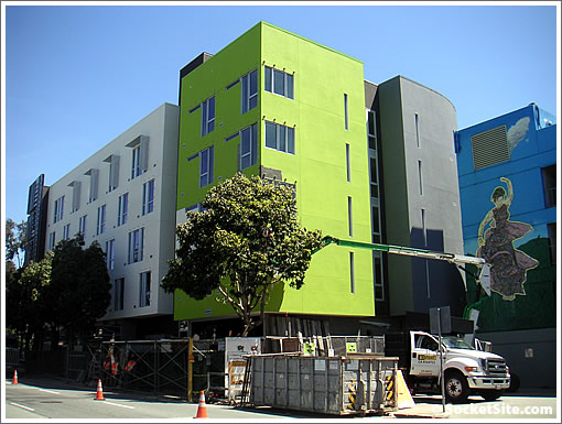
Formerly known as Central Freeway Parcel G, to be known as the Dr. Raye Richardson Apartments, and having started site work early last year, the scaffolding around 365 Fulton is almost completely down from around the five story development at the corner of Gough.

As plugged-in people know, the development will yield 120 studios for extremely low income, formerly chronically homeless individuals; 2,680 square feet of ground floor retail; and 2,000 square feet of social service program space.
And the yellow was a post community input added touch to the David Baker design.
∙ 365 Fulton (AKA Parcel G) Design Evolved, Site Work Commences [SocketSite]
∙ In The Name Of Dr. Raye Richardson For 365 Folsom (AKA Parcel G) [SocketSite]
∙ RFPs For Housing Along Octavia Boulevard [SocketSite]

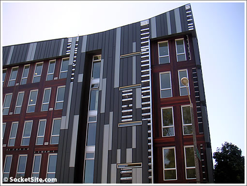
I’m definitely a fan of that vertical multi-colored paneling on the one side, although the stucco on the rest is pretty blah.
“And the yellow was a post community input added touch to the David Baker design.”
Is that yellow or green? Looks more green to me…Anyway, I do like it minus the Flamenco dancer.
I like David Baker’s designs. This one is a favorite of mine – http://www.200secondstreet.com/
Funky.
Props for being different. It’s nice to see something other than typical boring lego-land box SOMA stuff.
^Um, this ain’t in SOMA.
I know. Bad phrasing on my part. Hopefully you get the idea (all the new stuff that comes up tends to mirror the boring boxy stuff you see all over the SOMA/Mission Bay).
I thought your statement was quite clear, lolcat_94123.
Willow – I think you’re right. That wall appears to be a yellowish green (lime green?). For reference you can see the standard “traffic sign” yellow on the dumpster in the foreground.
Love the color. Love the vertical panels.
Is 5 stories the best we can do? Or is the city slowly testing the waters in different neighborhoods for heightened density? I hope its the latter.
In meeting David Baker on several occasions at several venues (and on bike), I realize now that I had never met anyone who knew what everyone wanted. How special!
What community wanted the yellow? The homeless community?
Or, maybe the higher income neighbors thought the building looked a bit to similar to their own places and wanted to make sure passers-by knew it was low income housing.
it was clear that this color was added post community input, as mentioned above … and if you have actually been by it, it is clearly green, not yellow. A light, yellowish green, but no doubt green.
I really like the front and the green corner… aka the “stucco” side. The massing is nice. The back side, which is actually the more prominent facade as you can see it up from Cathedral Hill, is quite busy .. not sure how I feel about it yet. I think it may be the brick red color that is getting to me, maybe would have been more of a statement as all grey?
Growing up in Orange County that color reminds me of one of the Disney corporate buildings off the 5 freeway.
Love the place i live in the place and enjoy the energy it radiats every moring i awake its so fresh i lovn the design of every aspect of the building its brite wit lots of lights and windows that allow light in the building
i moved in when they first opened, we had it great. we were able to have coffee in the community kitchen, until the lead social worker was replaced. now the social workers are hoarding all the services incomes. they instantly shut the morning coffee thing down to one day a week, this dave guy can’t even manage coffee, some leader eh?
they get all these resources they now hoard to them selves, the wallgreens food cards they keep those now, people that are taken to the hospital and taxi vouchers are used, the social worker comes and makes you pay her or him cash money for the voucher, this is illegal to my understanding. nothing is written saying this and it was never like this until dave took over. he is not nice he just looks nice but it is totally phony. if anyone can help me by hooking me up with someone who is these guys boss? something needs to be done.