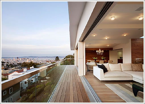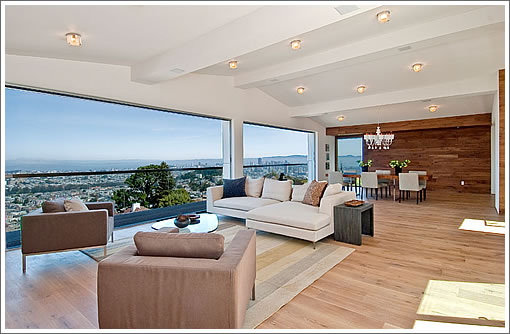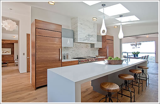
It’s another high-end home that’s not yet listed on the MLS. But as a plugged-in reader notes, the new 140 Saint Germain no longer only exists in renderings, but has been finished, photographed and priced at $5,000,000.

As we wrote about the property in 2008: “It’s truly a fixer, but with the requisite bones, big city views, and two atriums (not to mention decks and parking).”

Yes, it’s been fixed. And according to the architect, it’s now just over 5,700 square feet.
∙ Listing: 140 St. Germain (5/5) – $5,000,000 [140stgermain.com] [Floor Plans]
∙ 140 Saint Germain: Rendered Meat On The Bones And Coming Soon [SocketSite]
∙ A Fixer With Big Views And The Requisite Bones: 140 St. Germain [SocketSite]

I wonder how much this place and others like would be if we didn’t have the fog?
Or am I crazy? And the fog doesn’t matter?
i hope they at least doubled the s.f. because that dog wont hunt.
100 palo alto owner ought to be feeling pretty good now.
Didn’t a redone 46 St. Germain (5/5) sell for $4.2MM fairly recently?
[Editor’s Note: 50 St. Germain closed for $4,200,000 ($778 per square foot) this past September having originally been listed for $4,980,000 that March.]
That real-life living room shot looks better than the earlier rendering.
So…are all the nice lots in the city eventually going to be 5BR+ houses or condos? Sad.
Pretty fantastic. Where do all those glass doors hide?
I’m wondering how the living room looks with the glass doors closed – the way they will be 99% of the time.
I’m also wondering if I like the floor floor continuing up the wall in the master bedroom. I think I do but I don’t think I should.
Glass doors conceal in wall pockets at each end of the living and dining rooms.
Yes, they’re expensive.
@noearch, any guesses on the cost to remodel?
The place looks awesome.
Back in 2008 I said $800k to remodel. Now, in seeing the finished project, I would say in the range of $900k-1.1m. maybe even more.
more than that ^ thats for sure
Seems like better use of space than the place on Duncan, except for that weird desk cove. I’m assuming they did more than the $800K remodel predicted on the old thread?
Love everything……except for all those vessel sinks. Otherwise, pretty perfect. Those sinks just add a bit of cheese factor and seem too contemporary rather than sleek modern, like the rest of the home. I’d still take it and replace the sinks.
54 pictures and not one of the front exterior of the house from the street. Did I miss something?
It’s funny that this house was posted today, because it exemplifies the point that I was making yesterday perfectly.
I personally like this home much better than the “T” house. I think it does a better job of bringing “the outside in” and also a better job of having open space and open visual lines compared to the “T” house.
it’s all due mainly to the placement of the stairs out of the way instead of in the center of the house and the center of the view.
the only thing I might change about this house is the lack of a deeper deck looking over the city. I might have stolen a little interior space on the outside to make a bigger deck.
I love the walls that completely open up.
Gorgeous house IMO, one of the best we’ve seen in a long while.
I love to see a Blair Bradshaw painting featured prominently. He’s great and a great guy.
This is a georgeous house no doubt. Agree with the post about vessel sinks. They leave quite a mess much of the time.
Forgot to mention that the skylights add a great touch too.
I also wonder why they chose not to use wall ovens and opted for a double wide range instead. Even the microwave is under the counter. its not so fun to bend over all the time.You can hide the micro behind a cabinet. All may look cool but not be so user friendly. What do you readers prefer ?
I love to see the Blair Bradshaw as well. Did you see this place?
http://www.7juri.com/
lots of his work.
I’m not sure about the floors — they just look unfinished to me (and they’re unrelenting — even attacking the walls). Also, walking through small closets in the bedrooms to get to the bathrooms seems weird. Other than that — wow!
I don’t see this yet on the MLS web site, and I missed the wine and cheese open last Thur. Any plugged-in reader able to clue us in on the next scheduled open for plebian riff raff to come and drool?
Cool place, not a fan of the area personally though I understand why people like it. But if I’m dropping five bills in SF I’d want to see the bridge and palace.
@Been there, I’ll chime in as a range fan, rather than wall ovens, but I’m not in favor of below-counter microwaves at all.
Scooter – Thanks for the input. Do you prefer the look or function of the range? both? Always wonder what potential buyers value.
One feature of this house that I’d love to see in more places: the enclosed deck. It’s sheltered from the wind and brings in a lot of light. SF can be wonderfully sunny and warm, as long as you stay out of the chilly wind. This interior deck is going to be a great place to be when the wind is whipping around Clarendon Heights on a sunny day.
My only quibble — it seems like the pantry cabinetry is just a tad far from the kitchen work triangle to me. But I defer to MOD on all work triangle issues 😉
I agree that a windbreak can make a huge difference in deck’s livability. The outdoor life is more comfortable without a parka.
But on work triangles I’d re-defer to Ex-SFer. My personal work triangle swaps a trash can for the fridge. Maybe I’m the rare cook who constantly tosses out trimmings and packaging throughout the process. One visit to the fridge is enough.
haha….
work triangle is fine. one of the best ones that I’ve seen in a high end home. no walking around islands or any such nonsense.
good workspace with countertop on each side of the cooking area.
but I agree with you 1000%… gotta have at least a small trash receptacle right by the cooking area to drop ones scraps in!
but I agree with you 1000%… gotta have at least a small trash receptacle right by the cooking area to drop ones scraps in!
Ahem. You drop those scraps in a *compost* receptacle. This is SF, not Chicago!
It’s in contract as of today
So warm, so inviting, so intimate. Haha, not! Looks like a high-end bowling alley. I mean, it’s pretty, okay, I get it. Must be noisier than hell though at a party or with kids running around. If you passed wind in the bedroom, they’d probably hear it in the dining room. Pretty, though.
Joe:
I also live in a place that resembles a “high-end bowling alley” as you put it.
I actually like the flexibility, and ease of cleaning a large hardwood floor area.
Once you fill it with furniture, the echo calms down to normal levels as well. 🙂
Contingencies waived and fully pending today. Industry stats will show 0 DOM
Ahem. You drop those scraps in a *compost* receptacle.
shza is correct.
Those compost bins they provide us with are quite handy. They take little room on the counter when prepping and loading the dishwasher, and store conveniently under the sink the rest of the time.
Per Sunday Chronicle RE Section, there were 3 offers prior to MLS and in contract for over $5million list.