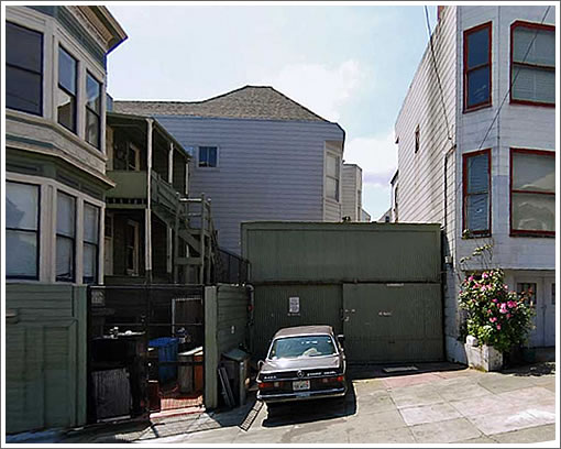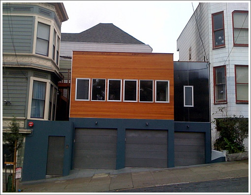
While they still aren’t building any new land in NOPA, that doesn’t mean they’re done building. A bit of new urban infill on Page off Divsiadero by way of a plugged-in tipster:

In the words of our tipster:
It’s a nice urbane dwelling although I would have tweaked a few things. Probably a complicated space to work in, but [hooray] for infusing new into in a very old stretch of Page Street without trying to be historical.
Looks better in person. It pops.
Additional details when we (or you) have them.
∙ Zillow Is A Lot Catchier [SocketSite]
Nice improvement though I’m puzzled that the builder didn’t go for three stories. The context to the right would have allowed for that height.
I’m not loving this one. Pretty plain, bland facade; could have used more articulation, expression. And what’s with the 3 garage doors? Is that necessary?
If that is the front door to the left, it leaves me cold. No special articulation or curb appeal to the entry. Could have done much more with the fenestration. 7 bland windows. boring.
How bout a “green wall” up one side of the facade? And I see NO trees or greening at the sidewalk.
Amazed that planning allowed the new building so damn close to the existing building windows to the left.May have been “allowable” but doesn’t seem very friendly.
Scale of 1-10 for design and neighborliness: I’d give it about a 4.
Yeah, this is totally out of place for D7. How much less perfect could it be?
Its in district 6 not 7
Agree with the tipster on appearance – it does look better in person but I don”t know why.
Mikey: Whoosh.
D5, actually.
And I see NO trees or greening at the sidewalk.
Looks like a new sapling on the far left, in front of the front door.
May have been “allowable” but doesn’t seem very friendly.
Is it “friendly” to make your new neighbor squeeze into a smaller space because you want more of his lot to be empty than the code requires?
Does anyone know the story of how this lot came to be? It looks like they just subdivided the backyard of the home to the left and built a house where the garage used to be.
+1 for loving modern architecture, especially in a historic context so as to emphasize the difference.
+1 again for this not being a great example. I agree with a 4 out of 10.
Looking better in person> What does that really mean? I’m lost on that translation. If ya don’t know why, then how can it really look “better in person”?
@bobn: sorry bob, but IMO one new sapling does not cut it. Could have been more green space next to the front door: cut out the sidewalk, and small vine pockets could have been created adjacent to each of the garage doors. Am I being picky? Yea, you bet I am. SF has way too much sidewalk and not nearly enuf trees and green space.
When I say the side setback is not “very friendly”, what I mean is this: Yes, the code probably only requires the 3′ or 4′ setback, but I’d rather see it be 5′ or 6′. That’s being “friendly” and perhaps more human oriented.
Can’t say I’m particularly impressed with this place, should be taller, I agree there probably should have been more of a set back from those windows, the facade is quite dull, and way too many garage doors, especially for such a small space.
Also, in my opinion this is not NOPA. NOPA stands for North of the Panhandle, and Page is definitely South of the Panhandle. I believe this is one of the Haight neighborhoods, or perhaps Buena Vista.
I agree that
-it’s a shame that they didn’t add any greenery
-it looks odd that this is only 2 stories when the things on either side are 3 stories. really seems like they missed their chance there
-that’s a lot of garage
-the windows seem a little odd.
all that said: I’m glad that they put some infill here. I’d be interested to see more of the place.
at least it looks better than it used to.
@bobn: sorry bob, but IMO one new sapling does not cut it.
You said “NO trees” [your capitalization]. I was just drawing your attention to something you apparently missed. Doesn’t mean I don’t think there could be more. Vine pockets seem like a really good idea to me. I plan on adding some. Ditto with bigger tree wells, though there should be enough room for people to pass each other easily.
That’s being “friendly” and perhaps more human oriented.
It’s not “friendly” to expect your neighbor to give up something you have not given up. That’s the point of having a code, it’s a agreement about how much is enough.
My my, you do love to argue don’t ya bob. From the initial photos I could not tell if that was a new tree or existing. Nonetheless, the front is void of appropriate greenery.
In terms of that side setback, I think the current code is not “friendly” with regard to this project. I would like to have seen the architect adjust the building footprint somewhat at the front to allow for more open space between the new house and the existing property to the left.
That’s what I would have done.
Editors – this is actually SOPA, not NOPA,or mid-Haight if you must.
I walked by the property a couple hours ago, and I am actually underwhelmed by it in person. I find the windows to be less impressive, and the wood is kind of dull when seen up close, not nearly as rich as the photo. The one thing I found better was the siding above the rightmost garage, which changes somewhat depending on the angle you are viewing it from, it seems to have some sort of corrugation that reflects light nicely.
My my, you do love to argue don’t ya bob.
Not, apparently, as much as you do.
3-car garage? SF= steadily destroying its pedestrian streetscape one lot at a time.
This is just simply awful and does a tremendous disservice to modern design. The stained wood facade is such a tired design feature, having been over-employed throughout the city. It can work when done correctly with proper detailing, but looks like a modern tract home when not. This would have been better as a completely accurate Victorian than a badly designed modern home. Sad that we’ll have to look at this building for many years to come.
@ DA: yes, I agree with you, in addition to my previous comments.
Simply a mediocre solution, not to mention the Planning Code allowing 3 garages; Baffles me as to how and why that was allowed.
Does anyone know whether this is actually a separate lot from the larger house to the left? I doubt it. It seems as though this is simply an improved parking structure for the main building – and they threw a rental or perhaps a TIC opportunity into the mix as an after-thought. This doesn’t really seem like true “urban infill” if it’s not a stand-alone lot/property. It’s more like folks building a giant garage.
I’d assume that the triple garage is for the house on the left– which is not to say that it’s a good idea. It is depressing looking at those gloomy bay windows. Would much rather have seen a third story but with a little more respect for the house on the left.
Is it possible that a third story would have required a setback, and by the time you made space for a stairwell, the space you’d loose on the second floor adding in the stairs would be about the same as the space you’d gain on the third floor, which would also need to have space for stairs, and so there was no real way to get more square footage out of another floor?
A spiral stairway would be the only way out of that jam, and those are pretty hard to go up and down.
Thirdly, the light that would be lost in the structure to the right would also have been a negative factor in adding another story.
So I think they may have factored these issues in when electing to only build this as two stories.
Is it possible that the city gave them a little leeway in the other design factors in exchange for limiting it to two stories, so, for example, they got a little extra width out of the second floor that they might not have otherwise had?
This one really does baffle me: how they were able to essentially build out the rear yard of the building to the left. Regardless of whether a garage existed there before or not, the loss of open space and rear yard space is simply poor urban planning (despite what the code may allow).
@tipster: by the way: it’s “lose” not loose.
noearch,
“Amazed that planning allowed the new building so damn close to the existing building windows to the left”
just curious, is the neighboring building’s distance (along with its windows) to the subject lot a criteria for how the subject lot can be built? i thought setback requirements were only based on your proposed building with respect to your property lines, independent of what’s on the neighboring lot. if anything, the neighbor’s windows which are right on the property line do not comply with today’s code requirement, and why should the subject lot be punished for that?
Well, like I said, this one baffles me. We really don’t know the entire story of the lot. It appears to me that it was (at one time) the rear yard open space of the property to the left. So the setback of the new building is defined as a side yard setback, or a rear yard setback for the existing building to the left.
I really don’t know. But I do feel a better solution would have been to set back the new building a few additional feet from those existing windows, regardless of what the code allowed.
I’m betting that the folks that say this is the garage for the building on the left are correct. They either added an apartment above or perhaps an office.
Is that allowed by code?