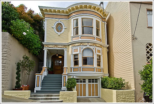
With a recently remodeled modern bath and “extensive seismic retrofitting” (estimated for the purposes of permitting at $94,600) soon after being purchased for $3,350,000 in October 2005, the sale of 2705 Buchanan won’t be apples-to-apples.

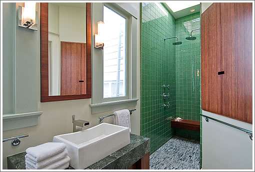
And while we’re not sure we get dual showerheads placed that close together, we are digging the skylight, shower tiles and hardware on that sink.
∙ Listing: 2705 Buchanan (4/3.5) – $3,495,000 [2705buchanan.com] [MLS]

I’m in love. For my taste…this is an excpetional combination of preservation and renovation. I’m sure some of you would prefer more original detailing, but I think it’s gooorrrgeous! One question though…is there ANY backyard?
enough with the neighborhood shots already on these sites, if u dont know the hood you arent gonna buy there anyway…agents look like paparazzi gone bad…dumb shots of people walking out of boutiques
I saw this back in 05… It looks a bit better, but I remember it feeling pretty cramped. 3.5? I don’t know… I’d buy the house on Scott before this one. The location is fine, I guess… It’s right across the street from 2734 that sold for close to 5 earlier this year.
Am I the only one who leaves all his daily stuff out next to the sink?
That’s a dramatic sink but not something I’d want to use every day of my life.
great house
I love love love the round sitting room with that fireplace.
The wood color isn’t quite for me, but I absolutely love this place anyway, and there are 1,000 types of hell for anybody who would paint it.
It has a functional work triangle in the kitchen! Yay!
I personally like the showers close like that. It’s more, uh, romantic. if you are going to shower together, shower TOGETHER! if there is one shower head then one of you is always cold/drying off. IF the heads are far spaced then you have to leave your stream to touch…
I’m at an age where I’d rather just use different bathrooms when we cleanse ourselves but when I was 27… then again, I don’t have that setup… yet!
That “triangle” has decent funtion but it’s not great. The cooktop and sink are right behind each other, seating all around the sink, no counter right at the frig. and the ovens are on the other side of the island. It works becasue it’s not a huge kitchen, but it’s not that good.
And for that kind of money flush the beam in the master bedroom.
Beautiful, not exactly my taste, but still quite nice. I’ve never been in it, so can’t comment on the layout.
That “triangle” has decent funtion but it’s not great.
I don’t disagree with you Sparky. But given the overall level of kitchen design where so many of the work triangles are downright stupid, I’m just pleased as punch to see a triangle that actually functions!
the bar for kitchen design has been set very very low the last 10 years.
Back on at 3.3.
nice job putting in that master bedroom view window. i’m betting that piece of construction had a ROI of over 1000%.