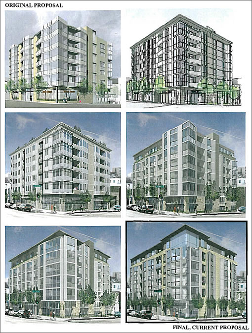
As the proposed Naylor & Chu design for 2559 Van Ness at the corner of Filbert has evolved in a bid for Planning’s approval, some changes have been less visible than others such as reducing the number of proposed parking spaces from 38 to 31 while adding 14 bicycle spaces in the basement.
In the more visible category (and as conditions for approval):
To reduce the perceived mass and bulk of the project and to better relate the building to Surrounding…all facades at the sixth floor – with exception of the proposed corner bay at the intersection and the south side façade – shall be setback a minimum of two feet from the main façade. The finish exterior material at the sixth floor shall be visually distinct from the main façade to further aid in mitigating the mass and bulk of the project.
Clear glazing shall be used on all facades. Mirrored, tinted or frosted/translucent glass shall not be permitted, with the exception of the southern side property line wall where obscure or frosted/translucent glass may be used.
An attractive ground floor commercial space shall be maintained by providing visibility of the commercial interior through clear storefront windows.
With respect to said commercial space, a “tenant has not identified at this time; however, the project sponsor [Tim Brown of Brown & Co.] is contemplating locating his real estate company [there].”
Oh, and “eleven, 24-inch box sized street trees shall be planted” out front.
∙ From Gas Station To Condos And North Beach Library Hearing Tonight [SocketSite]
∙ Fill’er Up (With Condos) At Van Ness And Filbert As Proposed [SocketSite]
god i hate our planning dept.
It looks worse! So provincial
for the love of god, please stop with the pastel yellow…
At least it doesn’t have awnings.
http://www.299valenciastreet.com/index.html
(scream)
Boring, boring, boring, boring. Hey, let’s go with boring.
I think it looks way better with the newer design, although I’d like to see some of the large balconies return. Beholder’s eye and whatnot…
I like the newest design the best. It is better than the first one. I hope it gets approved.
When is the hearing?
I think the latest rendering is also the best. The more substantial roofline helped a lot.
I also like the corner section better in the latest version.
It may just be my own personal perspective, however that top floor does not look like it’s set back only 2 feet… it looks like it’s set back far further.
it’s obvious however that the developer/builder will build right out to the 2 feet 0.0 inches setback limit.
I’m happiest about the TREES! yay!
Butt ugly corner-office-envy design. Looks like a freaking bank.
Though not great design by any means, the original was strongest, then it goes downhill from there. Just proves design by committee (or non-designers) gets you status-quo heavy-handed mediocrity every time.