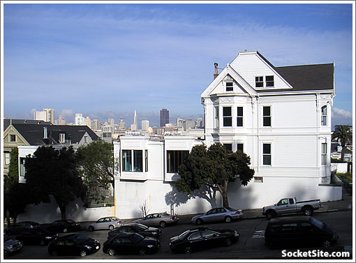
Plugged-in people have known about the project (not to mention the potential) for quite some time, but now we can finally share the plans for three new homes on Steiner below San Francisco’s Historic Postcard Row as proposed.
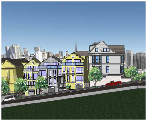
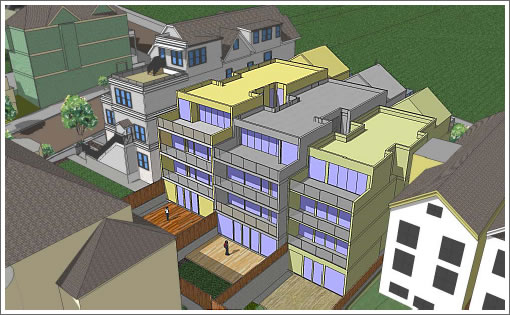
Once again, the project would demolish the non-historic portions to the north of 940 Grove (which would be renovated for single-family use) and build three new four story single-family houses along Steiner (potentially numbers 802, 804 & 808) in place.
The project will be heard by San Francisco’s Architectural Review Committee down at City Hall at 11:30 today. You know where to send your reports (tips@socketsite.com) if you go.
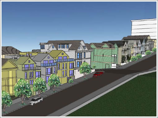
And yes, our dreams for something modern (think San Francisco’s past in the row to the right, it’s future right here) seem to have been dashed.
∙ A Future Postcard Row: Three Houses That Don’t Yet Exist [SocketSite]
∙ Whiter Than The Colgate Mansion (But Not As “Improved”): 940 Grove [SocketSite]
∙ Historic Resource Evaluation Report: 940 Grove Street [sf-planning.org]

What a shame that every bit of open space has to be covered by wall-to-wall buildings.
The City that knows how – well, when it comes to cementing over, building over and generally degrading what little open space is left in the City.
that design is horrid. especially in such a beautiful line of historic buildings.
It’s striking how different the skyline perspectives are between the photograph and the renderings!
Hardly surprising that they raised the buildings in the background, so that it looks like you’d still be able to see the downtown from the park after the new buildings are built.
The reality is that the buildings barely peek over the two story building there now. When it gets replaced by a 4 story building, you won’t see anything.
Seems fine to me. Certainly a better use of space. I do think it would be important to get the facades approved by some historic committee. There is an opportunity here that shouldn’t be wasted to create another landmark. Or a disaster. Creating a landmark-esq row would return an investment. Either way, good luck.
As Alamo Square is right there, this does not seem to be a place that needs additional open space — I am sure these have the 25% yard that is required. And it is not like it is open space now.
As for the design being horrid, it seems to me that the architect is trying to make something that works with the context of a historic neighborhood; If done with appropriate care and detail, these should like fine.
This seems to me to be a logical, properly proportioned in-fill project.
At least there will be lots of street parking.
“This seems to me to be a logical, properly proportioned in-fill project.”
I agree with the above statement. I’m not normally a fan of new buildings that attempt to blend in with faux historical facades, but considering the iconic nature of the site, it seems reasonable.
I disagree with Gil that this is paving over open space. Alamo Square is right there and what is being replaced is an underutilized building. This is “good” infill.
Not to defend a boring design and wasted opportunity, but…
Hardly surprising that they raised the buildings in the background
I suspect the “raised downtown” is just a result of taking the perspective from further up the rather steep slope of that side of Alamo Square.
Like last time when this came up, I disagree with the editors about putting something modern here.
Tourists come to alamo square with the specific purpose of seeing the victorian picturesque buildings. If there is any part of the city where an effort should made to preserve historical/archaic facades, this would be it.
(I still agree the planning commission, in a city-wide context, is too restrictive)
If you want to know what’s really left of the view from SS’s actual picture, draw a line from the bottom of the right house’s roof to the top of the existing house’s rook on the left. Nothing much left, imho.
No big deal, walking up the park 50 feet will bring the view back.
This city is not a museum. New houses are a big plus by all metrics as long as they fit in, and I think they do here.
If you’re going neo-traditional, do it right.
The details could help but the proportions are terrible.
I’m sure the developer will do well with this.
I am pretty sure whomeever developed those before and afters took into account several highrise proposals in the after.
One is on cathedral hill – and the other might be the hospital on van ness.
This is just a rough design, I think. One hopes that they would add some touch of individual personality to each house.I hope they get this right. It’s a terrible place to have a terrible building.
I’m sure the developer will do well with this.
Oh, I don’t know. 7000 sq/ft houses in this ‘hood? The house two doors downhill, a large home with real character, originally listed at $1.495M, appears to have found a buyer, but only after dropping the price (~$1.35M, IIRC).
The existing historical house is great, but with a “backyard” off to side, two floors down from the living area, how much will it get???
The crude MS-Paint quality of renderings indicate that this is just the developer’s trial balloon to gauge the response to the proposed height, density, curb cuts, and massing. Expect to see another round of better renderings later once the neighborhood gets into the process of designing the houses.
When I first saw the renderings I thought it was Liz’s jello version. And then, realizing this wasn’t jello — as I was looking more closely at the renderings I promptly fell asleep at my desk. These houses bore me. The whole square does this so much better — and with magnificence in its day.
Since I’m fixated on something modern for this particular site, it just looks forgettable and like Anyplace, USA that does Vic style townhomes, etc.
ASP would be enhanced with something very different.
The reason these new infill buildings neither look Victorian nor modern comes straight from the Secretary Of The Interior’s office in Washington, D.C. (as successfully lobbied by the A.I.A. & big contractor/developer groups like our local R B A) that, counterintuitively, actually FORBIDS any historic restoration in USA Historic Districts in favor of “post-modern” or “generic” designs. So much for rebellious, “cutting-edge” San Francisco in the 21st Century.
Notice the setback decks at the front of these houses. This is the assinine Planing code requirement to setback above 30 feet no matter the context. If you look at the beautiful Victorians, their form is a flat facade (meaning no setbacks, not that their aren’t bays or ornament) so that the gable end is set at the front of the building. This is just a stupid way to plan – with blanket rules that don’t take into account the neighboring buildings. What a way to screw up a historic site (sight)!
This is just the beginning of the design process.
Rocco: there is no reason in the world that ‘just the beginning of the design process’ should be so architecturally bankrupt – this design is a ham-fisted mash-up of ‘fake historic’ cliche in the front (to please the masses and planning) and bad ‘modern’ in the back. The site and the city deserve far better.