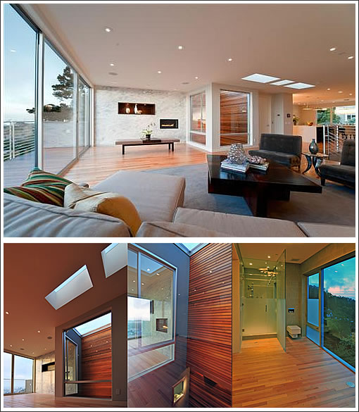
From Kwan Design’s description of “Clarendon House” which we identify as 28 Clarendon:
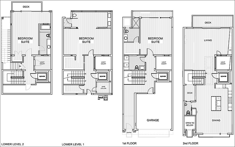
Completed in 2010, this project is a complete renovation of a two story mid-century house situated on a down slope lot. Two levels were added below the existing house with a central staircase and a four story courtyard served to bring natural light deep into the space at every level. The rear four story elevations composed of clear anodized minimalist windows and sliding doors that open to the views along its entire façade.
A glass wall at the entry stair, a small deck next to the kitchen, a courtyard with red cedar siding adjacent to the living room and skylights over the circulation area completes the indoor-outdoor experience at the main entertaining level. The lower three levels are bedroom suites with lounge area and panoramic views to the city.
And by the numbers for the property which just hit the market seeking $4,500,000: 3 bedrooms; 3.75 baths; and 4,537 square feet. Click the floor plan above to enlarge.
∙ Kwan Design Architects: Clarendon House [kdarchitects.com]
∙ The design & construction of the Clarendon house [kdarchitects.com]
∙ Listing: 28 Clarendon (3/3.75) 4,537 sqft – $4,500,000 [MLS] [MAP]

I want to comment on the lower level one bathroom, but I can’t find words to politely describe the bodily functions on display.
Why is there a toilet in the corner? Did they run out of wood or something?
curmudgeon – you’re talking about that little Chamber of Excremeditation with the square toilet ? That’s my favorite feature though I’d have finished the glass differently to provide more modesty as you suggest : opaque from the floor to 3 feet, translucent from 3-5 feet, and then transparent to the top. Then you’d have a home version of a long distance train toilet. All that is left to add is a little peephole at seated eye level in the translucent panel so you can make sure you don’t miss your stop.
This is a nice (and huge !) place and again so far out of my price range that I dare not waste any lust after it. Odd that for such a large place there are only eight photos of it in the MLS listing.
My favorite cognitive dissonance from the listing :
Beds:3 Baths:3 1/2
Year built: 1959
I’m not as concerned about the visuals from the outside as the visuals from the inside…like the partner who wants to brush his teeth at one of the sinks…
I like a LITTLE privacy when I am on my [throne], thank you.
it looks great to me.
innovative and exciting, nice and open. great look.
I’m disappointed by the fact that it’s 4500 sq ft but only 3 BR??? can that be right?
the open toilet is just gross. We unfortunately have a similar situation in our 3rd floor Master Bed/Bath area and we hate it. we never use the toilet up there for anything besides peeing for just that reason. it’s on the “to do” list but since we have other bathrooms we just use those for now.
although I love the look I’m always worried about that exterior wood since I rarely see wood that ages well by my aesthetic. there’s a very modern house that looks something like this near where I live (3 blocks away). At first it looked stunning but now after 2 years many of the boards are fading to an odd pinkish color. it looks terrible.
Hopefully it’ll eventually fade to grey, but the grey wood look doesn’t work with modern homes IMO, it looks great on quaint seaside cottages.
I actually like open baths but this one seems like a waste of space. taking up all that sq. footage and not even having a tub? just a small single shower stall. taking up that much space the thing should have a tub and maybe even a double shower. Or perhaps a few more throwns for conversation
1st on honeydew list: reorient the LL1 bath to closet adjacent wall so the bed can take in the view without seeing partner in the tatty old robe that he refuses to part with, because “you made it for me the first Xmas we were together.”
btw: how dose an elevator get bigger from Flr 1 to Flr 2? And this is better than the fire house at 50 whatever St. with the display window.
“Or perhaps a few more throwns for conversation”
True story, a big old house I shared with six other students in college had just one bathroom. It was fitted with two toilets, each in a cubbyhole facing each other at 90 degrees. You could see each other’s knees, but nothing else. And yes, the arrangement was good for conversation.
And for extra dysfunctionality, the door to one of the bedrooms was on the other side of toilet #2 so when it was in use the occupant of the room was locked in/out.
It is a floorplan feature that I will not attempt to recreate though.
Looks like a great showplace but useless for a family with kids. Where’s the playroom? Are you going to run downstairs to comfort a small child in the middle of the night? Who wants to walk up all those stairs?
A light well lined in medium to dark wood.
hmmm…
Though it is pretty.
Not digging the master bath. Needs a private toilet as noted above, and maybe a tub. Also needs a nice big two-person shower.
I suppose not everyone can afford the life style (nor the price) this house seems to have been designed for. And for that reason it may stir some sour-grape reaction. Understandably, because this property is Architectural Digest quality, seducing to a rather high-end life style not everyone can indulge. It will suit those who are spoiled by the luxury suites at the Leading Hotels of the World.
It is not a common home, and one would inexorably misunderstand it if looking for the ordinary (of which there is plenty available). Architecturally, this house is fashionable and sexy, Space and views are grand with that spa-like feel of the Mandarin Oriental in Miami. The light-well and the invisible division between bedroom and bathroom are certainly an architect’s new-school-of-design vision. A bit ostentatious, indeed, and it would be a pity not to show it off. At the same time, just to wake up to those immense windows over the city every morning, or to have coffee by that Four Seasons-like bar, would make it really difficult to leave for work.
This is the kind of home I (would) love (to have). There are things in life I cannot afford either financially or because of my station in life, such as a Ferrari (asking where I should put a child car-seat does not deserve an answer), but I bow respectfully to beauty, even when not within my reach.
gj Corrado
Oh god, the hoary old “haters are just jealous” chestnut. I usually only hear that from hippies, so props for the eye-opener. It’s perfectly reasonable to critique the design of something the person has no intention of possessing, say, like your preference for one Ferrari model over another (you must merely be jealous of the one you don’t want). However, at the end of the day it remains a fact that Porsche themselves manufactures a car seat for 911 (99x) cars.
P.S. http://store.ferrari.com/en/kids/accessories/car-seats/
Also, how come it takes a dog’s age for comments to post? It’s been happening for quite a few weeks now (at least).
Yeah, I don’t think it’s sour grapes either. I think that most people probably like a lot about this place. It is certainly beautiful in a “published architecture” way. My pet peeves are always when the beauty of design doesn’t match the everyday realities of living…so I seized on my discomfort with one particular toilet. And I certainly stand by that comment. But it’s a matter of taste and personal prefernces on what’s important.
Beautiful house, but WAY overpriced. I can’t see paying 4.5 M for a house that is plastered against its ugly twin. Also, the dreary L-shaped corridor that leads from the entrance to the stairwell on the first floor is not befitting a home in this price range. There are at least 4 other houses for sale in Clarendon Heights that are a better deal.
This property is one of the goofiest I’ve seen in person. The oven might as well be across the street, for use. The buyer who will spend less than 3M won’t be using it.
After 90 days on the market without a sale, the list price for 28 Clarendon has just been reduced $302,000 (7%), now asking $4,198,000.
And 65 Mountain Spring was dropped almost 600K!
After 133 days on the market without a sale, the list price for 28 Clarendon has just been reduced another $200,000 (5%), now asking $3,998,000.
As of Tuesday, 65 Mountain Spring which curmudgeon mentioned above was lowered to $2.775M. It was originally listed in June for $3.95M and has been aggressively cutting, but not enough:
Oct 26, 2010 Price Changed $2,775,000
Sep 30, 2010 Price Changed $2,975,000
Sep 15, 2010 Price Changed $3,275,000
Aug 23, 2010 Price Changed $3,475,000
Aug 09, 2010 Price Changed $3,675,000
Jun 30, 2010 Listed $3,950,000
Another price drop…$3.8mm
As a plugged-in reader noted, after 169 days on the market without a sale, the list price for 28 Clarendon was reduced another $198,000 (5%), now asking $3,800,000.
The asking price for 28 Clarendon has been reduced once again, now asking to $3,498,000, a drop of 22 percent ($1,002,000) below original list.
The list price for 28 Clarendon has just been reduced $500,000 (14%), now asking $2,998,000 (33% below its original ask).
I am going to guess that this cut will do it.
Btw, looks like 65 Mountain Spring dropped off the radar in December and never came back:
http://www.redfin.com/CA/San-Francisco/65-Mountain-Spring-Ave-94114/home/673068
I’d agree that should get some attention.
@sfrenegade, 65 Mountain Spring is this year’s Dream House – https://socketsite.com/archives/2011/03/the_2011_san_francisco_dream_house_is65_mountain_spring.html
Thanks fixthis, I had completely forgotten. I even commented on that thread too.
65 mtn spring was sold for 2.4m while owner was in the process of refinancing
The list price for 28 Clarendon has just been reduced $148,000 (5%), now asking $2,850,000. Once again, originally listed for $4,500,000 in June of 2010.
From asking nearly $1000 psft to $628. Even diemos thought it would stop at $661.
I doubt this is what they had in mind when they started the rehab.
My realtor told me that these guys will still make plenty of money. The initial purchase was only 1.6, and the reno probably didn’t cost more than $50/sq ft so maybe 250k at the most. That looks like a cool million in profit as long as it sells for the current asking! Ka-ching!!
oh really, did your agent tell you that. What else did your made up agent tell you?
El Bombero,
Do me a favor and ask your agent which contractor did the reno for $50/sq ft. I’d like to reno my entire 2,000 sq ft home just like 28 Clarendon for only 100k. Ask your realtor what he sees when he looks in the mirror. Better yet – keep talking to yourself like sparky-b says!
Wow, all you guys need to quit spending your time commenting on blogs and start applying to architecture school. Bunch of geniuses around here.
^Yeah? July 1 @ 740 nailed it, seems like.