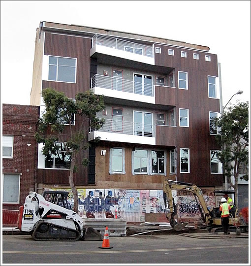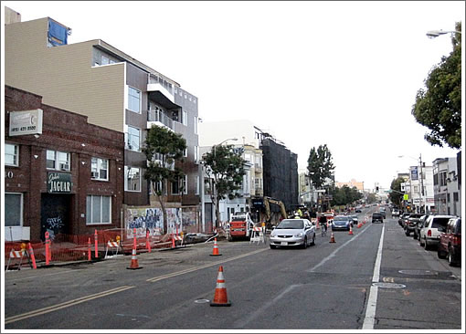
A plugged-in tipster photographs and reports: “726 736 Valencia is nearly done. Supposedly housing for next door auto repair shop’s employees. Nice brown wood. 700 Valencia (at 18th) is still in it’s black covers.” And so can you (tips@socketsite.com).

∙ 700 Valencia: Topped Off And Filling Out [SocketSite]
∙ 700 Valencia Street: The Details And Designs For Moving Forward [SocketSite]

Supposedly housing for next door auto repair shop’s employees.
What?
Story sounds a bit fishy. Exactly what is the deal with this being for neighboring workers?
Otherwise another bleak structure. They couldn’t think of a better way to integrate a front terrace/balcony into the facade?
What really hurts is the blank wall effect on the side of the building. What is the deal with this? Is it strictly because of a “fireline” rule? If you think about it, this really restricts interior designs on these structures as the windows are all in the front or back.
Maybe they can get some boys from the hood to paint a mural on the side wall. Anything would be an improvement.
There are code and fire safety issues regarding the blank property line walls..The code will allow some windows on the property line, if they meet the allowable area requirements (sizes of windows). they usually need to be fire rated glass (expensive), fire sprinklers are required sometimes both inside and outside above the windows..the real issue is that if the neighborhing property decides to build up the allowable height, those adjacent property line windows have to be closed off..
That’s why the blank walls largely exist.
Windows are not allowed on side windows on the property line. This is not only a fire code issue– the neighbors might want to build to the same height in the future, which would block any side windows on the property line.
The most important part of this building’s connection to the neighborhood is the ground-level retail. I’ll reserve judgment on the building until I walk by and see how it connects to street, after retail goes in.
The people who own the auto shop also own and developed this site. Perhaps they are planning to live there. It’s probably unlikely that they developed this site for random employees working at their auto shop. How many units are in the building?
I happy to see some more infill along Valencia but, wow, that is an ugly building. How about a living wall to the south? Anything, please.
I live right around the block from this place and walk by it frequently. Personally, I think it looks great. But I’m worried that before long the wood will look faded and not so pretty. Best neighborhood to live in SF…. although I may be a bit biased.
I like the building too..fresh, modern design, not stark and soul-less like a Saitowitz…I think the wood will hold up well…if they applied the right sealants to it..
Valencia is a pretty cool ‘hood..up and coming..but, ah….Noe is not so bad either..just saying.:)
I think it looks fantastic for its price point. The balconies and dark wood are a very nice and unusual contrast compared to the standard banana/mango stucco with painted steel tube railings typical at this price point in the Mission, or almost anywhere. This isn’t a Julia Morgan or Stanley Saitowitz budget here, people.
As to the revelations about “front and back windows only”, and “living walls”… I think perhaps SS should organize a field trip for folks down to the DBI for a “building codes in SF, for beginners unfamiliar with the city” lecture.
Wonder how nice this will look when the wood turns gray.
good point Kurt Brown..yea, the codes are very complicated and layered with many exceptions, conditions and “only in SF rules”…I like to think I know the codes pretty well..but I always have to end up with face to face interpretations down at the dreadful DBI..
I like the balconies and wood also.
I’ll write the marketing:
Wake up, go out your door and to the right is Ritual Roasters, out your door and to the left is Four Barrel. It doesn’t get much better than that!
Oy, don’t get me going on the cast iron waste line requirement — I’ll be sucking down the Valium in short order.
Sometimes I felt that I spent so much time at the DBI that I picked up an Irish accent.
On the subject of wood…and hijacking this thread a little bit…I’ve noticed that the beautiful yellowish blond wood on several dwell-ish residences built over the past couple of years has faded out to a very dishwatery natural. (I noticed it particularly in the quite striking house at the foot of Beaver in the Castro). In my opinion not nearly as handsome as the look when new, and kindof fulfilling my fears that the look would be either very difficult or impossible to maintain.
yea, really depends a lot on the wood species, how it was installed..and the finishing/sealer used…hard to tell here without knowing those facts.
curmudgeon – the wood can be treated/stained after it is in place and this will preserve the color and prevent fading to gray.
We put up a redwood fence 4 years ago and immediately stained it. II has retained its original look despite the fact I live in pneumonia gulch.
However, the vast majority of folks in my area who put in nice fences don’t treat or stain them. They look good for a year but then deteriorate to that grayish look. Even redwood fades though it will retain its look longer than cedar.
well, ok..
but if we’re talking fences, cedar is a better material than redwood..more durable, not as soft, weathers better..and is not as expensive.
but as to this facade, it’s not redwood..probably clear heart douglas fir, vertical grained..could even be a sustainable wood such as Ipe, or garapa..maybe someone knows..
looks awesome. those decks are only truly useful in the mission (and potrero)
^ but even assuming you’re knowledgeable (or more likely, get lucky) and score durable wood, have it installed well, and stained/sealed properly, you still need to MAINTAIN that every year or maybe two years. That sounds like a royal pain in the arse to me. Almost like painting your exterior every year- yikes! (and definitely a no-no for rental props.)
well…ok……..if I relied on “getting lucky”, I’d be out of business and probably sued, in about a month..
the world of knowledge is at your fingertips…right on the http://www..🙂
I have a beautiful cedar fence already 4 years old…sealed it just once..it’s weathering beautifully to a silver grey…which is what I wanted.
As the permit consultant for 736 Valencia – thanks for the comments and the questions. I’ll try and answer as best I can.
The wood is ipe – an environmentally responsible choice for a building where green design is a high priority. it was triple stained and sealed prior to installation, with one more seal coat in a year the finish should be stable for 5 to 7 years.
The project is currently delayed by a “Request for Discretionary Review” before the Planning Commission filed by Sue Hestor for the Mission Anti-displacement Coalition. (thanks for keeping housing expensive Sue!)
There are eight units in the building two of which are intended for use of the developer/auto repair shop owner’s employees who work next-door.
the project architect is Ed Panasci, who took over a botched project and developed a lot of attractive and workable solutions for what I think is a great building for the site.
the south blank wall IS a problem and we are discussing possible solutions – if anyone would like to e-mail well thought out suggestions to me you can be sure they will assist our process greatly: info@quickdrawsf.com
[Editor’s Note: Cheers!]
@jeremy: Thank you for that update and additional info. much appreciated. I had a feeling the wood was Ipe; looks very nice and nice to see more green products being used on housing in SF.
I think the project is a handsome addition to the Valencia corridor.
I guess I dont see the south wall (or the north wall) that much of a problem. Isnt is possible that the adjacent properties could build up against the subject property in the future?
Thanks for the facts Jeremy. On ipe being an environmentally responsible wood, I’ve heard allegations that the non-FSC stuff is poached from the Brazsilian rainforest and the FSC stuff is both expensive and possibly hard to really certify.
But on the flipside ipe is really durable. Using redwood, cedar, or red fir would need more frequent replacement. So maybe even poached ipe is better for the environment.
opinions ?
also, what did you use for a sealer ?
noearch- i was talking about the facade, not your fence. a fence becoming rustic is fine- my old redwood fence aged to a nice gray too. but, for instance, the exposed siding of my neighbors house is an ugly-ass gray, with rusty nails/drip marks to boot.
i am on valencia on a regular basis, so i’ll be curious to see if that facade looks okay a few years from now. i like the wood look too, and only hope it can ‘age gracefully’, for i’d like to consider adding wood exterior as accents on one of my buildings in the future.
Jeremey–How is it that a discretionary review can be filed and hold up the project at this late date, when construction is nearly complete? What could they possibly want review of . . . and hope to change?
The ~2 years-old “green” building at 3280 22nd (b/t Valencia and Bartlett, noted on socketsite here, https://socketsite.com/archives/2007/07/going_green_in_the_mission_3280_22nd_street_prices_and.html) features recycled wood cladding that has faded substantially, but I quite like the patina. Who knows how it’ll look in a few more years.
Hi Observant Neighbor… Jeremy from Quickdraw Permit Consulting (www.quickdrawsf.com) here. The DR is about a permit application filed for creation of new access for the disabled & new secondary egress from the roofdeck.
If you have more specific questions about this project please email me at info@quickdrawsf.com
http://sfhaps.tumblr.com/post/270895644/700-valencia-18th
The pic from the link above of 700 Valencia makes me appreciate 736 Valencia even more.
700 Valencia really looks nondescript.
Oy vey, 700 Valencia is fugly! Auto mechanic dudes bldg beats it hands down.
Btw, for those still reading that care about the new, trendy wood facades, I also noticed the facade at 3280 22nd st is not aging well, IMO. The sleek and modern glass/stainless windows clash with the rustic wood, IMO. So there’s an example of what needs to be avoided. But can it?
@Jeremy Paul: Thanks for the update; I am sorry to hear that you got a DR filed on you. As usual MAC is serving only to obstruct. I am involved with a neighborhood association, and we were concerned about the new permit. But someone involved with the project explained it to us, and it was clear that the changes are a complete non-issue. It is unfortunate that MAC is deciding to make an issue out of this — unfortunately, their goal is quite literally to keep the Mission crappy. They have no interest in anything that would actually make the neighborhood a better place to live.
Please do work on that south wall and I hope you are right about the wood holding up. In any case, this is much nicer than the project at 700 Valencia.
I disagree about that south wall..much ado about nothing…the adjacent property could, in the future, build up against that south wall..leave the wall as is…there are plenty of already discussed code issues as to why the wall is blank.
I’m interested to hear what Jeremy Paul has to say about that issue, or from the architect as well…thanks.
@noearch: You are right that the building next door could cover that wall at some point, but right now the wall is quite prominent and ugly. I understand the code issues that limit what they could do — but there has got to be a better solution than just a big, ugly, blank wall.
Wrt wall. How about a mural? Not so expensive and if neighbor builds up, oh well.
I’d suggest a more contemporary mural a la the ‘mission school’ artist variety. A little bit of grafiti/stick figures, a little rainbow colors abstraction, mixed with some post modern slackerism as best done by mission hipster types (chris johanson ru listening!). Well he’d be too expensive, but there are others of his ilk locally.
Why don’t you put a big billboard on the side of the wall as an advert for PETA or To Keep New School Alive!
On another note, I find that aged ipe (silvery grey color) looks nicer then glossy stained/uv inhibited ipe. Plus, ipe doesn’t take in stain easily since it’s such a dense wood so the areas of the wood that pick up the most sunshine (higher up on the wall) will fade the quickest and the lower areas will hold the stain for longer.
Agreed. This is far better than 700 – which is ugly, generic, and doesn’t look like some place that people would live. However, the empty wall on the side looks strange.
Are the people who are going to be living here aware of the history of the ground the building is built on? This site – and the auto building next door – is the very site where the famous Valencia Hotel fell in 1906. There is still a horse shoe hanging in the auto shop that was found in that rubble. Much of the Mission is built on swamp land, but this spot took the hardest hit. I know that buildings are supposedly up to code these days, but with history being what it was, I would think anyone afraid of earthquakes would have good reason not to want to live in this condo!