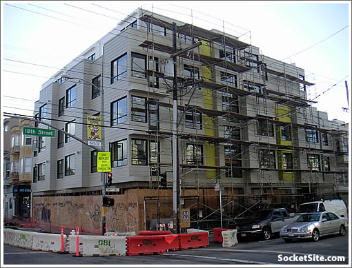
On the heels of exposing 736 Valencia, the scaffolding around 700 Valencia comes down.
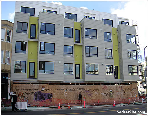
Most of the Juliette balconies didn’t make the original design cut.
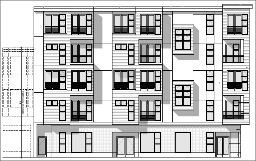
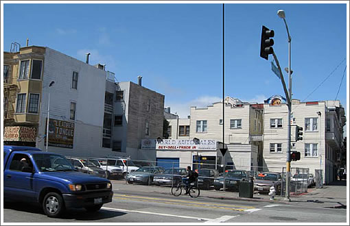
Nine units, nine parking spaces and ground floor retail. And as the corner looked before:
∙ 736 Valencia Exposed (700 Valencia Still Under Wraps) [SocketSite]
∙ 700 Valencia Street: The Details And Designs For Moving Forward [SocketSite]
∙ 700 Valencia: Topped Off And Filling Out [SocketSite]

Oh boy – more glorious trailer-park-meets-lego-land box condos! Such beautiful architecture in this town, indeed. I swear if it weren’t for the rolling hills, bridges and palace of fine arts this town would be just another boring architectural specimen in CA.
Looks very LA.
Not “necessarily” a bad thing, but it does.
Venty!
wow, I almost prefer the “before”.
“Oh boy – more glorious trailer-park-meets-lego-land box condos! Such beautiful architecture in this town, indeed. I swear if it weren’t for the rolling hills, bridges and palace of fine arts this town would be just another boring architectural specimen in CA.”
ITA.
The physical terrain is beautiful. The architecture generally awful. Lego-land with the de rigeur box bay windows. Flat roofline. Built to the sidewalk line with a couple spindly tress (I assume a tree or two will be planed) going for greenery.
Basically another boring box.
Gil, this looks like every newer building in Belltown, Seattle. Your selective criticism is kind of funny.
“Gil, this looks like every newer building in Belltown, Seattle. Your selective criticism is kind of funny.”
Actually that is not true.
But let’s take you point and say it is true.
Because another city is doing mediocre architecture, SF should also?
No need to strive for good architecture in SF? Is that what you are arguing?
“Because another city is doing mediocre architecture, SF should also?
No need to strive for good architecture in SF? Is that what you are arguing?”
No Gil, they just think that San Francico architecture is perfect and beyond any critical judgement. Sounds sort of like certain followers of Sarah Palin. My favorite thing is watching if someone brings up Chicago, they bring up its southside slum, or New York, they bring up the Bronx. Why not Michigan Avenue or Manhattan?
Not every building will or even should be an architectural masterpiece.
Well, if the developers did not have to spend so much time and money fighting asinine anti housing activist like MAC, etc. perhaps they’d have more money and resources for architecture. Both this bldg and nearby 736 Valencia got dragged through the mud for years before getting permits to build. And after all that time, concessions and last minute ‘springing fees’ I’m sure the developers attitude was just let’s build this f*ckin’ thing as quickly as possible.
I walked by on Saturday and the building is inoffensive at best. The black window frames do the design no favors either. I am however bullish on the area. The Valencia Corridor is benefiting from the “Noe effect” as more affluent people move in.
This is pretty awful — very bulky and ungainly. The original plan with balconies had a much better less oppressive facade. Plus the window frames, planking, and colors, all make this look cheap.
Boring, but better than what was there before. The Mission could use more condos, as most multi-unit dwellings in this neighborhood seem to be TICs.
That’s really… special. Kind of, Ikeaville.
At least a few of the windows open.
I didn’t say I liked it. I just think Gil is a funny sort of hater. That’s all.
My favorite thing is watching if someone brings up Chicago, they bring up its southside slum, or New York, they bring up the Bronx. Why not Michigan Avenue or Manhattan?
My favorite thing is that in every thread only the BEST parts of Chicago and New York are brought up, and then it is implied that those are the only parts of those cities that exist. Why should every development in SF be compared to only the best areas of NYC and Chicago? Why not compare the south side of Chicago to Pacific Heights? Why not compare Manhattan to the Bayview? Because it doesn’t make any sense. Compare like areas to like areas or the whole banana to the whole banana, don’t cherry pick the good from elsewhere to compare to the crappy here.
“The Valencia Corridor is benefiting from the “Noe effect” as more affluent people move in. ”
Valencia is great. Its tied for my favorite hood next to Hayes Valley. That being said, the architecture is still second rate. That being said, most 10+ unit projects being built in less than ultra-prime areas are second rate these days anyway. This is probably as good as we can expect unfortunately!
Most people dont have a clue as what it really costs to build in San Francisco. This building, while not a “world class” piece of architecture, perhaps, I dont feel it is bad, or unsuccessful..it’s going to offer much needed infill housing, probably at reasonable cost to own or rent.
It’s modern in expression, simple, restrained, and yes fairly economical to build..we cannot expect every project in The City to be high end in materials and design. just isn’t gonna happen.
It looks like the developer was forced to step back the top floor on appeal, and in the redesign took the opportunity to cut costs, removing any visual interest from the building.
It bears some resemblance to Valencia Gardens, but 700 Valencia looks cheaper, with less style. These condos no doubt will be expensive, so it would have made sense to at least use better windows and siding to project a sense of quality to buyers that will be asked to shell out top dollar.
Compare like areas to like areas or the whole banana to the whole banana, don’t cherry pick the good from elsewhere to compare to the crappy here.
interestingly, I think some people tend to compare SF to the best of Chicago, and others the worst of Chicago, depending on their point of view or point they’re trying to make.
I’ll say one thing about architecture in general in Chicago vs SF that I think most would agree with: it is easier to build things in Chicago. Thus, people tend to swing for the fences more often. Since they’re swinging hard, they have the potential for more home runs. But also the potential for more strikeouts.
But SF RE is hostage to a lot of rules and design by committee etc, and thus the design tends to be far far safer. Thus: less home runs and perhaps also less strikeouts.
I personally think that SF got so restrictive that they have far far less home runs, and the lower number of strikeouts doesn’t make up for it. but that’s just me. I’m ok with a strikeout here and there.
but you’re simply not going to see a tower like the Chicago Spire ever proposed for SF. and you may not see as many Harold Washington Libraries either (considered by many to be one of the ugliest buildings ever built).
so what type of person are you?
do you like to play it safe?
or do you like a few winners interspersed with losers?
SF is typically pretty safe architecture.
Chicago is not always so.
all of course IMO
Anybody have a guess about how these units will be priced? This is really a great location and in walking distance to some of the best restaurants in the city, Bi-Rite, Tartine and Dolores Park. I bet they will be pretty expensive but I think they will also be a pretty good investment as Valenica Corridor will only get better in the next couple of years. The work on Valencia Street to make it more pedestrian friendly is progressing, albeit at a snail’s pace.
Belltown Seattle:
http://www.findingseattlerealestate.com/neighborhood/images/belltown-seattle-pictures/images/belltown-seattle_22.jpg
http://www.findseattleonline.com/Images/belltown-photo-gallery/images/Belltown-Washington-Re0028.jpg
http://www.findingseattlerealestate.com/neighborhood/images/belltown-seattle-pictures/images/belltown-seattle_6.jpg
http://www.findingseattlerealestate.com/neighborhood/images/belltown-seattle-pictures/images/belltown-seattle_10.jpg
http://www.findingseattlerealestate.com/neighborhood/images/belltown-seattle-pictures/images/belltown-seattle_13.jpg
http://www.findingseattlerealestate.com/neighborhood/images/belltown-seattle-pictures/images/belltown-seattle_27.jpg
^Remarkably bold architecture! Amazing! Why can’t we get some of that good stuff in SF?!?!
NVJ:
i think you bring up a good point. Most of the cities are looking and feeling more and more similar.
Construction styles have been nationalized. Planning has been nationalized to a certain extent. Even tastes and things to do are nationalizing.
When I left SF I remember that there were a lot of things unique to SF that couldn’t be found elsewhere. Over the last 1-2 decades that has really changed.
as example: seafood restaurants. in the past you could only get good seafood on the coasts. Now they fly it fresh every morning to the midwest. It used to be that you could only get good Mexican in the Southwest and parts of CA. That has changed now too. Same with asian foods. And even some of the arts.
in the end, the access to internet, increased transportation (of goods/people), and larger chains has lessened (but not obliterated) the regionality of our United States.
And some of that is seen in the architecture. At one time you saw Victorians in SF, Brownstones in NYC and Chicago, Prairie homes in Minneapolis, Mid-century in Palm Springs, and Adobe homes in the southwest. That seems to be changing more, for better and worse.
So now Belltown resembles the Pearl District (Portland) and South Beach in SF and Gaslamp district in San Diego and the West loop in Chicago and so on.
The architecture is bland & boring, but what makes it truly awful are the colors.
I rarely see such a “spot on” comment in this “sea” of usual BS……but 45yo hipster couldn’t have said it better – yet no one here seems to get it, perhaps with the exception of noearch – anyone care to respond directly to his post?
[Editor’s Note: Two past perspectives: What’s/Who’s To Blame For “Bad” Building Design In SF? and Damn That Planning Department To Hell! Oh, Wait A Minute….]
stumped–
Ok, I’ll bite. First, the cheapifying (or value engineering, if you prefer) of 700 Valencia is almost certainly due to the fall in the market for condos. Props to the developer for accepting reality. Also, this is done yet–perhaps the roofdeck railings or the streetlevel retail will add a bit of visual interest, though the line drawing doesn’t give me much hope.
Noearch put out a straw man asserting there is no middle ground between this econobox and “high end materials and design”. I’ll put out my assertion that one could build econoboxes that don’t look bland and bleak. For instance, if it is to be stucco-clad, hire some local artist (if any haven’t left for Oakland) to score a design in the wet stucco with a stick. The above building could have had its beige siding ameliorated with a few horizontal stripes of a different color siding. Put in roof edge planters with low maintenance mid-height plants, and deed the requirement for their existence. Stick a freaking gargoyle on each corner and call it an homage to Gaudi.
The point is, there have to be cost-effective ways to add some human-level detail to what is otherwise a contemporary Richmond Special. And yes, anyone doing the above will be mocked for doing something mildly different. But many others will appreciate and enjoy something a bit better than the lowest common denominator.
Sorry delancey: I dont buy anything you’re suggesting..You are starting to play “designer” or architect now without really addressing the issues of actual building costs. I still assert that this building is “modern, simple and restrained” in its architecture..That is not a bad thing..Your suggestions are about merely applying non-nonsensical decoration to a facade…that’s not what good design is about..it’s very easy to play armchair architect here, offered in this forum.
The building is really very clean design, with windows aligned and offering some variety in the actual fenestration. It appears there will be small balconies located at each exterior french door.. I would say the ground floor facade will become “humanized and enlivened” once retail tenants move in..Again, an appropriate and decent building for the very low budget.
Some new buildings in The City perform very well as backdrop architecture to an otherwise already richly varied and lively street scene. This building, I feel, is one of them.
Noe, I don’t disagree much with your statement, and my suggestions for moderating the bleak and bland are somewhat tongue in cheek (though I wish some building besides the Academy of Art mothership would incorporate the odd gargoyle–they’re cheap!). And I’ll agree the above building could be significantly worse and that it isn’t finished yet (omitted a “not” in my prior post).
But, I will play armchair architect/exterior designer for as long as I have to look at bland new construction on a daily basis. I’m acknowledging cost constraints that restrict the architecture to right angles and large color swatches; that is why I suggest superficial humanizing of the facades and rooflines. Such minor decoration goes a long way towards breaking up the bland bulk of these denser infill residences, needed as they are.
Perhaps you can educate me on the street level retail in new construction–why is it always tucked in under an overhang, instead of being emphasized, celebrated?
Most Socketsite commenters are bitchy and adversarial. (God knows, I’ve been one.) I admire those of you who adopt an earnest or constructive or positive tone here.
The balconies will be added as per the drawing. Those tall windows on the yellow part of the building are doors — currently to nowhere, but they will be balcony access.
^^ I agree. Every once in a while there are very good, constructive, informative dialogues on here. Lately it seems those are few and far between.
I’m actually in the industry – work for a RE developer her in the City – and so theoretically am “plugged in”. Seems like the majority that comment on this site work in totally unrelated industries but somehow feel “plugged in” enough to comment here.
I wonder if there are legal, medical, accounting etc blogs where I could go on there and start commenting about things I have no idea about.
FWIW – I think this new building is a fine “modernish” addition to the Mission. Fairly clean, decent design. The wood siding gives it a more residential feel. Compared with some dusty drafty victorian with poor sound transmission etc, I’d live in these any day.
[Editor’s Note: Please feel free to lead by example. Regardless, thank you for plugging in. Cheers.]
yes…read back on a few of my comments: this IS a fresh, modern, clean design….done with a modest budget..
and yes, as I previously mentioned: those french doors will lead to a small balcony.
good project, good infill for the Valencia corridor.
It could have looked a lot worse. I’m grateful for anything on the gradient of not hideous > beautiful. We have way more hideous than this popping up, and often with hideous souls inside to match.
No Gil, they just think that San Francico architecture is perfect and beyond any critical judgement. Sounds sort of like certain followers of Sarah Palin. My favorite thing is watching if someone brings up Chicago, they bring up its southside slum, or New York, they bring up the Bronx. Why not Michigan Avenue or Manhattan
Hahhahah. Palin follower. Whatever. The Southside of Chicago probably has more residents than San Francisco. It’s absolutely fair game when all the Up With Chicago folks start yapping about how great Chicago is. And I like Chicago.
OK, I take back everything bad I said about 700 Valencia St. OK, well, I did say on one thread that I wanted to wait to pass judgment until I saw what was going in on the ground floor. Jon Darsky, the pizzaiolo for Flour+Water, apparently is opening up his new pizzeria (in conjunction with Farina) on the ground floor of 700 Valencia.
http://sanfrancisco.grubstreet.com/2010/02/new_farina_pizzeria_coming_to.html
I’d live there just to be able to go downstairs in my pajamas to pick up one of Darsky’s pies.
(Well, at least there will be a Farina pizza restaurant there– the part about Jon Darsky’s involvement seems unsubstantiated so far.)