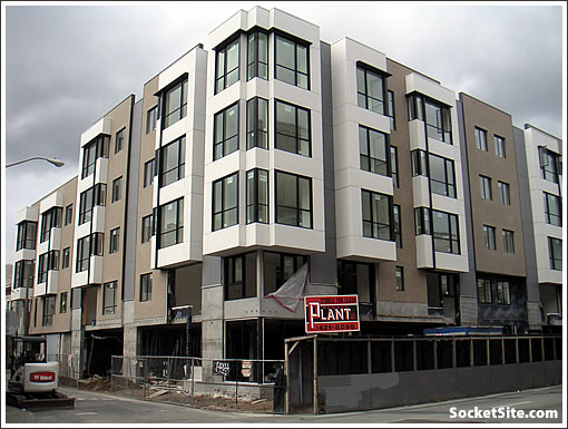
231 Franklin, the mixed-use development (32 residential condos over 6,000+ square feet of retail and 36 parking spaces) at the corner of Hayes has started to strip its scaffolding. They’re hoping to be construction complete by the middle of February.
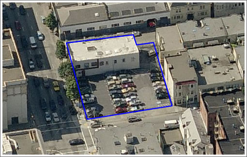
Once again, what was there before:

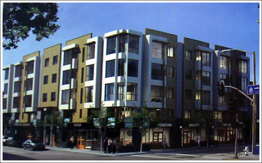
And the pre-reality rendering with hints of retail to be:

UPDATE: By “hints of retail to be” we weren’t being literal in terms of the types of stores, but a plugged-in reader hints at the scoop:
That hint in the rendering for a gallery/furniture store is a bad hint. According to my sources, a “well known” restaurant operator was in negotiation to take the space, and design changes were being made to place the entry in the corner.
Now come on, spill the beans. Or throw us a bone. (Or something else food related.)
∙ Okay, So Maybe Not So Soon For The Corner Of Hayes And Franklin [SocketSite]
∙ 32 Condos Coming “Soon” To The Corner Of Hayes And Franklin [SocketSite]
U.G.L.Y. You ain’t got no alibi. You Fugly, You Fugly, yeaaaaaaa, you Fugly.
It’s clean and crisp. I think it looks fine. Why does everyone expect an architectural tour de force with every condo building. I would like to see some examples of condo buildings people actually like. And better than a parking lot. Thank goodness it looks like it has ground floor retail.
can this be considered for ugliest development of 2009, or does it come in too late so it has to be in the 2010 category?
Michael E-
There is a difference between a tour de force, something stylish, and something boring and uninspired. This place is dull and cheap looking. It takes the boxy look of many modern condo buildings and takes it to a mundane extreme without any points of visual interest. And white on taupe? Really?
I suppose it’s better than a cacophonous mismatch of styles like some of the places we see on the site. The only damning thing you can say is no one will notice this place.
It’s not going to look great at that corner, since the next block of hayes is all preserved victorians.
As an aside, anyone know if any of those windows can open? If so, how? They don’t look double hung, but if they slide, which panel is it?
they are probably casement windows.
I agree that it’s ugly, and I think that “jog” right at the corner really weakens it.
That hint in the rendering for a gallery/furniture store is a bad hint. According to my sources, a “well known” restaurant operator was in negotiation to take the space, and design changes were being made to place the entry in the corner.
Wow, what a banal building. I bet it’s Heller Manus again, actually this would be a good HM project if so, lol.
It would look better with more interesting colors…from the pictures it looks like the usual dark beige and light beige color palette that seems to be so popular in San Francisco new construction.
Yes, it is not ground-breaking architecture, but this turned out really nice. It is understated and fits in well; a welcome addition to the neighborhood.
the beige is a brick veneer.
“The Grove” is going into the retail. I think the building is ok but I think they had a unique opportunity to do something special.
Website for the building…
http://lindenhayessf.com/main.html