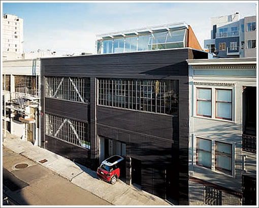
On San Francisco’s AIA Home Tour in 2007.
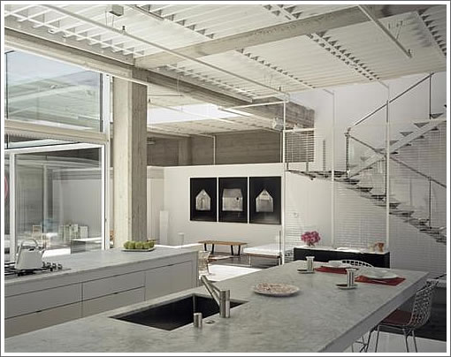
On the cover and inside Metropolitan Home in 2008.
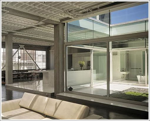
And now on the market and asking $4,128,000 in 2009, it’s the Fougeron Architecture designed “Tehama Grasshopper” otherwise know as 431 Tehama #2.
San Francisco real estate tips, trends and the local scoop: "Plug In" to SocketSite™


On San Francisco’s AIA Home Tour in 2007.

On the cover and inside Metropolitan Home in 2008.

And now on the market and asking $4,128,000 in 2009, it’s the Fougeron Architecture designed “Tehama Grasshopper” otherwise know as 431 Tehama #2.
Besides the price drop, did the Sq. Ft also mysteriously drop ?
The Metropolitan Home magazine link says
whereas the MLS listing says
It is an 8500 sq ft warehouse, but the residence is only 5000 sq feet (second and third floors). The bottom floor of the warehouse is the garage and includes Fugeron’s studio – or – at least it used to. She used to lease it from them.
Very nice architectural project.
Some people , maybe just a few, will love it.
But you cannot get $ 4 MIL this location betw 5th and 6th.
Count me among the few. Quite possibly the best space I’ve ever seen here. Remarkable.
Someone was wondering how much that $2M Oakland loft would go for in S.F.
This is one answer.
Sure, there are plenty of differences besides the city they are in. I’d say the design on this loft is several cuts above. But there are some parallels between the locations.
What’s unit #1? Is it the office space?
[Editor’s Note: Correct.]
The Metropolitan Home article made no mention of the perpetual smell of urine on that particular block of Tehama.
It’s some of the best-smelling urine in SOMA.
Not as acrid as 7th and Howard, nor as pungent as Third and Brannan. I think they eat a lot of organic asparagus.
Try to take a shower or use the toilet in the master bathroom. Unless it is electric glass that can go foggy by using a switch, people around you can see into your business! I believe it doesn’t have any window treatments to block anything….. In essence, the master bedroom is a glass box. If that’s your cup of tea, then you’ll love it here. This place is kinda Sanaa-esque.
kee-rist adam! stop scooping me!
I will predict the sale price of $2.8M. My final answer!
Whoever pays $4m for this is probably chairman of the board of the Association to Keep Northern San Francisco “affordable.”
For all those who’ve always wondered what it would be like to live in a cheap glass display case…
I’m surprised people like this loft more than that Oakland loft. It’s drab and grey and depressing to me. It’s very East German bomb shelter circa 1955. Maybe if some walls got some color? (that’d probably ruin the ascetic feel?)
I’m guessing people love it because it’s more “pure”?
I think that the Oakland loft would go for far more than this would (if the Oakland loft were in SF) because it reaches a wider audience. This loft is clearly very specifically made for a very very small demographic.
(single person or couple without children with lots of money who want to live in a gritty neighborhood and want a loft with an ascetic style).
Ive been to this Loft as part of the AIA tour and although its got some great detailing, there is something incredibly boutiqe like and sterile about it. The master bedroom/ bath at the uppermost leve- part of the “grass hopper” is a glass box about 20′ from some SOMA condos. Yep, the lower leve is Fogugeron’s office.
I cant believe somebody would pay that kind of money to live here. Something for everyone I guess.
It’s one thing to buy an Eames lounge chair knockoff and Tweet about how “modern” you are. It’s quite another to actually embrace modernism. It is absolutely not for most people.
The people who live(d) here did so with a kid.
… and it seems an East German bomb shelter would be Brutalist (which this isn’t), primarily made of concrete (again, no) and rather dark (a bit of light in here).
“It’s one thing to buy an Eames lounge chair knockoff and Tweet about how “modern” you are”
Actually, that’s quite enough for me (apart from the tweeting), if this is “embracing modernism” 🙂
I’m more impressed with the shameless new-normal staging of the red mini in the top photo. Wouldn’t want anyone to think we were being over-consumptive or wasting resources!
And how on earth did this couple survive in a 4 million 3/3 5000 ft^2 loft with a kid! The humanity!1!
amused:
I don’t disagree with you at all actually. (except there is a fair amount of concrete in this place).
that’s why I used the word “pure”. this place is likely more “pure” modernism (input correct design style here) than that Oakland loft?
the Oakland loft is perhaps the “Eames knockoff chair”, where it’s a loft that is made to try to appeal to the masses, in a lofty way. whereas this place is much more ascetic or sparse or antiseptic (unsure what adjective to use)
this place has great windows, but it just comes off very sterile to those of us not into pure modernism. which is why I postulated that this place would have less of an audience than the Oakland place. which isn’t a knock on it by the way.
I love esoteric music as example that would never play on the top 20. and I’m very very happy that it would never play on the top 20!
the only thing I find somewhat intriguing, the top floor doesn’t really seem to go with the rest of the place. I was surprised to see it. the top floor is white and bright and airy whereas the lower floor is so concrete and steel and grey with white accents. since you are an expert in this type of thing, do you think that the top floor adds or subtracts from the modernism/desireability of the rest of the unit?
It’s one thing to buy an Eames lounge chair knockoff and Tweet about how “modern” you are. It’s quite another to actually embrace modernism.
Although I hate that too, I’ve found that the worst offenders are the rich folk who buy the original Eames or Wassily chair and then surround it with hordes of other orginal furniture and art, packing it all in as much as possible as a tribute to their modernism in their mansion.
the best modernism people I know are artists/architects/design students etc who have a very tight budget but who embrace the design style and often create their own pieces to put in their homes. true original furniture.
Modernism is obviously beyond me, but in many ways isn’t that the point? to reject tradition and to push the audience’s buttons?
I think one of the semantic challenges that often arises is the difference between “modernism” and “minimalism”. This loft is both modern and minimal. Modernism has a constantly evolving vernacular (everything was modern once, right?), whereas minimalism is a constant (strip away everything non-essential). They correlate very strongly, but are actually independent of one another. You can have modernist clutter, and you can have traditional minimalism.
I am a fairly committed modernist, but not willing (or able) to give myself over to “real” minimalism. It’s a monk-like existence when embraced completely, down to wearing the same outfit every day (to eliminate the unnecessary distraction of choice).
The Oakland loft, in my view, is a great conversion with a few dated choices and finishes. Nothing tragic. Post-industrial conversion (and very much how I live).
The Tehama loft is a bit more aspirational — not only financially, but in terms of its asceticism. It might appeal to 1% of buyers in its range. No question that it’s not for everyone. But to your point, Tortoise are not for everyone… yet they’re a great band.
amused:
agreed.
I like some modern, but very little minimilism.
that said:
do you think the top floor adds or subtracts value to this specific unit? obviously a lot of personal taste, but I’m intrigued.
on the one hand I could see it adding value, because modernism noobs like me go “ooh, how pretty and white!”. I could also see a modernist liking it as they’d say “it’s a great juxtaposition of the two living spaces” (but they’d say it in a cooler sort of way). but I can also see them saying “this space is schizophrenic and the dominant themes clash” (or something like that.
your thoughts? (I always really really enjoy your input on these modern lofts.)
I’ve never seen it in person, but based on the photographs I don’t see the rooftop addition as being too incongruent. I also think it adds value, as one big challenge in an open loft is the difficulty in compartmentalizing the space without compromising it.
The main space below the addition shows its origins – clearly converted from industrial use. But for me it’s all about the central courtyard. It’s a juxtaposition into the downstairs, breaking it up while bringing transparency and massive amounts of light. Based on what I see it helps to integrate the more whimsical addition upstairs.
One advantage of living here is, if you were later committed to an insane asylum, you’d feel right at home.
tipster –
Don’t quit your day job.
To add to amused’s comments, if Charles and Ray Eames (grand masters of modernism) lived here – and it might have appealed to them – it would be full of colorful, whimsical stuff, cluttered even. You can see how they lived in their own house here:
http://tinyurl.com/nkhvsc
This place looks cold because it is basically empty and uninhabited.
Even so, I, a confirmed modernist and minimalist, find this a hard place to like. The central courtyard is a great idea but the insistence on glass walls for all the bathrooms and several other whimseys of the place seem aggressive and designed to intimidate the visitor. As a result, it is actually way less minimal than it pretends to be.
Thanks for the input salarywoman.
cool link.
salarywoman/amused:
what’s a good “idiot’s guide to modernism” or “minimalism for dummies” sort of book that you might recommend. something that might be instructional and historical without being dull/dry??
i’m intrigued.
that said: this place is not empty/uninhabited… if you look around there’s furniture all over the place… but everything is white and grey so it just melds in…
I think I could do a lot here with a few buckets of paint (for the walls and also the furniture)!
but then I’d probably go to modernistic hell!
This is actually post-modern and not modern. The reuse of space, combining industrial with residential, are the prime indicators. And it is also minimialist.
Although I find the design intriguing it would not work for an art collector like me since there is so much glass and few white walls. I do admire a less is more aesthetic, as I think it’s better to highlight a few great pieces rather than overwhelm a space with too many objects. But this space is very austere, and that faux Kennith Noland target painting doesn’t cut it either.
faux Kennith Noland target painting doesn’t cut it either.
this is funny, I’ve always thought of Noland as copying a bullseye and calling it art, which came first…Noland or the bullseye.
It is cold and does not have any texture. Throw in a pillow or something warm. Call in a stager.
“Throw in a pillow or something…”
indeed, a chopped pillow would help 🙂
Btw, glad to see there are a few posters here who care about art.
Call me petty bourgeois, but I’ll take two… in Oakland. Oh, and according to RealtyTrac, it looks like someone on the block is having a hard time paying their $1.8 million mortgage.
The listing for 431 Tehama #2 has been withdrawn from the MLS without a sale after 172 days on the market.