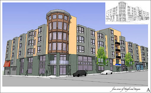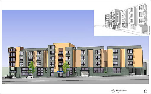
“Last night, the Planning Commission voted 6-0 to approve the Conditional Use for the 690 Stanyan project, the mixed-use proposal with Whole Foods as the anchor tenant.”

∙ Comments: The 690 Stanyan Project: Public Venting Vetting Tomorrow [SocketSite]
yay!
I for one am an optimist, and think it will be a great addition to the ‘hood.
That corner will really benefit.
Double yay for me as well!!! It means more construction jobs, more housing, a better neighborhood, and money coming in to keep SF out of a really nasty economic downtown. Joe the shopper is much better than Joe the drug dealer.
I’ll finally be able to check out Whole Foods — haven’t been to one yet.
the neighborhood speaks! and thankfully the neighborhood is changing for the better.
Aggressively uninspiring. The redwoods across the street are taller.
We can live with it tho …. I guess? Really, our own Central Park South – gateway to a Park like none other — deserves far, far better.
Density-wise, this is ridiculously underbuilt for this important location.
Let’s just stop talking about high density, transit village site locations — and accept that we enforce SF’s future as a safe & quaint village. All at the same time while spewing high density planning parlance du jour (but do not execute on our words.)
dude, this is NOT New York and that’s not Central Park. why keep comparing us to NY? what’s the point?
the scale of this building fits the existing context. it’s gonna be a good, if not great, addition to the end of Haight St.
now if we can just get rid of all those damn hippies still hanging out in the park and making a mess of it.
I agree with invented’s assessment of “Aggressively uninspiring.”
It’s good that the neighborhood is developing, but this building is truly fugly. How long will it be before this uninspired building becomes simply depressing. Blight is built not born.
This building looks great ……… in comparison to its counterpart on the other side of Haight St.
Why do the best sites in this town get the worst buildings? It really is appalling though par for the course for new development along Stanyan (and Haight) Street. The density and mixed-use aspects are great; but the awful windows, the dumpy posture, the cheesy storefront and silly hat on the corner bay. No grace, finesse or elegance to celebrate this wonderful corner of the city…
I’m beginning to think that most of the development in SF is designed to go un-noticed. I like to take walks and admire some of the architecture of the older homes and then just walk right by something like this and all of the boxes from the 60’s and 70’s. No chararcter whatesoever, just muted boxes with unassuming windows, all over town. Still, glad some more housing is being built.
It’s fair to criticize the design of this building and the mediocrity of SF building design in recent years. A comparison to NYC is really not even necessary. Lesser cities, as in suburbs, have been permitting more inspired if not similar structures. My gripe would be height. I would like to see at least two more floors on this building.
Bland and uninspired and already dated. Where do these architects/developers come from? I know they want to make a buck, but have they no interest in making something great? I guess it’s an improvement over the old Cala Foods (low bar there). But this city and that location deserve an A+ building. Take away the corner flourish and that’s a 100% dog of a building. Future blight indeed.
I think I’ve read it here on this blog by a working architect: the NIMBY crowd is why SF architecture is so boring.
What sane business person is going to propose a fresh, modern design when there is a 99.9% chance someone or some group will object and drag the planning process out 2, 3, 4x longer than if they’d just gone with the cookie cutter approach.
This looks a LOT like the building on the NE corner of Stanyan and Beulah.
In the end, as a resident of this neighborhood I’m ready for ANYTHING that will help get rid of the homeless-by-choice kids who hang out at that corner. I can live with boring architecture if it means I can actually walk down that side of Stanyan without being offered drugs every 10 feet or pandhandled.
Can you snobs please find something to NOT be critical of?
Please put down your cocaine and get out of your hot tubs. We all can’t live in a 6 BD mansion in pacific heights.
This is the HAIGHT. I think it looks fine for that area.
Glad this was finally approved- I’ll use it often, great news for that corner no matter what ends up on the bottom floor!
Absolutely right in that it is uninspiring. Developers develop what has worked in the past and this form has passed many times in SF. Why would a developer risk (time=money) more delays in building especially with the naysayers and anti groups [Welch, Hestor, MAC, etc.] that abound. And of course the neighborhood, that is any taxpayer or anyone who objects to the bums, beggars and would like to shop in a nice environment and have a decent building object. Game over.
Anyone remember when they tried to build the Walgreens & apts farther east on same side of Haight — this was around 1988… someone burned it down. It was wild. Let’s hope the nasty factor has moved on and this place doesn’t fall to the same fate.
Remember the Hate:
Yes, I lived in the Haight then and still do now. The torched building was by the same developer as the current Whole Foods project. The tenant was to be a Thrifty Drug, not Walgreens, and when they rebuilt we ended up with Goodwill. The same developer later developed the building immediately to the west that has the goofy facade and Wells Fargo.
It is amazing the level of hate that developed over a pharmacy back then. The old non-chain pharmacy between Ashbury and Clayton (that soem argued they were trying to save) quickly closed and except for the new agey one in Cole Valley, you still need to make a trip to get your medss in the upper haight.
hideous.
is this the best that architect/partner/planning commission can do?
glad the development is coming. too bad we’ve gotta settle for a design that looks just like the monstrosity up the street on Haight.
jessep: this is NOT in character with the Haight! the Haight Ashbury is one of the most architecturally superb parts of the city.
this development only downplays that beauty.. and will encourage more mediocrity!
we’re not being snobs — some of us are concerned for letting ‘developers’ get away with mediocrity when they could be creating a building with more lasting beauty. this proposed building is already dated. it doesn’t fit in with the historical nature of the Haight.
YOU may claim you are opposing a project because it is inadequate. The developer just sees time and costs, especially when the “innovative” architecture itself elicits howls of outrage from yet other members of “the community.” And certainly, a twelve story building or a fifteen story building that is “appropriate” for this site-can you not hear the foaming at the mouth opposition.
Bottom Line: It’s not YOUR property. It’s not YOUR money. And, even in the People’s Countercultural Socialist Republic of Haightistan, that still means you don’t have all that much of a say-or at least shouldn’t.
The Victorian architecture you all admire-that reflects a diffferent era when cheap redwood was being mowed down by the railroad car-load and you could get skilled labor cheap. Our culutre, sadly, does not admire good architecture. But you know…if you want world class design on a basic commercial block…show them the money. I’m sure they would be willing to do more if it were made worth their while.
Remember the Hate: no the “nasty factor” has not moved on – they were there yet again at the Planning Commission last Thursday night, the smell of gasoline still on their hands.
“New community activists flex muscle in Haight”
http://www.sfgate.com/cgi-bin/article.cgi?f=/c/a/2008/10/27/BA7L13P0D8.DTL
bk: you claim that people should ‘put up more money and they will get high quality architecture.. bring that by me again!!
correct me if i’m delusional.. but i was under the impression that san francisco homebuyers were already paying some of the highest new home prices in the country.
so i don’t understand what you’re talking about.
gabriel – ummm, BK wasn’t talking about residential development, he was talking about commercial development.
Now, I admit to not fully understanding where BK was going with the “put up more money” ending to his post, but I *think* BK and I are coming from the same place: No sane businessperson is going to propose a design he/she KNOWS will be controversial, thereby delaying the project and increasing the holding costs of the project.
BK also made the *EXCELLENT* point that’s all-to-often missed in San Francisco Land Use: When did it become acceptable for those with ZERO skin in the game other than not wanting to look at something “ugly” get to lord over those with the ways means and motive to actually build something?
There is a balance between developers running roughshod over neighborhoods and neighborhoods running roughshod over developers and clearly we’re out of balance.
The other half had a storewide meeting at Whole Foods last night. It was told to them that the Stanyan Project has been scaled back to be just like the Noe Valley project. No external construction – no condos, just a interior gutting of the old Cala foods and a small format Whole Foods going into it.
We’ll see when that hits the fan publicly.
if you drive out to Colma to the Costco out there, its surrounded with housing that looks just like this. its awful and surely uninspired, Where are the good architects who can create something better!!
This proposed (but never built) building is as ugly as ever. The site and the city deserve a lot better than tired mall architecture.