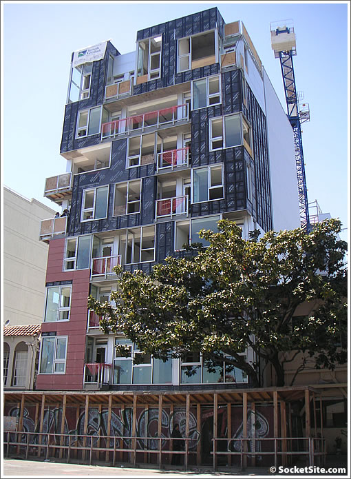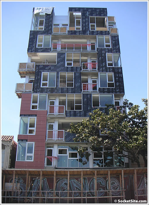
A plugged-in tipster notes that the scaffolding has been stripped from 766 Harrison and what’s rising rings true to the rendering (with the exception of that two-way street).

And while our tipster also offered to send along a photo, we just couldn’t wait (but bonus points for the gesture and a gentle reminder that we always appreciate a good pic or tip).
∙ The 98 “Sophisticated/Stylish” Studio Apartments Of 766 Harrison [SocketSite]

Interesting concept I think there is a place in the market for “up-market” sro units. Why did they take the scaffold down before they finished the skin?
Honestly, i think this is one of the best designs ever featured on socketsite. really cool
those aren’t really proper studio apartments. from the terminology i’ve always heard, a studio has an actual kitchen (and usually in sf, a huge closet where the murphy bed used to be. a room with a bathroom and ‘kitchenette’ like that is an efficiency. sf seems to have downgraded real estate parlance so that now these are studios sro rooms are efficiencies.
right now this looks like something our of the videogame Tetris…
It does look like it’s right out of Tetris, and that’s kind of why I like it.
THIS is San Francisco. Who doesn’t love this building? This is splendid. A touch of jumble echoing the hills & the mixed-up SOMA cityscape, a hint of 1950’s intl style. Tho, needs a dumbwaiter to the deli @ Whole Foods to top off this smart urban confection. More please.
Does the graffiti stay?
Could be cool, could be not so cool, all depends on the finishing materials and final facade articulation – for now, I’m reserving judgment.
This is really a cool building. I was just there earlier today, and wrote about it on my blog. The Baumeister company is also hiring a leasing team to lease the apartments once they are complete! I’m new to blogging but was really excited to see the same building on Socketsite!
Has anybody else noticed that the plastic wrap has been removed from the Argenta (Polk & Market)? And that it looks NOTHING AT ALL like the renderings?
This design is very nostalgic to me. It reminds me of the housing built at the Montreal Expo. Check out “Habitat 67” which was built over 40 years ago. (This was shown in a lecture when I was in architecture school as an example of a past flop in modernist housing. The strange thing about most San Francisco modernism is that it calls to past designs instead of inventing new paths.
European suburbs are full of these 1960s “efficiency meets architecture” buildings. Go there and say if that’s what you want for this town.
It looks like a Jenga or Tetris???
It looks better in reality than the rendering – the horizontal siding gives the facade texture that isn’t apparent in the rendering and warms up the design.
Kudos for not ripping out the large Magnolia tree! Or wait, is that the neighbors? Either way, love it all around!!!