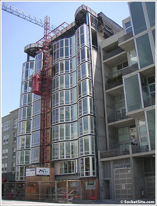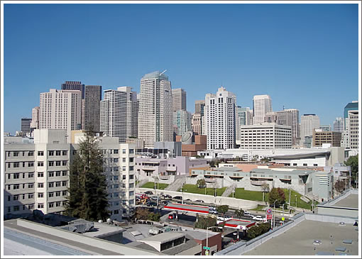
The full site and floor plans are still “coming soon,” but a few new details about (and registration for) the sixty-nine new condos of (and at) 829 Folsom are now online.

Units range from alcove studios to three-bedrooms (priced from $485,000 to $1,850,000) and offer high-end finishes throughout (i.e., no “upgrades” necessary or even being sold). Sixty-three parking spaces in the building and a rooftop terrace with city view.

Reservations have been placed on ten of the sixty-nine units, the project has just received approval to being accepting hard deposits, and the developer will be calling 829 Folsom home (out of desire, not necessity). Expect a model unit to be open next month, a sales office to opening soon, and initial occupancy this summer (July/August).
And yes, discussions are underway for a restaurant on the ground floor.
∙ 829 Folsom [829folsom.com] [Registration]
∙ 829 Folsom Street: 69 Luxury Condominiums Coming In 2008 [SocketSite]

What an odd floorplan. There’s the kitchen, then the dining area and that’s it. Not sure what the developer was thinking unless they figure most would use the 2nd bedroom as the tv room/office. Also, they wasted precious square footage in the bath as well…
This would make a very nice rental property. But luxury condominium is hardly what I think of when I see this driving by.
I don’t own a TV and prefer more windows over wall space. Agree that the second bedroom would make an ideal office/guest room. Good closet space and nice to see the two bedrooms separated by the living area/configured as two suites.
I seem to remember looking at a top floor unit in the adjacent Saitowitz building with formerly unobstructed views from a large terrace that now looks right at the side wall of this building.
Interesting floor plan. I like the long window line, ample closet space, that little nook for a foyer table, and even the kitchen layout. I do not like the split floor plan, agree with missionbayres on the wasted space from the bathrooms, and the fact that a guest would have to enter a private living space to use the bathroom.
“luxury” has to be the most overused word in contemporary real estate. has anything been built in san francisco in 20 years that wasn’t ‘luxury’? the architecture should speak for itself, and this building says “concrete box with low ceilings and windows along one wall that don’t open”, or more concisely, “spend your high income on sick building syndrome and claustrophobia” wait… how about “more of the same soma schlock”.
If I see another bay window I’m going to puke! I drove by this developement this weekend and thought what a waste – threre was such a great opportuity to play-off/visually reference the Saitowitz building (one of the better designed buildings in the area). Tragedy.
sorry to post twice, but five words: “developer aesthetic: $500k per room” can anyone describe it in four?
Where on earth does the TV go??? So many of these new condo’s don’t even consider where my 46″ will reside….or how people actually will live. I guess I could relax at my dining room table and watch TV.
What’s worse? This 829 Folsom or next door (821 Folsom). I agree with infinitybuyer, both should have played off Saitowitz building and LuLu across the street.
821 Folsom and 829 Folsom should be decent rentals but hardly luxury buildings.
Wow, this block is looking pretty bad. With this building, the shipley square building, and Saitowitz’ homage to the 1950’s era soviet architecture (which, BTW, isn’t aging very gracefully), it’s quite the eyesore.
anon, you’re right. This block is looking very bad: much worse than it looked 10, or even just 2-3 years ago.
I think we can all agree that things looked much better when this block was filled with vacant buildings tagged with graffiti, hookers, and crack heads, right?
On the use of the word “luxury”…honestly what do people expect? The marketing people are actually trying to sell the units so I view the use of the word in this context entirely acceptable. Also, the word itself depends on your frame of reference. For instance, some people may consider The Brannan buildings as the ultimate in fine living whereas others may turn their noses up at anything other than St Regis or The Four Seasons . Luxury is a very relative term!
On the floor plan, I actually like the split bedroom setup, however as others have noted, the master bath is a waste of space. More importantly the living/dining area is tiny (a major flaw in a lot of new condo construction) forcing most people to use that second bedroom as a living room / den.
gmlight, it is now “the joyless street”.
That master bath is not that big, the rest of the apt is small. It’s only the width of a bathtub and only as deep as three stacked-washer/dryers next to each other. If the bowl were next to the tub there would be room for a double vanity. I don’t get the million dollar 900 square foot apartment. The decorating budget has to be a million dollars in order to get it to look like a million dollar home. So boring and expensive.
I like “the joyless street”.
to gmlight: there’s a particular conceit in the idea that there was nothing but crackheads and vacant buildings in soma prior to condo development. i’ve lived here since 1992, and don’t recall there ever being prostitutes at 4th/folsom. there were (and are) crack heads. lulu has been there since 1993. if you read ‘the electric kool-aid acid test’, lots of it takes place right around there, which is just prior to much of that area being condemned and eventually YB/moscone/lots of parking lots right there, but also a vibrant cultural center of sf… genuine lofts; big spaces where artists, underground parties, local fashion designers, ad-hoc performance/dance spaces, the heady techno-philic birth of wired/internet culture, pretty much all the nightlife in town…
that era is over, obviously, and that’s just part of the life cycle of the city.
density is great. it’s just sad to see it replaced by a bunch of crap buildings that are going to be there 100 years. each building is a lost opportunity for brilliant architecture, and further proof that this town’s only architectural legacy was to have had the good fortune to be mostly built out between 1850 and 1930 in a style that has aged well (with a few exceptions).
but it’s particularly annoying to see people indiscriminately fawning over whatever hyperbole marketing people throw at them, as though a collective delusion helps investment potential, as sf becomes indistinguishable from places it always made look crass in comparison.
Who is the developer? Who is doing the marketing?
Just curious.
The developer is Forma: http://www.formasf.com it looks like they might be doing their own marketing. looks like they’re based in sf, and have done a lot of development going back to the 80s…
“And yes, discussions are underway for a restaurant on the ground floor.”
Hmmm…Jollibee?
Are you frackin’ kidding me? The dining room table in the middle of the living room right in front of the couch?? Is this what things have come to?????!!?!!?
Also, can someone explain why all these new buildings with curtain walls have windows that only open 6 inches outward? I’m sure it’s a code reason and I would love to know the rationale? Is it some stupid thing so babies don’t fall out, when it’s more the case the occupants will suffocate from heat or die if there’s a fire and can’t get out the front door?
I already like it a heck of a lot more than most of the cookie-cutter buildings that have been constructed but also think it’s ridiculous to judge the design until it’s finished.
I understand that the ppsf is in the mid to high $900k’s. It will be interesting to see if the building will achieve that price?
Every single development would have some “bad” floor plans.
Note “Units range from alcove studios to three-bedrooms (priced from $485,000 to $1,850,000)”. This floor plan is just one of the plans.
Actually, this could be a decent 1BR unit. I think they realized that 1BR condo market is tough, and added a wall to make it 2BR.
It has to be one of the units facing the back, right? The outline doesn’t fit the building front.
Such wonderful banter! Please note this is ONE of MANY floor plans and as another poster noted – we may all want to reserve judgement, until this property has become fully realized. The developer has designed this residence with the idea that it will also be his home. You can be sure the “attention to detail will surprise you” and when compared to the other enormous developments on and coming on the market 829 Folsom will prove be just what a lot of buyers are looking for.
if you look at the photo above, one of the floors has considerably higher ceilings, possibly the top two (hard to tell). it’s pretty safe to assume that’s the developer’s residence.
Argh! More “luxury” condos!
While all of you debate over the design or whether it needs higher ceilings or floorplans or shinier appliances — has anyone stopped to realize that someone is trying to sell several freaking glass box CONDOS on FOLSOM street for (over) a million dollars?
Who wants to start the over/under pool for the first NOD on one of these units?
This is truly frightening, bottom-of-the-barrel design, just horrible — certainly in terms of interior spatial arrangement and most definitely when it comes to facade; not to mention being an outright insult to the design finesse in Saitowitz’s building next door. Why is the architecture bar so ridiculously low in this city? Go look at any number of new developer housing projects in any number of cities worldwide — it puts this typical SF crap to shame.