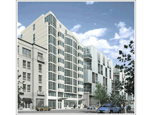
It’s a plugged-in reader that finds the developer’s site for 829 Folsom Street, “an exclusive boutique condominium development nestled in San Francisco’s burgeoning South of Market neighborhood, offering 69 luxury studio, one, two and three bedroom units.”
And while we have a call in to the developer, and have been told that a model unit should be open by March/April of 2008, that’s about all we know at the moment. Perhaps a tipster or two would care to show off by sharing some details. And yes, you know we’d do the same for you.
∙ 829 Folsom Street Overview [FORMA SF] [Map]

Talked to the developer/owner.
Prices are not concrete yet, but they will range from 550K (studio) to 800-something – 1.2/1.3M for 2 to 3 bedrooms. 10 floors.
Developer “plans” a restaurant on the ground floor. Full security.
5K – 10K refundable deposit. Becomes non-refundable once finishes have been chosen (in 2 – 3 mos.)
Deeded parking has not yet been determined. He said that you will “own” your space, though.
I’m not quite sure the difference or the technicality there about the parking.
With the recent propositions and the guidelines (or mandates) from the city, how many parking spots can buildings have? Is the maximum number effected by whether they are deeded or flexible?
“nestled?” As if Folsom were a quaint leafy side street?
Hard to imagine anything “nestled” on that thruway stretch (to the Bay Bridge) section of Folsom.
AS for parking – I believe this property is in a different planning zone than ORH and the south financial/south beach areas. Maximums of less than 1:1 are in effect for the south financial area whereas the minimum 1:1 parking requirement still seems to be in effect in SOMA as well as the rest of the city. However, I think new development approvals in SOMA are currently in limbo until the re-zoning of the Eastern Neighborhoods is complete and then it seems it will switch to maximums similar to the south financial area. Anyone else know what the status is of new developments in SOMA until the Eastern Neighborhoods plan gets finalized?
what kind of effect do you think this will have on the yerba buena lofts (saitowtiz) building next door? do you think there will be bargains to be had?
“what kind of effect do you think this will have on the yerba buena lofts (saitowtiz) building next door?”
Resale wise – nothing.
Design-wise – Gasp. I can’t breathe. It really jams the Folsom streetview of YBL.
The only units I ever thought I would like at the Yerba Buena Lofts were the upper level side facing ones with large roof decks that this project just ruined.
The units facing Shipley St. should be much quieter than the Folsom St. units.
And lofts vs. condominiums are two totally different types of properties.
I used to live pretty close to this location and it was excellent being so close to the SFMoma, union square, metreon, etc.
I get a really good feeling about this building. No neon lights or ostentatious palm tree sheltered lobby. This façade of the street seems quite refreshing and pleasant with this addition, at least from this rendering. Since the developer is most likely reading this thread, how about some floor plans?
“”what kind of effect do you think this will have on the yerba buena lofts (saitowtiz) building next door?”
As mentioned above, this does nothing to Yerba Buena Lofs. If anything, it’ll improve the block since it used to be an empty parking lot.
As for the neighbor building next door (821 Folsom??), I can’t say the same. My guess is this new building will push 821 Folsom further down the line. I’ve seen several units at 821 Folsom go for sale but none have sold. I think some are even short sales.
Interesting. Why isn’t anyone demanding that this be “taller” like the posts on the 818 Van Ness thread? Are we only hoping to plop 70 story towers on the north side of the city as some sort of revenge? I like 829 Folsom, and here again is a building that chooses to identify itself by the address instead of a name similar to a Shampoo or Cocktail, which is a nice change. I also agree with the comments that it is refreshing not to see dozens of palm trees or flashy neon.
The drawing actually makes it look like a decent neighborhood. People will be shocked to see what that neighborhood REALLY looks like.
On the inside the YBL units are basic and uninteresting – no luxury at all. It look cool from the inside, but that is abt it.
that doesn’t look like folsom street to me.
Miles,
You are correct that this building is in a 1:1 parking zone. The Eastern Neighborhoods plan does not have anything in it that will reduce parking further – the only added bits on parking will be to make parking “unbundled” from the unit – therefore each person has the option of buying parking or not buying parking. But it will still be a 1:1 zone.
theres alot going on with Folsom and this is a nice addition to go along with Blu nearby. I bet this area of soma has upside (reasonable long-term) potential.
Hideous, bland and a complete outrage. This is another styleless pile of developer crap not worthy of the same block as YBL. No matter what your taste or lack thereof, there is no excuse for this faux bay window abomination that uses every available square inch of the lot to maximize profits and diminish what could have been a great complement to Saitowitz’s gem. The only blandness in a YBL loft is to be found in the imagination of the viewer in not knowing how to utilize the space. If only all buildings allowed their owners the opportunity to create a truly urban living space, we wouldn’t need these West Elm, Crate and Barrel, Pottery Barn hovels that no amount of marketing can disguise as true design. Really just a cheap piece of Heller Manus Metropolitanism chopped off at the knees!
?
i like this more than yerba buena lofts.
Smugly: couldn’t have said it better myself!
S&S: Did you happen to ask the developer why they want to further ruin SF with such an ugly, bland design? Wow, symmetrical AND a big curving window! Why didn’t I think of that? Now I finally realize why I didn’t get that “A” in my first-year design studio. If I could have only thought of such a progressive design…
Nothing says “exclusive…boutique…luxury” condos ready in 2008 like a rendering with a 19 year old Pontiac minivan in the foreground.
Did their 3D artists accidentally delete their late 80s Cadillac Brougham model? Now that was luxury…
The way this building brings the Good Herb Lofts together with the cheap ass stucco condo pile on the other side really brings the streetscape together. From Museum Parc all along Folsom there is a veritable wall of condos and office space roughly ten stories tall, so neither the height nor the design are at all extraordinary or alarming. They started with a really big hole, so there should be lots of parking.
The only thing that bugs me about this is the hideous paint scheme going on the concrete office block at Fourth nearby in view from Forbes. Painting concrete structures like that is always a huge mistake, even when the color scheme is reasonable.
The building looks OK in the rendering (I’m sure it won’t look like that when it’s built). At least it’ll provide a compliment to the fugly Stalinesque YBL lofts/tombs next door.
anonSF at 7:40 — Stalinesque is almost right! I would put these in the Khrustchev era though– buildings were much nicer during the Stalin time. Every time I walk by YBL I am reminded of the high-rise slums where the majority of my generation grew up (and yes, I did grow up in Soviet Russia). Anybody who has been on the outskirts of any large Russian city will understand what I mean.
“Interesting. Why isn’t anyone demanding that this be “taller” like the posts on the 818 Van Ness thread? Are we only hoping to plop 70 story towers on the north side of the city as some sort of revenge?”
I’ll bite. Another five stories here would have been welcome. It’s not like the form or design of this fairly bland building demands its current height. I don’t recall anybody wanting to plop 70 story towers on the north side of the city. On the other hand, 30-40 story towers…bring ’em on!
There is nothing vaguely Russian or Stalinesque about YBL — if anything, it has similarities with some of the better recent multi-family residential design seen recently in Spain, Denmark, Holland, Germany, Switzerland and Japan. As such, YBL has design quality light years beyond the typical mid-rise developer schlock in SF — of which this new neighbor is a pathetically bad example.
I agree with Smugly and RG above, and it is the lowness of the bar set by such formulaic crap that contributes to the generally sad state of architectural affairs in housing design in San Francisco.
Residents of YBL did our best to “influence” the design of this building, which originally required over 14 code variances (too dense, too high, not enough BMRs, blocked sunlight, windowless studios, etc.) We didn’t have the planning department on our side… now we are stuck with an eyesore – where bay windows stick out a full 3 FEET over a public sidewalk, with an internal “corridor” which we nicknamed “the dungeon”, which has ZERO affordable housing (after the building was permitted – the developer “chose” to pay into the Daly fund instead of following through with his committment to the community).
Lastly – regarding the rooftop garden – the large electrical box located on the public sidewalk in front of the building will be relocated to the rooftop – leaving not much room for “rooftop dining” and barely enough room for the wicked loud generators and air vents.
We would have been grateful if the SF planning committee had helped us when we begged and spent thousands of dollars on lawyers. (did I mention the owner/developer hired a low end realtor – known in the business as the “sears of real estate” to fill his building? Nice way to impress the neighbors.. bring in the recent lotto winners!)
Lots of lein on this property, be very careful buying anything on this building. I have heard the builder has not paid any of their sub-contractors, so plenty of law suits are on its way. Stay away from this property at this time.
anything new on this property? … about the builder not paying … problems, etc.
There was a modified Deed of Trust executed on Oct. 14, and it appears that there may have been some more capital injected into the project as many (all?) of the mechanics leans were released on October 16. Or maybe the subs are now “investors” in the building through Redwood Mortgage Investors? At any rate, the ball should be rolling again…