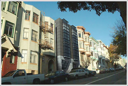
A reader wonders if we know anything about the four modern units coming soon [see UPDATE below] at 1440 Jackson. And to be honest, beyond what’s available on the 1440 Jackson website, we don’t (but perhaps a plugged-in reader or two will be able to fill in the gaps).
The basics: Bulthaup kitchen with Subzero, Wolf and Gaggenau appliances; Dorn Bracht/Lefroy Brooks fixtures and WET bathtubs in the bathrooms; commercial grade supreme Bonelli windows; two private roof-top terraces with outdoor kitchens and spas; and one parking space per unit.
The units: 1440 Jackson #1 (1/1) 683 sqft + 60 sqft terrace; #2 (4/3) 2,274 sqft + 960 sqft terrace; #3 (3/2.5) 1,227 sqft + garden; and #4 (3/2.5) 1,457 sqft + 749 sqft terrace.
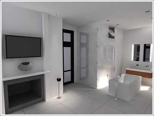
The rendered (and quite agressive) open master suite of unit number two:

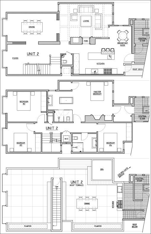
And the full floor plan (for the same):

UPDATE: Well, while it never hit the MLS three of the four units are already in contract and only unit #1 remains available at $700,000. Sorry about that folks and we’ll try not to let it happen again (seriously). And the quote of the day (from the sales agent), “I was wondering if the developer had put up a billboard or something because I was flooded with calls this morning.”
∙ Property Website: 1440 Jackson Street [1440Jackson.com]

Wow, the bathroom is so big it has a bed, tv and a walk-in closet!
Um… No.
I want “a bathroom I can play baseball in and a king-size tub big enough for 10 plus me”. That should do it.
I really like it, good use of space. you really have to like modern though…
will someone hurry up and get some pricing info
My friends in LA told me modern is over and that I should stop reading Dwell and Wallpaper.
So I’m now renting a Victorian 1bd in Pac Heights for $4000/month and stuffing it with Shabby Chic wall-to-wall.
Three bedrooms share the non-master bath? That seems ill conceived as does the master shower venting to the rest of the room. Hard to tell but it also looks like you have to walk through the shower to get to the master toilet.
Looks like a hot tubbers dream complex.
Amused, you are STILL bitter? The Dwell comment was in regards to hoping that a very nice period Sea Cliff home was not torn apart and turned into the latest issue or Dwell or Wallpaper. Modern is fantastic, but it is not a religion, just a style of architecture. No need for fanaticism when it comes to taste, o.k.? What makes San Francisco great is that a modern building like this can be tucked into a row of older structures on Jackson and help to keep the city feeling alive. I happen to like this project btw.
Not bitter. Never have been.
My post that started the fury was about Spanish/Med and how it is good and cool for the Bay Area.
It was (admittedly) followed by a diatribe that design movements are not named after magazines. Someone else came up with the bright idea that updating the kitchen would lead to a Modernist Armageddon.
Well, while it never hit the MLS three of the four units are already in contract and only unit #1 remains available at $700,000. Sorry about that folks (and we’ll try not to let it happen again).
That is SO cool! Definetly not for the modest. I am a firm believer that the best investment is in something different.
I am glad they did a private stall for the shower & the loo! 😉
Hmmmmm, what were the list prices of those now in contract?
The still available one bedroom is very strange, and the floor plan indicates a long corridor, wrapping the bedroom to the other units.
not sure I like the bathroom open to the master bedroom.
and I live in a home with that arrangement(my master bedroom and master bath are one big 400 sq ft room, separated only by a partial wall.
I don’t mind it that much, but I’d definitely never do it again. (previous owners put it in that way)
in the morning, one person can’t get ready while the other person sleeps
Thus, we ALWAYS use our spare bathroom unless we have guests over.
I’d be interested in seeing how much they went for. At least they have some SPACE to raise a family etc!
I’m not a modern guy, so have no idea if this is a nice place or not.
I do really like the bathtub spigot.
I also feel that this place blends into the block well…
Excellent development! The developer will be rewarded handsomely for it.
Only downside to this development is it’s directly opposite an Elementary (?) school, with possible noise and traffic issues at certain times during the day. Other than that, this looks like a really cool development.
I really like this facade
It looks like a Transformer to me. I’m waiting…
I love modern, but … uh … no. This one’s not for me unless … the unit comes with that floating vase thingy. 😛
THX 1138 Phone Home!
I live around the corner from these units on Hyde St.; my building backs up to the school on the east side of the school across the street from this building. I work from home and I’ve got to say, the kids are noisy! They have assembly outside, practice singing and dancing routines outside, and they are rotating for recess throughout much of the day. I’ve learned to live with it and appreciate that they seem to be good kids who are fortunate to have engaged faculty who support them with good programming, which seems rare in schools these days. But it can definitely drive you nuts if you need peace and quiet to do work or be on conference calls. That and the folks playing basketball early Saturday mornings (which, again, I try to have patience with b/c it’s all in good fun and better basketball than something else!) Having said that, unless you work from home and/or sleep past 8 on weekdays, you’d never know the kids existed noise-wise; though the whap whap whap of the b-ball on weekend mornings can still get to you. Hopefully these units have double-paned windows; in addition, most of the recess and assembly happens on the east side of the schoolyard, so their side will be somewhat sheltered from the noise by the school building.
I went in the property when it was for sale (before the current developer bought and remodeled it) and seem to recall some pretty incredible Golden Gate Bridge views from the upper units.
This design is alright for this block; it definitely is not in keeping with the other building styles, but it’s not offensive either. It’s a good neighborhood with involved neighbors, though the building kind of seems too high-end for this low-key area…
I’m glad that it has been developed though. It was just a plain building with peeling paint before, so this is an improvement!
Think it’s a good looking building. My issues with the remaining 1BR (from the floor plan) look to be a serious lack of windows and natural light. The upper units look amazing, it’ll be interesting to see what the pulled in $-wise.
I would ditch the tub and put a wall with a door there and that would fix that issue for me probably without costing much money in relative terms. The roof deck is splendid and seems like it would get a lot of practical use.
That master bath, yow, I’ve seen more inviting pathology labs.
There’s something wrong with this picture that is a real problem in San Francisco.. there are no TREES!! A city of density is not very charming without lush greenery.. I’m amazed at how you can drive down some streets and boulevards in the city and just the fact there are big beautiful trees planted everywhere makes it so much more enjoyable and livable than streets that don’t have them.
Can someone direct me to a website for WET? I tried google and couldn’t find a main site for them. I’d like to see what else they offer in terms of tubs and showers.
Thanks.
http://www.wetstyle.ca/en/index.html