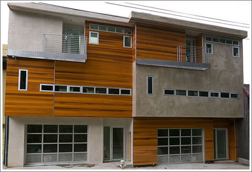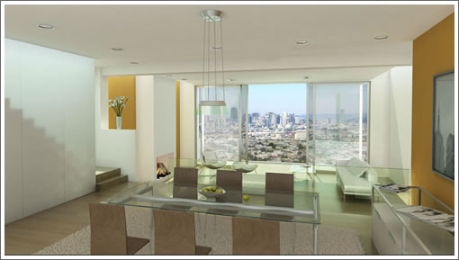

They’re two new modern view homes “situated on the southern rim of Noe Valley” that are obviously coming soon, should offer some fantastic views, and sound to be luxuriously finished (that’s only a rendering of the interior above). Other than that, there’s little we know about these two. Any plugged-in readers care to share the inside scoop/story?
∙ Coming Soon: 71-73 Miguel (4/3.5 each) [71-73miguel.com]

Miguel st. is not in Noe Valley. It’s Fairmount Heights, Glen Park.
[Editor’s Note: Yep, we definitely got caught up in the marketing verbiage (“Situated on the southern rim of Noe Valley…”).]
I’m not a fan of the contrasting / opposite facades of these properties. I like modern but I’m not a fan in this particular case. I’d pick the one on the left if I had to chose. Views look amazing! A roof deck would be nice 🙂
I didn’t realize that Pete Brannagan left Droubi (I guess when they got bought?) and went to Brown. He’s pretty good in Noe.
Don’t forget the video.
http://www.openhomesphotography.com/MadeGreen/71Miguel.html
I’ve been in 73 Miguel (don’t ask), even though modern isn’t my first choice this place is really cool. The interior has a natural flow onto the deck.
IMHO, the smallish deck at 89 Miguel, and no deck on the top level (?!?), might be why that property is stuck. I mean, for 2,995,000 dollars, I’d want a deck on the top floor. Otherwise that’s another beautiful place.
http://www.89miguel.com
Am I the only one who is sick and tired of the ‘modern design’? When will the “modern design” bubble burst, too?
I can see that “modern design” fetches a higher premium so there is a better margin to build it that way when you flip a house. I can also see that most of the young architects these days want to do ‘modern’ because that’s what they are taught in school.
But modern design feels so COLD and impersonal to me. I feel like I am walking around in an office if it’s light and airy, or in a trendy night club if it’s dark. While it’s nice to find myself in a clean and modern space, I certainly do not want to live in it everyday.
So I am calling it a bubble 🙂
anon8mizer:
What do you mean “the ‘modern design’ When will the ‘modern design’ bubble burst?” It is hardly a bubble. And its not about a question of style, its called the time we live in.
If you mean, when will the bubble burst of producing buildings that actually acknowledge the time they were built, rather than mimic a historical style, hopefully NEVER. You clearly are part of the problem I just spoke to in the previous post on 29-41 Ord below — San Francisco’s perrenial fear of the new in the built environment. Why is a modern, contemporary looking and performing car, airplane, iPod or clothes good but in buildings its bad?
“It feels so COLD and impersonal to me” — how cliche is that? Fine, if you say one ‘modern’ building isn’t as good as it could or should be design-wise, but to dismiss all of newness or contemporaneousness in architecture is simply retarded.
One of my favourite view streets in the city.
I agree that the flat roofs and contrasting facades above look a little graceless, but a lot of modern design is beautiful. Do we really want all architects designing and building brand-new Edwardians and Victorians? The idea is so bizarre to me. Those houses were built in a different time when people had different lifestyles (servants, formal parlors for entertaining, different requirements for bathrooms, closets, and kitchens). And building a brand-new house with a modern layout and an old-fashioned exterior just seems like Disneyland– there’s no integrity to the design. You might as well just slap some white columns on the front of an Eichler and call it a day.
Architects: Please realize that exposed concrete is about as sexy as turf lawns
Hear, hear, criticritter.
I’ve said in a previous post that I like the “cold, never-been-lived-in modernism.” Whatever anyone wants to call it — un-San Franciscan, LA-wannabe, impersonal, cold, trend bubble — doesn’t matter to me … I LIKE it. 🙂
Change is good. New is good. And I welcome both.
And I like the facade of the left one better too.
I like some modern designs. I grew up in Chicago, I’m an architectural sophisticate!
But there is a lot of low quality stuff. Anything that looks like the chassis to an air conditioner: that’s a sign. Ditto computer chassis. Ditto bumpers or fenders of any sort.
Anyhoo, these houses are nice.
Is this “Lower Noe Valley” like “Lower Pacific Heights??
More like Upper upper upper Noe Valley.
I have friends who live near these homes. Great views!
I am no expert and I like a lot of Modern stuff but there is a difference in my mind between Modern as a nod to a past movement and modern meaning simply using the most up to date, functional materials with design that meets the demand of the household
they are obviously interrelated but to me not exactly the same
I like both
hey! in that video, i think i saw my car heading off to work (sadly, before the sun was up). 🙂
actually, a bit of a gimmick but the time lapse video is kinda neat.
I agree that the pathetic concrete look is awful. That’s the primary reason I think the lobby and hallways at 170 Off Third have such a terrible appearance. Concrete appearance = cheap, cheap, cheap.
No bare concrete inside that I noticed, it’s actually quite bright and not industrial. I don’t know how to describe it, but when you are inside you feel like you are on the outside deck. I’m looking forward to a proper open house.
Here’s how to see Fairmount Heights via the Harry Street steps, from Noe Valley Voice Harry ‘Street’ is actually a staircase street, you can only get to the homes via stairs.
The Harry Street Steps: To find this steep wooden climb, head south on Sanchez until you reach Randall. Turn right onto Randall, take your next left onto Harper and turn right onto Laidley. Harry Street ascends from between two houses at roughly 100 Laidley.
Harry Street’s rickety-looking steps are flanked with greenery from banana trees, palm fronds, and winding vines. With the treetops creating a patchy canopy overhead, a trip up these stairs can make you completely forget you’re in a city.
Once you reach the top, you’ll be on Beacon Street. To extend this walk, you can turn right and follow the road until you hit Diamond Street. Take a left on Diamond, and the newly built Haas Park, which has a gated dog park and playground, is just up the road on Diamond Heights Boulevard.
To return to the heart of Noe Valley from the top of the Harry steps, turn left on Beacon and follow the road down to Miguel. Turn left where Miguel dips back to Laidley. Take a left on Laidley and enjoy the striking architecture of the street’s homes as you stroll back to Harper.
Sold fast: http://www.23harry.com
Still open: http://www.203fairmount.com
modern design is a “bubble?”
exposed concrete is a) “sexy as turf lawns” (whatever the hell those are), and b) “cheap, cheap, cheap?” wow.
no wonder pottery barn does so well. I bet all of these people own at least five things that are “antiqued” (not exactly old, but they sure look it!). I’m picturing tv’s stuffed into green armoires with peeling paint. and I’m vomiting in my mouth.
do yourselves a favor and look up tadao ando. then come back and talk about how concrete is neither sexy nor elegant.
to say that modern design is a bubble is such a far reaching ridiculous statement. each can own their taste. some prefer restoration hardware fake old furniture as ‘amused’ suggests above. and some prefer board form concrete and glass.
‘modern’ design has been around for more than 100 years. styles come and go based on available materials, construction methods and various media filtration. however to think that ‘modern’ design is simply going to burst is short sighted. take a look at le corbusier. amazing projects done almost 100 years ago that would look fresh if constructed today. even if they are “cold”.
Krassel:
you bring up a point that I’ve always found interesting… When I think of the word “modern” I think “forward looking” or “futuristic”. But when I see modern design, I often think of it as more “retro” than looking forward… maybe because the “midcentury modern” movement is so big right now??? or because the trend is to look back and make old ideas new again?
this might be a fun learning exercise for me, to see what is really “modern” and what is not… to find out what “defines” modern…
sometimes I like modern, sometimes not… to me it just depends on the asthetic and also innovation of the product. when it comes to homes/furnishings, comfort is a big issue and in general modern furniture hasn’t been very comfortable for me. I think it’s made for people with different body proportions than me. (like the dining chairs in the pic above… you need to be lean and lithe for those… I’ve got a muscular stocky build… the couch has no real back and I like to recline into a couch without slouching so the couch is out too… those living room chairs though do look like they would be quite comfy).
but like anything else, there are good and bad with every moevement… overall I don’t love current “modern” design (in terms of living in it) but there are a some choice homes that I’ve seen that I love and would snatch in a minute. sort of like country or top 20 music… not my style overall but there sure are some awesome country songs… not so much awesome top 20! 🙂
Ex SF-er, the way you think about these architectural terms are I think the way most people internalize them too. But in architectural terms, “futuristic” is not the same as “futurist.” And futurist is old hat.
The era we’re in, supposedly, is post modernist or post-post modernist. I’d say this house is sort of a modernist meets post-modernist concept. Individual ideas meets industrial craft, but it indulges ornamentation. It’s kind of tough to pin a badge on a residential house though a lot of times. People just like to go with whatever they happen to think is cool. For the record I think the facade is attractive. It kind of screams “converted firehouse” to me tho.
“converted firehouse” – I think it’s the garage doors. 203 Fairmount – sold? or pulled?
203 Fairmount was withdrawn from the market yesterday.
So you were right to question the pricing. You must be like a trained professional or something!
Anyone know who were the architect firm and contractors for these homes?
I love modern homes…I cant even imagine living in a traditional house….just not my style….I like em clean, modern, open, wired up…and tons of glass, concrete etc…great kitchen…and a pool is a must.