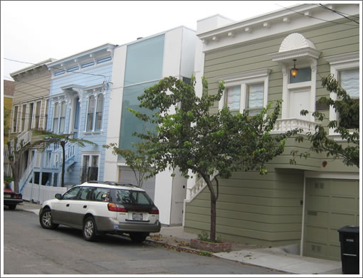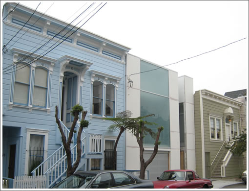
From a plugged-in reader: “These are the small quiet gems which transform a great city into a new age of civilized urban landscape. Thank goodness the 1980’s trend of look-alike contexualism is dead. ([Or] is it?)” We couldn’t have put it any better ourselves.

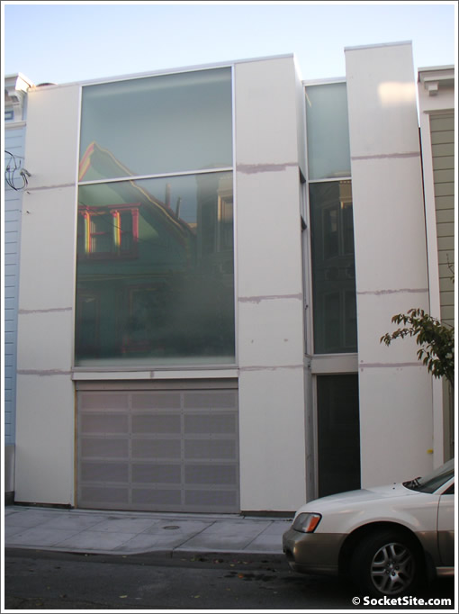
And in case you’re wondering, that’s 113 Germania Street there in the middle.

And while Stanley Saitowitz | Natoma Architects get the credit for the interior remodel (circa 2006), we don’t know if they orchestrated the exterior overhaul (which isn’t yet complete) as well. Any plugged-in readers have the inside design scoop (or care to take the credit)?

Well, this lover of modern thinks it’s inexcusable. The problem isn’t the lack of ornamentation, color or cross-references to its neighbors. It’s the big opaque windows that wall this house off from the street. The garage door is the house’s most welcoming feature, and that’s never a good sign. It says to the neighborhood: “We need light, but we are not a part of you and we don’t want to see you.” It practically shouts “F—You.”
I watched this building go up, and I love it – it’s different but still respectful of its context. What’s more, this house is a great contrast with a mediocre pseudo – Victorian that went up in the next block of Germania at around the same time.
I’m all for modern and out of place, but this just looks weird. It reminds me of a washing machine or some other kind of appliance. It doesn’t help that it’s so much skinnier than the houses on either side.
I’m all for modern and out of place, but this just looks weird. It reminds me of a washing machine or some other kind of appliance. It doesn’t help that it’s so much skinnier than the houses on either side.
I live right down the street from this house, and I think it’s neat– a great contrast with the houses on either side. I hope it will look a little more friendly once it’s been painted. I still can’t figure out where the front door is, though.
isn’t he front door in the nook just to the right of the garage?
to be fair, the exterior looks unfinished and may look a bit nicer/welcoming when it’s complete. maybe a “welcome home” mat?
UGLY, looks like a commercial building or a retail store. Reminds me of the Larry Elison architectural disaster in Pac Heights. The house for sale on 306 Mullen Street is a far better example of current design trends in modern residential architecture.
http://sfarmls.rapmls.com/scripts/mgrqispi.dll?APPNAME=Sanfrancisco&PRGNAME=MLSPropertyDetail&ARGUMENTS=-N458332778,-N211879,-N,-A,-N11120795
“mediocre pseudo – Victorian that went up in the next block of Germania at around the same time.”
Do you mean the two rentals that replaced a garage structure? Isn’t it better to have housing then a garage?
That central window must be around eight feet on a side–huge! I love it when something is modern enough to piss people off.
Generally I think the mark of good architecture (or simply good building – as that’s all that’s on either side) is to ask would you want to live in a neighborhood, or even a street made up of nothing but? I’ve definitely got my answer.
Love it…great contrast to the adjoining buildings. Like how the green/blue glass plays off the color of the building to the left. We need more of these contrasts – stops you in your tracks and take notice of the modern and the victorians.
While the house on Mullen is beautiful, I have to believe the budget was just slightly larger….
check out the temple he designed on 14th Ave. The neighbors call it the “toilet tank.” It kinda looks like one…
Terrible design, diasaster to the overall harmony, no match with the entire neighbourhood, who is the designer, where this guy graduated from ?? Just like playing rock and roll in Classical concert.
I want to throw up.
I love San Francisco with all the victoria style building, one of the beautiful city in the world.
Tell me if you put this monster in London … BAD TASTE.
Wonder why all the neighbours not against it, this refigerator type of build going to destory everything.
I definately won’t buy any properity on the same street.
Make me sick.
BadTaster: Its people like you that are the roadblocks to moving forward in time. Go live in your Victorian (or fake-history psuedo Victorian) with your hateful bad grammar and retrogressive conservatism… And by the way, there is in fact much more modern design than this in London recently.
“Modern”?. Well the movement in architecture is close to 100 years old (Bauhuas). Take a minute while perusing the internet and educate yourselves if you are unfamiliar with the history and the impact on art and architecture.
wow- I love it
Love it if only for the fact that it offends so many “natives.”
Why are so many people here control freaks?
You keep your property how you would like it and I’ll keep mine the way I would like. Tough if that offends you.
How come people that don’t like this design are instantly attacked as natives that are control freaks that are stuck in time and apparently partial to retrogressive conservatism?
I’m not against different looking buildings coming to this city but I do think that building is bland, boring, and unattractive.
Wow! This building sure produces polarized opinions. At least it makes people think! That alone makes it a worthwhile effort, in my opinion.
when do they put the fish in?
I like to think I have an appreciation for good examples of all types of architecture, from the deyoung to city hall. This home doesn’t look like much thought went into creating an interesting facade. Call it modern and controversial, but it’s just plain unimaginative.
Do yourself a favor and go look at in “person”. It’s very cool.
I agree with 94114 – the shoddy pictures don’t do it justice, it’s really striking in a good way when you see it in person
I love it! My partner and I walked past this home a couple of weeks ago and were stopped speachless in the middle of the street. Wow. It is so impressive in person. There are many beautiful homes and buildings in the neighborhood and this is a welcome addition.
Eyesore!!! Just looking at the picture is making my eyes bleed.
Come to think of it, it’s those two retarded houses next to this one that need to go… welcome to 21st century, San Francisco.
I would feel trapped living in that house. It has absolutely no relationship with the outdoors. Do the windows even open? I am sure the owners love it and are very proud…there is no accounting for taste.
First impression is “Meat Locker” or “Funeral Home” feel no sense of family warm.
Sure 21st century, lots of crazy things happen, like “tongue ring” … but won’t last.
Please stop ruining our city.
These are the same type of people who would have used a lot of glass brick back in the 80’s.
Cool building. Like the Alfa Romeo in front, too.
A pleseant suprise on a quiet little street.
Looks perfect — if the garage will hold my 6000 SUX.
I wish they’d designed a cooler garage door.
looks like a cheesy night club.
Thumbs up. Thank god they didn’t build some Pottery Barn version of Victorian double dipped in nostalgia. This building looks forward facing and timeless (how old is the Bauhaus movement now….) and fits the scale of the neighboring buildings. I’d live in it.
To anon- “I would feel trapped living in that house….Do the windows even open?”
Do you prefer the victorian neighbor with bars over the windows?
JD, if you don’t like the type of architecture that comprises most of our city, then maybe SF isn’t the place for you. Those ‘retarded’ buildings are the types that give SF a lot of its charm. There CAN be a harmonious balance, but I don’t see that here, nor the space for that in your post. One doesn’t modernize JUST for the sake of progress, and destroy what works and characterizes a place. I would hope that’s a lesson we have learned after tearing down all the western addition Victorians in the 70s and putting up all those ‘progressive’ projects. I AM a fan of diverse architecture, but this is jarring and stark. I see no sense of aesthetic cohesion whatsoever, just strident and determined modernity plunked down without other considerations.
It looks like the “Pax” closets from IKEA– please, please, please use birch for the front of the house so it’s a perfect match!
“if you don’t like the type of architecture that comprises most of our city, then maybe SF isn’t the place for you.”
That’s just an absurd comment. There are plenty of reasons to want to live in San Francisco besides the architecture.
Looks like a condensed office building. Seems depressing to come home to.
That house is fantastic. How refreshing to see something so unique. Love the clean lines.
To someone with so-called “high taste” of 21 th century, this house probably missing 2 things.
1. A big Handle
and
2. A label of Whirlpool
Looking like a mentally hospital.
These pictures can’t do it justice. No sun, no shadows. No shadows, no depth or texture. Besides, you don’t want to hurt the owner’s feelings, trust me.
I like it and it will look better when it’s painted. I’ve been by a few times and it is quite imposing but somewhat out of scale with the neighboring houses and the street itself. (Germania is very narrow!) I would have also chosen windows that are a little more inclusive.
I heard directly from the owner that it will be completely finished in hammered chrome siding.
I live just a block away, and walk by this place occasionally– I like it, and expect to like it better when it’s done. I enjoy the contrast with the little gingerbread dainties that make up most of the rest of Germania, which is a pretty charming little alley in my book.
But what mystifies me is that there appears to be a door on the second floor, opening into that slot in the front and then dropping you seven feet. Perhaps they’re putting in an incredibly awkward staircase?