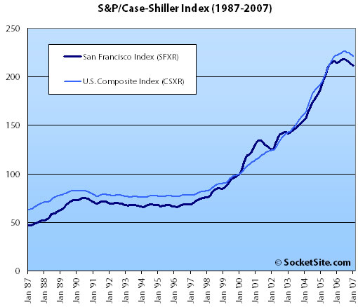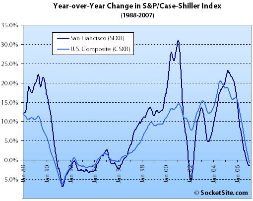
According to the January 2007 S&P/Case-Shiller index (pdf), single-family home prices in the San Francisco MSA dropped a nominal 0.17% from December ’06 to January ’07 but slipped 1.4% year-over-year. For the broader 10-City composite (CSXR), year-over-year price growth is down 0.7% (a thirteen year low).

As previously noted: The S&P/Case-Shiller index only tracks single-family homes (not condominiums which represent half the transactions in San Francisco), is imperfect in factoring out changes in property values due to improvements versus actual market appreciation (although they try their best), and includes San Francisco, San Mateo, Marin, Contra Costa, and Alameda in the “San Francisco” index (i.e., the greater MSA).
∙ The New Year Begins With Negative Returns (pdf) [Standard & Poor’s]
∙ S&P/Case-Shiller Index Down For San Francisco [SocketSite]

I don’t quite understand the difference between the 2 graphs. Can someone shed some light on this?
Looks like 2nd graph is (very roughly) the “first derivative” of the second, but there are scale changes on both axes (!!) which makes comparison very confusing.
dub dub
The top graph reflects the cumulative increase in prices (with 2000 set as “100”). So it will always have a generally upward slope, with slight dips (you’d see the same thing if you charted the price of about anything over time — from eggs to cars). The bottom graph reflects the year-to-year change in prices. The latter is more helpful as it shows the short term ups and downs more clearly. For example, the top graphs shows that prices were basically flat through the ’90s, but the bottom graph illustrates how sharp the downturn was in the early ’90s (and in 2002 and 2006).
of the second —> of the first
🙂
Interesting thing to notice is that with all the talk about the market being “local” i.e. San Francisco being isolated from the overall market, the correlation between San Francisco and the overall US composite is in fact close to 1.
The index “is imperfect in factoring out changes in property values due to improvements versus actual market appreciation”. Assuming most changes in property values are increases due to improvements, wouldn’t the index be biased towards showing appreciation?
The blog site Paper Money has created a dynamic charting tool that allows users anytime to select dates and cities for the updated Case-Schiller data.
http://www.paperdinero.com/CSI.aspx
Raw Excel data can be found at the following URL:
http://www2.standardandpoors.com/spf/pdf/index/CSHomePrice_History_23716.xls
kernalboy said: Assuming most changes in property values are increases due to improvements, wouldn’t the index be biased towards showing appreciation?
There is absolutely no data to support the notion that most changes in property values are due to improvements. The data in graph #1 only represents resale of the same property “pairs” over time. (Pair meaning the first sale and second sale of same property.) You must consider that over time, some resale properties will be improved, some will stay roughly the same, and some will deteriorate from use between sale #1 and sale #2.
One way to think about chart #1 is, if I bought a home X years ago, what is a reasonable assumption of the resale value assuming I made no material improvements. If I bought in 2006 and wanted to sell in 2007, I should prepare to accept a loss according to the data. If I bought in 2003, I could reasonably expect a gain. If I bought in 2005, I’m about at break-even.
The 2nd graph is just plotting year-over-year changes in appreciation (positive or negative) at monthly intervals.
“Since the indices seek to measure homes of constant quality, the methodology will apply smaller weights to homes that appear to have changed in quality or sales that are otherwise not representative of market price trends.”
“To calculate the indices, data are collected on transactions of all residential properties during the months in question. The main variable used for index calculation is the price change between two arms-length sales of the same single-family home. Home price data are gathered after that information becomes publicly available at local recording offices across the country. Available data usually consists of the address for a particular property, the sale date, the sale price, the type of property, and in some cases, the name of the seller, the name of the purchaser, and the mortgage amount.
For each home sale transaction, a search is conducted to find information regarding any previous sale for the same home. If an earlier transaction is found, the two transactions are paired and are considered a “repeat sale.” Sales pairs are designed to yield the price change for the same house, while holding the quality and size of each house constant.
These sales pairs are further examined to eliminate outliers that might distort the calculations. Outliers include non-arms-length transactions (e.g., property transfers between family members); transactions immediately preceding or subsequent to substantial physical changes to a property; transactions where the property type designation is changed (e.g., properties originally recorded as single-family homes are subsequently recorded as condominiums); and suspected data errors where the order of magnitude in values appears unrealistic.”
S&P/Case-Shiller Methodology:
http://www.homeprice.standardandpoors.com./spf/pdf/index/SP_Case_Shiller_Home_Price_Indices_Methodology_Web.pdf
One thing that is interesting is that home prices in San Francisco have appreciated less than for the 10-city index since 2000.
True, but that’s presumably because SF prices were subject to a relatively large increase in the dot com boom years up to 2000.
Not to be repetitive, but as noted in the previous discussion about the Case-Schiller index, let’s remember this index measures the SF MSA (Metropolitan Statistical Area) which includes SF, Alameda, Contra Costa, Marin, and San Mateo counties, so this index is more of a gauge of the regional suburban housing market rather than the SF urban housing market.
While this may be the SF MSA, I’m not sure what comfort can be taken in that (if that’s the implication). All these areas shot through the roof during the boom so it’s reasonable to expect that they are all going to respond similarly in this new, more challenging environment. I will submit that prices should drop more quickly in less desirable areas, but “urban SF” has less desirable sections as well.
Well yeah, that’s exactly the implication in the statement about the MSA. Granted that the regional housing market is definitely related to each other, but this index is going to be heavily weighted towards the outlying suburban areas because there is significantly more housing and population in Contra Costa and Alameda Counties than in SF. I don’t think house and condo values in Oakland or Livermore rise and fall at exactly the same rate that housing does in San Francisco. In fact, in typical market cycles the outlying areas are the last to increase and the first to decrease and the more centralized and desirable areas appreciate first (and more) and decline last (and less). As an example, it will certainly be interesting to see how all that proposed condo development in downtown Oakland turns out in comparison to all the new condo development in SF.
Look at the negative YoY in Jan, 2002, and then look what happened. Sweet!
duh, If you think this is going to be a repeat of what happened after 2002, you’re misinformed. Interest rates were dropped by the Fed to 1% and lending standards fell through the floor. Have you paid no attention to the Congressional hearings going on right now?