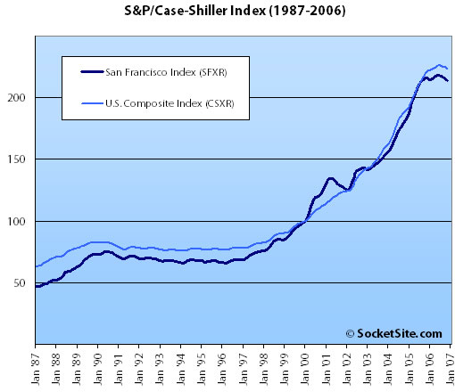
According to the November 2006 S&P/Case-Shiller index, single-family home prices in San Francisco dropped 0.7% from October ’06 to November ’06 (down 0.9% year-over-year).
A couple of things to remember, the S&P/Case-Shiller index only tracks single-family homes (not condominiums which represent half the transactions in San Francisco), and it is imperfect in factoring out changes in property values due to improvements versus actual market appreciation (although they try their best). Regardless, it is another data point.
The chart above doesn’t lend itself well to interpolation. On the previous chart (SF from ’98 to 11/06), you could have visualized a line through the curve to see where the index “should be” assuming a linear relationship.
I find a couple of interesting things about this chart.
1. Prices have not fallen by more than about 5% in any one year during the 88-06 period.
2. There have been three huge “cliffs” in which appreciation has gone negative after very rapid appreciation. The cliffs are similar but the aftermath is different: The first one (the nineties) took about six years to work through. The second (dot com bust and 9/11) was similarly steep, but we bounced right back in only a year (surprising most all of us, I think). The third…well we’re in that one.
I think the question that we’re asking every day on this board is will it be years to work through the “irrational exhuberance” of the real estate market? I don’t see anything to pop us out quickly this time.
It’s also interesting to note that the previous two drops were driven by changes in the economy (national in the 90s; local in the early 2000s), and yet the recent drop is in the face of a growing local economy, increasing population/immigration, and continued low interest rates.
What is the Y axis of the 2nd chart ?
…um … I mean “what is the Y axis of the first chart?” (the straight index, not the YOY variation)
I could have sworn that they were in the opposite order just a few minutes ago. Hoping that the editor is meddling with the page right now and this is not dementia setting in.
[Editor’s Note: The Y-axis is the index value: “The S&P/Case-Shiller® Home Price Indices… have a base value of 100 in January 2000; thus, for example, a current index value of 150 translates to a 50% appreciation rate since January 2000 for a typical home located within the subject market.” And although we can’t make any promises with regard to the dementia, we were just meddling with the order of the charts.]
Can someone show the graphs after inflation? This is the only relevant number.
Personally, I have qualms about adjusting real estate prices for inflation, only because inflation is not an observable number like, say, the average temperature or precipitation. Depending on the number you use, inflation is a synthetic construct calculated by the nominal price change of a fixed basket of goods, which exclude real estate to begin with (but usually includes rents). So basically, home prices increased at X% over the past year, but we’re reducing that by the change in prices of bread and electricity. Why?
I agree that an index like this, by itself, is not very telling. For apples to apples consideration of affordability, I still think median price to median salary is a good multiple to gauge how expensive things have really become. Just my 2 cents.
“I agree that an index like this, by itself, is not very telling. For apples to apples consideration of affordability, I still think median price to median salary is a good multiple to gauge how expensive things have really become.”
Well, I doubt the median income rose by 30% in 2000 and by 25% in 2002. That should answer your question.
Seems like this is a well thought out statistical survey of home prices, but let’s not forget that this is for the San Francisco SMSA (Standard Metropolitan Survey Area) which includes Alameda, Contra Costa, Marin, and San Mateo counties in addition to SF county. So, it’s more of a gauge of the regional home market than applicable to SF specifically as I think the larger outlying areas will hold the greatest weight in the survey. Also, note that the index estimated average prices in the SF SMSA at $465,000 at the end of 2000 which gets adjusted up to $773,336 to the November 2006 index. So again, we’re talking more about suburban home values rather than SF home and condo values. Still interesting though.