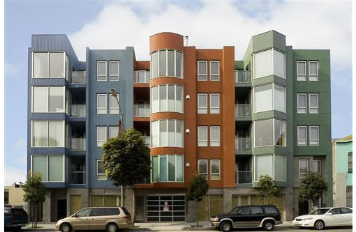
In July 2005, 525 Gough #105 sold for $881,000. Early last month, the Hayes Valley condo was listed for $929,000. And yesterday, it was reduced to $899,000. In related activity, 525 Gough #405 appears to have fallen out of contract and is now back on the market.
Is it something about the “05” units? The building? The block? The neighborhood?
∙ Listing: 525 Gough Street #105 (2/3) – $899,000 [Pacific Union]
∙ Apples To Apples In Hayes Valley (525 Gough #405) [SocketSite]

Personally I wouldn’t buy on either Gough or Franklin because those two streets with synchronized lights are so heavily trafficed.
OK, it’s all a matter of taste. But I’ve always thought it has a very unappealing paint job, especially for a building that’s otherwise fairly interesting.
899 offer price – 881 sale price = $18K, which should cover the obligatory 2 years of HOA fees plus buyers closing costs.
Something tells me the current owner got none of those bonuses in 2005 when he bought the place. So we’re right back to where we started.
hhmm,,,not sure if i’m liking the 3 buildings with 3 colors scheme. paint all the white doors and railings yellow and might as well go all the way. who might the architect be?
This type of geometry play on façade looks like it came out of a 2nd year arch. student. But I doubt that’s the only reason that the units are sitting.
Location, location, location. Gough St. north of Lombard is prime.
This building looks like it’s built with leggos.
All the more ugly as it sits between an empty lot and and an auto repair shop and is across from a 4-story parking garage.
The garage and ugly & cheap street level window materials make the whole thing avoidable. The street experience is worsened by unoccupied retail space.
It doesn’t stand on its own – it’s a bad looking infill type work which has nothing to buttress it or hide it.
In my opinion.
More architecturally interesting buildings tend to be more controversial and thus have a smaller potential buyer pool.
Hence cookie cutter condos. People might bash them, but people are buying them.
Unless you have a window unit facing the street, you feel like you are living in jail. The patios have high high glass walls as there is nothing to look at.
blah – you’re giving this architect a VERY big compliment by assuming it’s SECOND year architecture studio work. I don’t think it is FIRST year student worthy. Who IS the architect? I drive past this building multiple times a day and have for years and I still get the chills looking at it. I remember an architect friend of mine visiting from NYC last year and I had to pull the car over we were laughing so hard talking about the primary geometry and primary color “theme.”!!!
Invented – baffled by your comments. The limestone tiled ground floor and aluminum storefronts are the only GOOD part of this building! Atleast they didn’t choose granite tile or multicolored slate. It’s nice and simple and clean – I wish the same could be said for the joke that sits on top.
Will H – is this an “architecturally significant” building??? I’ve seen the units, and all that I see with this entire building is CHEAP, CHEAP, CHEAP.
toll – the building is not north of Lombard, it is just about as south of Lombard as you can get in the worst part of Hayes Valley.
“This building looks like it’s built with leggos.”
hehe, I was just thinking the same thing…
Why would the city allow something like this to be built, seriously!! Who would now be willing to take the risk and develop a decent project around this building? If this is not killing the value and potential of a neighborhood, I don’t know what is.
I love conceptual designs with digital applications in architecture. I think San Francisco needs to erase all the Victorians (all right, not all of’em), and finally take a step to develop its own language of “forms”. But what the heck is this? Every time I look at it, I feel like a testing animal taking some wicked experiment, and something is gonna jump out of the boxes and strick me if I don’t pick the color right…
Can someone tell us which office did the design? I would really like to find out what the architects’ design concept is behind it. Who knows, maybe Lego did put out the commission.
Why is everyone complaining about the facade ? There are the requisite bay windows after all 🙂