As we outlined in September of last year:
We’ve been fans of penthouse unit #613 atop the historic Embarcadero Lofts building at 300 Beale Street since we first featured the condo back in 2008.
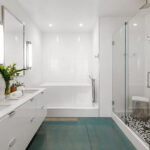
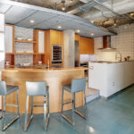
Having last traded hands for $1.92 million in September of 2017, “over $350K” has since been spent to further improve the upscale three-bedroom unit, including an upgraded kitchen; the installation of high-end, motorized shutters throughout; new glass railings; and two significantly upgraded bathrooms.
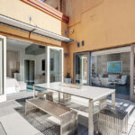
In addition to over 1,700 square feet of interior space, the modern unit also features a private 250-square-foot view terrace and an assigned parking space in the building’s garage.
And having just returned to the market listed for $2.098 million, an “at asking” sale would appear to represent appreciation of 9.3 percent for 300 Beale Street #613 since the third quarter of 2017, at least according to most industry stats, but it would actually represent a loss when accounting for the cost/value of the aforementioned upgrades.
Reduced to $1.998 million in October, the resale of 300 Beale Street #613 has now closed escrow with a contract price of $1.925 million, which would appear to be equal to its value in 2017, at least based on most industry stats and calculations, but not accounting for the additional $350K+ that was invested in the property between sales.
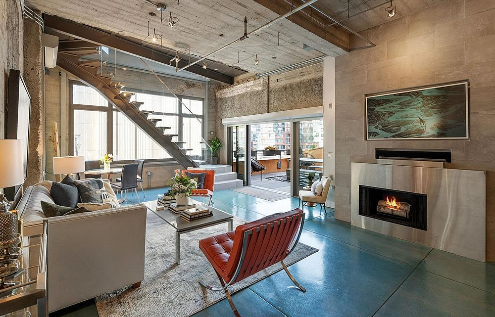



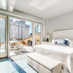
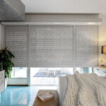
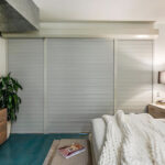

Wow. Huge swing and a miss with those shutters. Or are they blast doors? Either way they make an already uncomfortable looking space look even more cold.
Looks like concrete bunker. Taste is subjective. Maybe safer in earthquake?
I’d have put them on the outside surface (though I suppose the condo rules wouldn’t allow it). Must be pitch black when closed, which I would love.
Those shutters look better in person than in a photo. But, they do not seem to belong in that unit, period. They would be filthy with exhaust and tire residue if mounted outside as suggested by another Commenter. Believe me, at that location they will get filthy anyways with the current inside mount. But I digress.
As others have noted, their common in parts of Europe. You just hose them off from time to time.
I think it’s pretty clear that we’re about 15% down from the peak — not surprising when interest rates have doubled.
Those metal shutters don’t make any sense. They look like shutters I’d expect to see in Europe on the EXTERIOR. My guess is that’s what they wanted to do but the permitting for an exterior alteration was too difficult so they mounted them on the inside?? Also, the kitchen screams 90’s to me — looks outdated in 2023
Looking at the MLS photos from 2017, they made a few cosmetic upgrades (new backsplash, some cabinet reconfiguration?) but the overall look hasn’t changed. The industrial look has aged decently, but it still looks dated.
Wow, why all the negativity about this place. The shutters can easily be removed. This is a great unit in a great location IMO. The building is unique and interesting (vs the nearby high rises). An amazing sunny outdoor deck – most other units nearby have a small balcony if any outdoor space. And this little pocket of soma/south beach feels much more neighborhoody than the “east cut” area around the bay bridge.
Modern industrial. I think they targeted their buyer (guessing) younger “hip” couple working in tech. It’s an entertainer’s home and the balcony is where it’s at. The bedrooms are for sleeping but living room, kitchen and bathrooms floss well without being gaudy.
Don’t hate. Appreciate.
(the shutters should’ve just been verts)
Was in Europe recently and was a bit flummoxed by those shutters. I wonder if the sellers were European; you just like what you are grew up with. I tried to make myself like those shutters: definitely helped make lodging cooler in direct sun, esp as 90% of European places appeared to not have A/C, more secure, more darkness for electronics during the day, etc, but I think when it comes to light control I would far prefer blackout curtains or blinds. That said, the security aspect would be helpful if you are not in the unit often. I see it is fairly easy to access the balcony from neighboring balconies, in fact nearly a dozen other units appear to be several jumps away from being in your balcony. In that regard, maybe it might be nice to be able to lock up the shutters and not worry someone will break your glass?
Looked at the pre-remodel pictures, I can see why some of the 350K was not captured. Some of the changes are individual style, some are definite improvement, but not sure enough to add 350K. In the end, hard to capture remodeling costs unless you have a design that just blows one’s mind.
Not saying prices aren’t down though. They are down. Just chatting about design.
I honestly would have expected an entirely new kitchen for $350K. Hard to see how the money was spent, and thus, how it would be met with a decent return.
As outlined previously and above, the improvements included “an upgraded kitchen; the installation of high-end, motorized shutters throughout; new glass railings; and two significantly upgraded bathrooms,” with the kitchen upgrades representing a minor portion of the overall budget and return.
I’m more opining on how I would spend $350K on refreshing this unit. I’d argue that they did not deploy it most effectively from an ROI standpoint. But its impact on sale price, if any, was dwarfed by the changing market conditions.
In Europe, inside curtains and blinds of any taste are used in addition to the shutters outside. Shutters are manually mostly, using a belt on the inside next to the window for pulingl the shutters up or letting them down. One difference to consider: As opposed to our sliding half opening windows, Euro style windows are hinged at a side and swing open to the inside, so they can be cleaned. To complete the picture, there are also hinges at the bottom to allow cracking the window open: Select side or bottom hinges with a separate lever in the corner of the window frame, or use the more modern triple setting twist handle to pick window closed, hinge side, hinge bottom. It’s an annoyance when you’re trying to sleep off a last night bender and come morning, your neighbors are ratcheting up the shutters with a vengeance.
Love this unit. Reminds me of the lofts at the Dahl-Beck building at 580 Howard St, San Francisco. IMO, One of the better loft conversions at the time. The unit has a nice layout and finishes. I note the raised floor in the kitchen. I assume it was to accommodate the plumbing for the kitchen sink. I remember when this building was converted from a warehouse to lofts. I Also remember how pricey the units were when they came to market. Ground floor had a restaurant as I recall. I believe that space is now home to a Biolab company.
Can you smell the nearby water treatment plant from up there?
The metal shutters are weird, but there are about 4-6 units at 333 Fremont St. which have a view STRAIGHT into the bedroom.
This unit just sold again, for $1.91 mil. Fairly short hold!