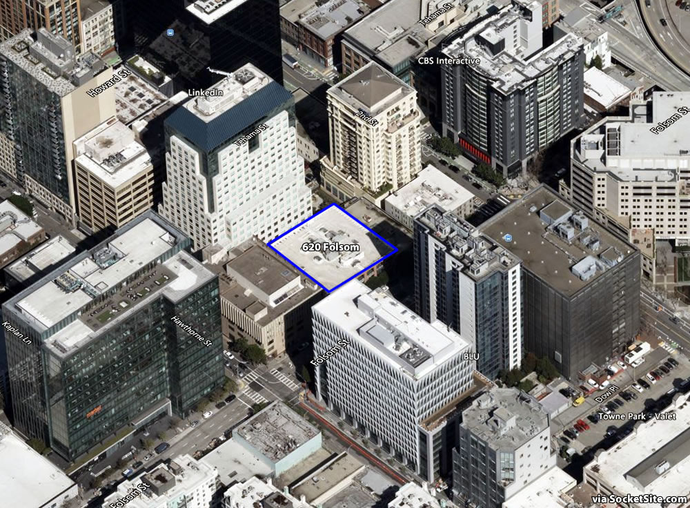
As we first reported last year, the preliminary plans for a 575-foot-tall, 623-unit apartment tower to rise on the South of Market parcel at 620 Folsom Street hadn’t raised any red flags or Code issues that couldn’t be overcome if the State’s Density Bonus Law was invoked.
In fact, the height of the now formally proposed 62-story tower has been increased to a bonus-sized 640 feet and redesigned to yield 826 rental units, of which 135 would need to be rented at below market rates (BMR), with a mix of 118 studios, 118 one-bedrooms, 472 twos and 118 threes over a basement garage for 133 cars and 282 bikes.
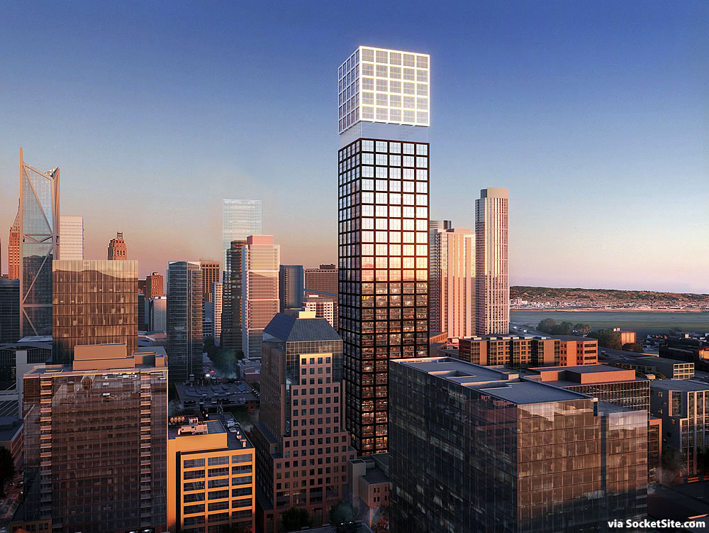
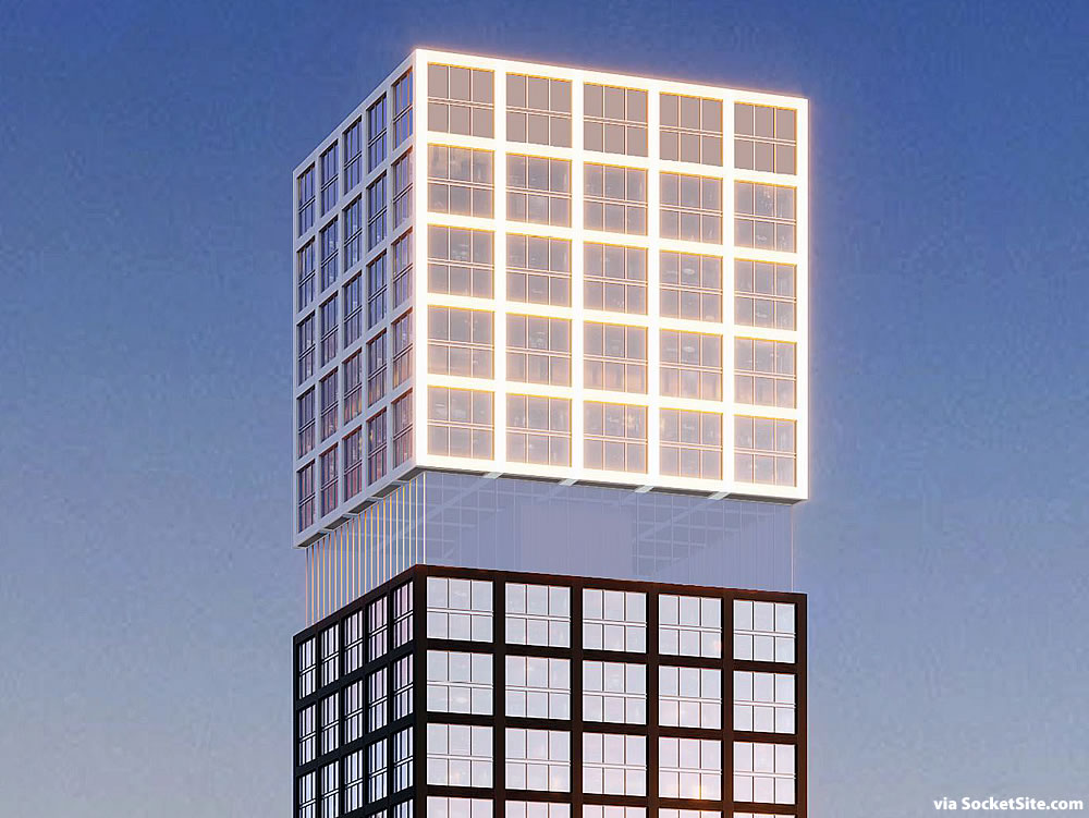
And as envisioned and newly rendered by Arquitectonica, above and below, the proposed tower would be punctuated by a floating mass of 112 of the building’s apartments atop a transparently framed amenity floor for the tower’s residents.
We’ll keep you posted and plugged-in.
I’m dubious as to how “floating” that mass will look in real life (if this actually gets built). I like the rendering though.
Me too. A casual Googling found no examples of something similar already built.
Yeah. When looked at from the west, the Park Tower in the area fades into the sky on blue sky days, other times of the day it lights up with the sunset. Its a really neat illusion. Not sure if this one will do the same thing, but if they can pull it of will look great as an addition to the skyline.
I’n wrong – its The Avery that fades into the skyline. I think it is also illustrated for effect in the first rendering.
The John Hancock building in Boston seems like a prototype.
It will look similar to the infamous “hole” in Arquitectonica’s design for Trinity Place.
In other words, it will become a victim of value engineering and there will be no floating…
good location. right next to Benu and Gold Club
I do like it…but it does appear to be a copy & paste of 432 [Park] Ave in Manhattan.
Disagree re: 432 Park. This is a very different design, would love to see it built.
Definite similarities, but not a copy & paste
All I can see is 432 Park, which is about the most boring high-rise in Manhattan… even the windowless 33 Thomas St tower is more interesting.
I disagree – 432 is an amazing design – this is not anywhere close to it. Details matter.
O. K. Rafael… if a zero visual interest is the new “detail”.
Yeah – I guess we have different options on what quality is. Enjoy Walmart.
beautiful and much needed. hope it gets built
UPDATE: A close-up of the tower’s floating cube has been added above.
I was only half serious in my previous comment implying that the floating feature would get value engineered away. After seeing this close-up revealing that the cube is held aloft by the center core alone I’m more convinced that this will not be built as rendered. I hope I’m wrong because the floating effect is interesting and engaging, but will cost at both ends of the P/L analysis.
Not sure how they’d pull that off. Non-reflective glass???
The glass will be reflective somewhat. The rendering is showing what it will look at under the optimum conditions. At other times of the day it will look more normal. I’m fine with an ephemeral effect. Its rarity makes it more special. Kind of like St. Mary’s “Two O’clock T****y”
This is an amazing proposal in a few ways. First, that area needs residential in a big way to bring more life on nights and weekends. Second, it’s excellent to see the mix of units being so balanced. It has just as many three bedrooms as studios! That’s rare these days. Great for working from home, younger people, and gasp, even perhaps a young family. Third, there’s a healthy dose of BMR. Finally, there’s relatively limited parking.
Looks cool. Good location for density. I wish we built more cool and unique buildings suitable for our fair city (and in the appropriate places).
The floor plate is only 18,000 sf, love the density and many things about the project, i wouldn’t want to live there but is it buildable, seems like the floor plate will be too small to support the project proposed. The group entitling the project isn’t a builder and is likely looking to flip
Tony, can you explain more about why the floor plan is too small? Is it that lots of small floors requires building up more, which is the more expensive part than building horizontally?
+1 on Panhandle Pro’s comments, this is great looking proposal.
It also has the potential to pulls some of the long planned goodness for Folsom’s that’s finally starting to happen further up Folsom.
Unfortunately, Arquitectonica’s buildings never look anywhere close to their renderings. Case in point — Linea on Market near the Mint. The renderings looked amazing — the result looks like a bland suburban office building
I really like that building. It’s significantly different than a standard residential building.
I don’t know whether Arquitectonica cheats on its renderings or they get whittled down by value engineering. Either way, they quite reliably disappoint on completion. It’s sad when I really interesting firm drops its standards.
The missing holes at Trinity were not a matter of cheating on the rendering. It was clearly a hole in the initial rendering and the builder changed the design after that rendering had circulated.
Levitate a part of a building Oh gee what could go wrong. Seriously FS
The world’s first maglev building!
826 units and parking for 133 cars and 282 bikes?
What works in NYC might not work for SF.
totally missing an opportunity to make that a 5x5x5 rubik’s cube at the top
Glass is always much darker and reflective in reality. Trinity was mentioned in the early comments and if you compare the renderings with what is actually built, they dont compare, everything looks pasted on and paper thin. This project should stick with the simple, tailored grid and leave the disappearing floors out of the design, it adds nothing.
A very reflective band below the white-framed windows might be kinda cool. Not sure why they seem to have pulled it back a bit from the face of the other floors — would be better flush with them. Narrow deck???
Exactly the same with Linea – the renderings are nothing like the reality, given how glass reflections actually behave.
On warm days, with the blinds pulled and cardboard flats stuffed into the windows for deflection/insulation, Linea presents one of the most derelict facades in the city. Most of the time, it is just a cold, dark, block-killing monstrosity that makes a Saitowitz maximum security luxury compound look cozy and inviting by comparison. Nice job, BSD!
“Saitowitz maximum security luxury compound” — that is an awesome line and I’m totally stealing it. I want to like his work as I love modern architecture — but his designs take it too far, especially given how unlivable the interiors are. Would you like a bathroom with wall mount sinks and absolutely no storage? How about a shower that opens up directly into your bedroom with hardwood floors that are guaranteed to buckle in a few years? Closets? Who wants closets? Nobody!
Saitowitz should do exteriors and let someone more realistic do the interiors. I like pared down modern design, but it has to be functional. Much of his work is not.
Call up Jean Nouvel and let him split slice and twist it a bit slanted more. We have enough of the postmodern stuff around the city……maybe a splash of well coordinated color or lighting? Or a dash of green? Maybe trees that hold up the upper section, or maybe a baby yoda statue levitating the whole thing… creativity sure does lack in SF lately… exterior glass shaft elevators? Or maybe some Tesla heliport and Amazon delivery center?
Actually a “hanging garden” at the gap would be a better solution than whatever magical cloak of invisibility they’re trying to sell here.
Or just paint the squares different colored and call it Rubik’s cube No.10 of all the mundane elevations we got plenty of these already in SF…magic tricks right now not needed pre earthquake unless it’s a dice faced cube and it’s flipped to a casino 🎰??
That would look amazing at night with just the cube lit up.
To those who missed it, there was a Weekend Update joke about this building plan on the last SNL (about birds flying into the invisible floor). [This] rendering was shown on the screen.