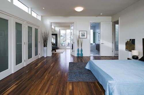
Damn, our tipsters are good. Four weeks ago we wrote, “2130a should hit the market within the next few weeks at a list price of ~$1.3M.” Well, it’s now on the market for $1,295,000. And as promised, it’s just shy of 1,800 square feet (1,792 to be exact).
∙ Coming Soon: Another Possibility In Potrero? [SocketSite]
∙ Listing: 2130 24th Avenue #A (3/2) – $1,295,000 [BJ Droubi] [MLS]

Boy, they did *not* try to appeal to the mass market here. You either love the floors or you hate them (I think they are too intense), and I’m sure someone will love the industrial IKEA look of the kitchen, but wow is that ever not me.
is it me, or does that master bath have two shower heads…but you’re standing in the middle of the bathroom? some people i think like that design. i find it very cold plus water sprays everywhere.
Boy, am I glad that there was no attempt to appeal to the mass market here. Attempts to appeal to the mass market yield nothing but homogenized results (Da Vinci Code, anyone?). Most listings look like they were torn out of a Pottery Barn catalog.
I think the floors are outstanding (looks like black walnut to me). The kitchen isn’t entirely to my liking, but I’m relieved that it doesn’t look exactly like every other kitchen everywhere.
LOVE the floor!
now if only I could add a zero to the end of my salary, and live in a place like this…
(Don’t care for the shower in the middle of the bathroom thing. I like my shower to have doors, so I don’t spray water all over everything?)
Nice job — any idea who the architect or builder was?
[Editor’s Note: The Architect/Developer is Michael Levitt.]
Floor is “warm walnut”. Love the look overall but would prefer a different kitchen. Props for trying to be different though.
The floors and the overall condo looks awesome based on the pictures. Boy would I kill for a rooftop where I can just hang out on a warm sunny day on the Hill.
The kitchen at first I thought “interesting” but looking at it again I think it’s pretty ugly. I think in about 3-5 years the kitchen will look even more ugly to people as this type of attempt to be different may look even uglier in the future. Nice try though but I still love the property overall.
I think the kitchen will hold up just fine…IKEA it’s not…European (Poggenpohl? Snaidero?), contemporary and design-forward it is. Besides, I know it’s hard to love a kitchen like that when there’s so many Stepford McKitchens with their “slab granite” and “stainless steel GE Profile” appliances and Studio Becker cabinetry…oh my