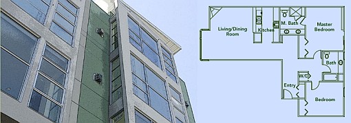
Eight months ago we plugged our readers in to the “inside scoop” on 368 Elm Street in Hayes Valley (“28 units in total with 2 bedroom units averaging ~1200 sq.ft. and offering 2 car parking”). This weekend, the sales office opened its doors, and lo and behold, 28 condominiums with two-bedrooms averaging 1,201 square feet and offering two car parking.
Features include: bamboo flooring and gas fireplaces in all living/dining rooms; Jenn-Air appliances and marble counters in the kitchen; and marble flooring, glass sinks, and walk-in multi-head showers in the master bathrooms.
As far as pricing and availability, Vanguard appears to be testing the waters with a first release of the six first floor units priced from $515,000 (studio) to $769,000 (1,249 sq.ft. two-bedroom).
∙ 368 Elm #101 (2/2) – $769,000
∙ 368 Elm #102 (1/1) – $549,000
∙ 368 Elm #103 (2/2) – $769,000
∙ 368 Elm #104 (0/1) – $515,000
∙ 368 Elm #105 (2/2) – $749,000
∙ 368 Elm #106 (2/2) – $749,000
∙ New Developments: 368 Elm Street [SocketSite]
∙ SocketSite Inside Scoop: Vanguard Turk Street Development [SocketSite]

Wow… these prices and specs make Hayes look ridonculous !
2 car parking !
That’s “lo and behold.” Unless you were punning on the fact that, damn, these prices are actually reasonably low.
[Editor’s Note: Yeah, that’s the ticket…]
I wouldn’t exactly call it “low.” The way the RE market is heading, I think developers are finally wisening up to “reasonable.”
The location is iffy, pushing the definition of Hayes Valley a little more north, with subsidized housing and projects as nearby neighbors.
Plus, as some other posters who share this pet peeve will no doubt agree, the living/dining is too small to work well as both together (you’ll be dining from your couch), while in the case of the plan shown in this posting, scads of square footage are wasted on hallways. Not just the main one but the one between the two bedrooms… call me a die-hard modernist, but if one is paying upwards of $1000/square foot, they better be bloody well worth it and not useless transitional space!
C’mon those drawings are obviously fake. I think the actual design is a perfectly lovely use of space. Who in their right mind would design a hallway that DEAD ENDS in front of the master bath. That has to be a fake, right? Oh it’s not? Oh, well that’s very different. Never mind.
I wonder sometimes who does the floorplan design in some of these projects. Why put W/D right outside a bedroom? There’s space in the niche opposite the front entrance. And a masterbath with shower only? And please save us from the angled fireplace placement — it just complicates furniture arrangement. Do designers and architects ever do focus groups?