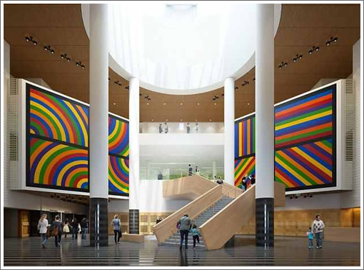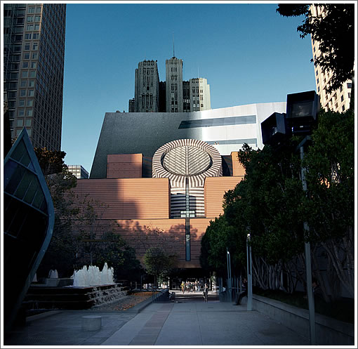
The design for Snøhetta’s new grand staircase to rise within SFMOMA which replaces Mario Botta’s original and will serve as a bridge between the existing atrium and the museum’s 235,000 square foot expansion has been rendered and is on display.
The stair spans a single rise, from the ground level of the Haas Atrium to the Art Court on the second floor, signaling that the continuation of one’s journey is directly ahead and keeping views toward that space open and transparent.
Rather than following a straight or spiral configuration, Snøhetta’s variation on a switchback design is inspired by the notion of traversing an incline. This zigzag movement will slow visitors as they climb through a beloved part of the museum and encourage them to pause and take in the beauty of the atrium and the art installed there.
Embracing architect Mario Botta’s original atrium design, the new stair will enhance the space for the display of art and allow a more direct experience of natural light streaming down from the oculus, which will be visible as a complete circle for the first time.
The expanded SFMOMA is on track for an early 2016 opening.

Ugh. The staircase is fine – nice even – by itself, but it’s a jarring contrast to the huge open space and the oval rotunda.
I don’t find it jarring at all. Much better than that cramped staircase before
Nice, nice. Very nice.
Nice indeed. Much more relaxed and museum-like. Less Busby Berkelely / Lord & Taylor.
Though they could finesse the joint where it meets the back wall.
quite nice. I like it, it is like the new musuem space is invading the old. If the could replace the 80’s botta floor that would be the major coup though… and I also feel than in 30 years, they’ll replace this with a straight stair.
I like it too. The original always seemed strangely corporate to me. I won’t miss it.
Loved the old stairway. This pretty much destroys Botta’s design.
I bet Botta’s pissed about all these changes…
Is it kosher to change an architects major project? Was he even notified, or are there any restrictions on what the museum can change? Just wondering.
How will the old atrium be used once the extension is complete? I thought the annex will include an entrance. Will the SFMOMA now have two separate entrances?
[Editor’s Note: While there will be a new entrance on Howard Street, “It is projected that the majority of SFMOMA’s visitors will continue to enter the museum from the main entrance on Third Street” (as linked above).]
Mario Botta was involved in the initial discussions about changes to the museum and he supports those changes.
The original stair was dark and tunnel like, not really very inviting to enter the upper galleries. The new stair is very open and inviting, at the same time allowing the new architecture to integrate and insert itself into the original space.
This is a great addition to the museum and will simply enhance the spaces and collection.
@poor.ass.millionaire I believe there is a set time for museums to maintain the status quo, and then they are free to make changes. This probably varies from site to site, and contract to contract. But one example is the change that the California Academy of Sciences has made to the piazza that was an integral part of Renzo Piano’s design. Putting a retractable roof over it made sense from a utility point of view but did indeed change the idea of a piazza.
Is the skylight bridge staying or going? It’s hard to tell from the picture.
The stair itself is rather unremarkable, if not simply restrained, but the space is quite nice. Botta’s atrium seems to flow naturally to the addition, without being overwhelmed by it. A nice balance.
Sigh. Some modern buildings age so well and become sought after (think Case Study homes in Los Angeles as an example) while other “modern” buildings seem dated as soon as they are built. Both the original and expansion SFMOMA are poor examples of modernism, and if anything represent two different schools of Post-Modernism.
Imagine if the sides of the staircase were clear instead of the heavy wood… might help this fit into the space a bit more organically. As of now, it looks “plunked” in there from another building.
I really like this design. Putting an element that contrasts with the existing architecture is always risky – in this case a heavy angular staircase in a round room. But to do it right, it needs to be bold. Half-assing these elements is the worst of all possible worlds.
I love the Jewish Museum – but there’s no way it would work if the architects hedged and decided that instead of a big blue diamond, they’d go with a smaller brick red diamond. It would not be a statement and would have been terrible. This is the same idea. Toning the staircase down by trying to make it disappear (glass railings) wouldn’t make sense. Neither would straightening it out. And making it curved would just be boring.
I also really like that it breaks the plane defined by the two pillars on the right. It seems like an integral element to the design.
As for the old staircase, I’m trying to remember it, but it keeps getting confused in my head with the gym staircase at Bakar – UCSF Mission Bay.
I loved the old symmetrical stair. The space was perfectly balanced and added a sense of formality. It also was more contained. This is more inviting, but one can argue that the lobby is distinct from the gallery and the lobby should remain distinct.
Oh well.
I agree Frog. Good design commentary.
Snohetta knows what they are doing and they highly respected in the world architectural community.
It looks as if an older building was gutted by a different architect and a stairway which wasn’t part of the original plan was carelessly placed for purely utilitarian purposes.
The new staircase beckons you to the work inside. The old one tried to steal the show.
Since everyone wants to know, what does Botta think:
When it was revealed in 2011 that Botta’s staircase didn’t fit into SFMOMA’s remodeling plans, The Chronicle sought a response from Botta via e-mail. He answered with chilly grace, writing, “The recent extension has been assigned to another architect. I was not invited to submit my proposal and now I don’t feel up to expressing any easy judgments on the choices made by a competent designer like Snøhetta.”
Translation…
The old staircase:
http://www.atmtxphoto.com/Portfolio/California-Gallery/i-6w3KWkh/A
I liked the old one quite a lot. Withholding judgement on the new one until I see it in person.
Disaster worsens. More Dwell Style in the public arena
I think I saw a version of this staircase at the Fresno Marriott.
Jarring and inconsistent with the interior and a banal repetition.
The staircase was central to Botta’s design, but I guess that does not matter after 20 years? There was a simpler stair proposed at one time, but it’s no better than the original as well.
The 80s floor is beautiful. Not everything from the 80s was a mistake, and not everything today needs to look like a pottery barn catalogue.
The old staircase was wonderful and mysterious. You knew you were going somewhere special. The now one looks like it belongs in an upscale Hong Kong shopping mall.
NotSatisfied’s comment about the Los Angeles Case Study houses is interesting. They were mostly built in the 40’s and 50’s with a few in the 60’s. They all seem fabulous now but they too went through their awkward stage. Twenty-five years ago they seemed drab and dated. Botta’s design has held up more consistently. I predict that in another 20 years the removal of the original staircase will be seen as a tragedy.
“Is the skylight bridge staying or going?”
Probably staying because it is so far above the remodel.