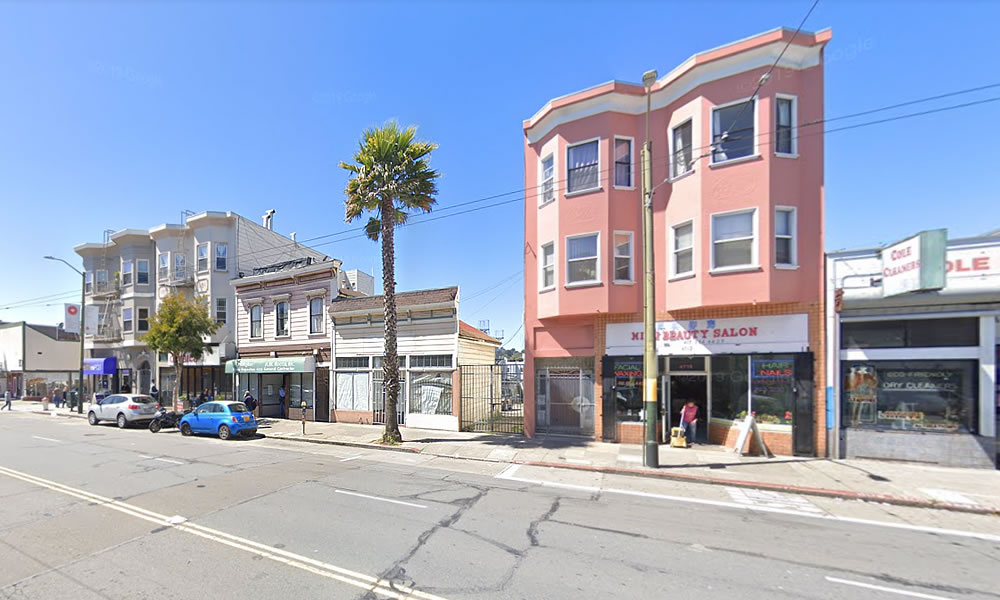
Plans to raze the two older buildings at 4716-4722 Mission Street, which technically sit on the border of Mission Terrace and the Excelsior, between Leo and Ruth and within the Excelsior Outer Mission Street Neighborhood Commercial District, have been in the works.
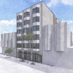
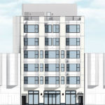
And as newly rendered by Stanton Architecture for the project team below, the proposed redevelopment of the site would rise up to 65 feet in height, the full height for which the parcel is zoned, and yield 24 residential units, 16 of which would technically be “accessory dwelling units” (ADUs), measuring between 436 and 898 square feet apiece, as a maximum of eight (8) residential units would be allowed on the merged site as zoned, along with 730 square feet of new retail space fronting Mission Street.
And while the project as proposed “complies with the applicable provisions of the San Francisco planning code and requires no exceptions of variances,” a Conditional Use Authorization will still need to be approved in order for the project to proceed as the existing two-story building on the site (4722 Mission Street) includes an existing dwelling unit which would need to be demolished and the residents of which would need to be relocated prior to the project breaking ground.


Ugly as sin.
Nondescript? Yes.
Ugly? No.
Agree bad visual after-taste….back to the drawing boards…
It looks fine, not everything is going to be a ground breaking (heh) architectural masterpiece. It looks kinda like 10 million apartment buildings that already exist in SF, but i guess those are all ugly as sin too or something.
Those bicycles look like they are buried in a foot of snow
I happen to love palms *in theory,* but not when they look like this. There’s a proper use for them, like the Embarcadero and Union Square, but not these skinny Mexican Fan Palms coming out of the sidewalk. Even LA is done with that aesthetic and planting proper street trees when these variety of palms are removed. It would look much nicer to create a bit of tree canopy with low maintenance, drought tolerant, smaller evergreen trees (nothing messy).
Now the ficus removal along 24th is a travesty. That’s the main aesthetic element tying together the entire street. I am so sad to see so many of them go. No doubt they’ll be replaced by something not suited.
Do you realize the Outer Mission starts south of Geneva Avenue? In the article, you pointed out correctly that this sits on the border of Mission Terrace and the Excelsior. I’m not sure why you mentioned the Outer Mission in the title.
We’re guessing it has something to do with the site being located on outer Mission Street and “within the Excelsior Outer Mission Street Neighborhood Commercial District.”
Any reason they could not adaptively reuse the existing facades that have character and scale vs the new building which is a behemoth and shows zero material or scale and transition?
Adaptively reuse some mediocre one story false fronts? Why? Just to make the project an even more expensive mishmash?
And why worry about ‘scale and transition’ on a commercial corridor that already has lots and lots of scale mismatches? Build this one big, then demolish the excelsior crud around and build THAT up to ‘scale’ with this.
Start at a decent scale, you have two existing decent possibly historical store-fronts. (Still needs accurate documentation) and to date nothing has been reviewed by SF Preservation, nor any analysis by the initial submitter on Jan 3rd 2020. If its not historic than it goes, if it has merit, than they should have reviewed this and had some indication on what is in store process wise. There is enough “crap” in the area architecturally, and we can push for better, I am all for re-skinning buildings, and there are already a number of new condo type units that have been built including ones recently near Geneva that could already go under the face-lift knife. We do not need more of the usual mish-mash of crap that we have seen over and over again in the district. Stanton can do better.
Agree with Goodmaab. The new building should include the current historic facades and be no more than 3 floors.
And please stop showing palm trees in renderings it’s truly not what the neighborhood has discussed for streetscape improvements…
It sure looks like the palm tree is already in place…
It is there, it just does not fit, and palms were something Willie Brown loved, but serve no real shade or purpose… Excelsior outer mission discussions we had on this noted to plant trees not palms… If they can replace ficus trees they can do the same with palms…
There is literally a palm tree there currently
There is also a historical two buildings possibly on the site, that did not negate the developer and architect from showing it removed. We can hypothesize that we need to remove it due to height/age and lacking shade.
Call this my naivete about architectural design but is grander architectural design inherently attached to increased cost to build and market rate of units?
I’m a native San Franciscan and grew up in the Excelsior and it feels like there is an expectation that every proposed building look like a luxury development. There is nothing luxury about the Excelsior (AND THAT IS OK) and i can’t imagine those who can afford luxury living are looking for a condo in the Excelsior as opposed to looking for a renovated single family residence since they likely fall in the same price range.
These days I’d much rather just see development that is affordable and responsive to greater masses, designed to a community/neighborhood at large and less on luxury and over-designed facades.
there is nothing luxury about 436sq ft ADUs, and this is likely to be 3-4x less than a renovated SFR. this is exactly what needs to be built all over the city. at $1000sq ft, a unit might be priced under $500K, which is unheard of currently in the city
I was referring to the quips about the building being ugly and a sense that the building itself needed to be of a greater level of design and aesthetic. No argument at all about the sizing or price point, just a response to a focus on aesthetic which is far better than the aesthetic of friends and family leaving, and others falling into desperate straights over the cost of housing.
they better get 2 really good murals on those upper walls or the neighborhood will do it for them
There is an art excelsior group near Geneva with some excellent muralists working there… They may need to paint the front as well, unless they up the game on the details/concept and materials…
As long as Bottoms Up and Sippin are not affected