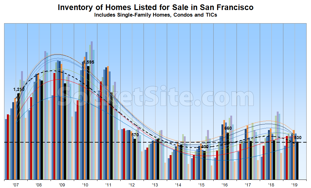
With a typical seasonal nadir now a week away, the number of homes listed for sale in San Francisco has ticked down to 530, which is 4 percent fewer than at the same time last year, driven by a drop in listing activity along with an uptick in sales.
At the same time, the percentage of active listings which have undergone at least one price reduction has ticked down to 18 percent, as is typical and even with the same time last year, while the percentage of homes on the market with a price tag of a million dollars or less has dropped to 32 percent, which is down six (6) points.
Expect inventory levels to jump after Labor Day and peak in October, after which the share of listings with a reduction should pick up steam. And yes, while there has been an uptick in recent sales, at least in the absolute, year-to-date sales and contract activity remains down, year-over-year.
Those trend lines are looking wacky.
Remember about six months ago when the editor drew them swooping upward toward 2010 levels? Guess that didn’t happen, and comments rightly called out how silly it was. The headline should read “lowest mid-August inventory since 2015.”
Perhaps you don’t understand how trend lines work or are “drawn,” but a funny thing happens when the trend changes: the trend lines, which are based on the underlying data, change as well!
Well, except you used to draw them “projected” into the future and sweeping up to 2010 levels. Interesting that you stopped drawing them that way. You can see from the data that the trend as been pretty flat seasonal inventory levels since mid-2012. Some months see a bump up, and some see a dip down. That’s called “noise.” No need to try to overlay misleading “trend” lines.
That’s incorrect. The trend lines are still base on a polynomial function, as they were before, and “drawn” in the same manner. What actually changed was the trend, which subsequently changed the “sweep” of the trend lines. And no, inventory levels haven’t actually “been pretty flat [on a seasonal basis] since mid-2012,” at least not based on the actual data at hand.
The previous smoothing function only allowed for a single wiggle in the so-called “trend”.
If you can’t see that the smoothing function was changed, you have no ability to read a graph.
The number of inflection points, or apparently “wiggles” to some, is based on the underlying data and actual trend. And when the actual trend changes direction, care to guess what happens to the direction of the trend line?
You are lying, or have been lied to. The previous chart fitted a cubic polynomial to the entire time series. A cubic polynomial can have one local maximum and one local minimum (and a single inflection point, since you seem to like that word). The new chart may also use a cubic interpolant locally, but it has a least been windowed so you’re not trying to fit a bunch of history into four parameters.
There was at least four months where the smoothing spectacularly failed to fit the data points with several commenters pointing out the error. Finally somebody at SS took note and fixed it, but it’s clear that for four months you were not actually looking carefully at the graphs you were publishing, or someone on your team would have caught the error. Why not admit your mistake and move on?
@heynonnynonny — Do you understand how a curve fit works?
The order of a curve fit does dictate the maximum number of “wiggles” that the fitted curve will have, but it will not add “wiggles” that the underlying data does not have. It looks like the underlying data took a wiggle which the curve fit was able to capture.
Look at the red and blue month curves vs the other months. Presumably all the months are using the same curve fit algorithm?
@greznick the curve fitting bug was fixed about six months ago so it doesn’t show up in this month’s graph.
I am bringing it up because the editor is claiming that it was never changed, which is simply dishonest.
Here’s before the change (including the comments that finally got it fixed).
Here’s the next month. Note that the smoothing on the left side of the graph changed significantly, not just the right.
Go back a few more months to see commenters who were actually looking at the broken graph trying to get clarification from the editor, and the editor dismissing them. The people building the graphs for this site appear to be amateurs.
And ALL of them pending in less than 2 weeks tops
And yet, the average (not “top”) number of days the 530 active, non-pending listings for single-family homes and condos in San Francisco have been on the MLS is currently over two weeks, at least based on the actual data.