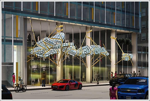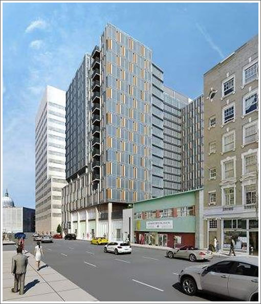
While Defenestration’s flying furniture days are numbered, a canopy of thirteen steel and glass piano sculptures has been commissioned to hang from the façade of 55 9th Street.
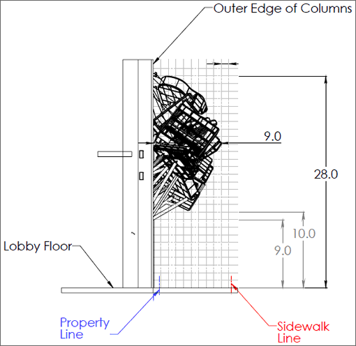
Designed by Brian Goggin with Dorka Keehn and entitled “Caruso’s Dream,” the permanent installation will extend up to nine feet over the sidewalk as proposed.

Per Section 136 of San Francisco’s Planning Code, certain categories of building features are permitted to extend over the public right-of-way, but artworks are not. Today, San Francisco’s Planning Department will decide whether to approve the requested variances required for the canopy to be installed on the facade of the building that’s on the way:

∙ Defenestration’s Days Are Numbered [SocketSite]
∙ 17 Stories And 273 Rental Units Ready To Rise At 55 9th Street [SocketSite]
∙ Hugo Hotel’s Flying Furniture Update, No Word On The Graffiti [SocketSite]
Less is more in this increasingly interesting area. What’s the point?
Clever way to get “free” advertising for the building, but I highly doubt it will be approved.
It will be approved, but Planning will recommend changing the color scheme so that it frames elements of the neighborhood better.
Does it reflect the cultural diversity of the area? What does it do for economic justice?
Uh Earthquakes?
It may not be my favorite piece of art, but I hope it gets approved.
It’s unique — I approve.
“Uh Earthquakes?”
Uh seismic standards?
Cool.
I dont know enough about this to have any sense of this being approved or not
Injecting some fun and interest into a standard building facade – Bravo!
What nit-wit spent time coming up with this? Looks vulgar and unnecessary. Is the building that poorly imagined that you need this sillyness?
SF has indeed jumped the shark.
Opinion on public art subjective, a lot more subjective than the term “jumping the shark.” Here’s an ipinion. It is too bad what the Internet is doing to writing. Monkey see, monkey don’t.
The flying pianos make me respect the Crown Zellerbach building more every single day. A well designed modern structure should not need flying pianos to stimulate visual interest.
Speaking of new appreciations, although I was less than 8 years old when these two projects were built, at least the “Art” both in the lobby of the Hyatt Regency and the Embarcadero Center by John Portman seemed appropriate for where the pieces were located within the structures. Sure, both projects speak a design language of the 70s, but what is wrong with that? What is right is appropriate sized art pieces in settings that allow the public to pause and enjoy what is being displayed.
I feel the flying pianos would be best enjoyed passing by in a car at 35mph, for that is how much thought seemed to go into this project.
Nice idea for public art, I like it. Shame that it will be attached to such a boring building.
Like my mother always said, if you don’t have anything nice to say, don’t say anything at all.
How ’bout moving the flying pianos to the awkward corner of the Civic Auditorium at the end of 9th Street. There would be more context — and it would momentarily allow us to forget the ugliness of the backside of the building facing major Market Street — and would add visual interest (such as it is) to the Mid Market stretch.
And I think the Crown Zellerbach building is a great building. It has lessons to teach, for sure, and I think I know some students in need.
Good grief, so many nay-sayers. A little whimsey on an otherwise boring building facade can surely be tolerated.
What could possibly go wrong?
“What could possibly go wrong?”
I think that might be what the artist is trying to express here. A piano falling from the sky and onto the pavement is a cliche of early 20th century cartoon and slapstick comedy. Everyone knows it, no-one has ever experienced it.
The Straight Dope actually addressed this meme recently: http://www.straightdope.com/columns/read/3101/has-anyone-ever-been-killed-by-a-falling-piano-or-anvil
I think that we can rest assured that this sculpture won’t come crashing to the pavement. The same artist installed Defenestration which has proven to be quite solid.
Are flying pianos any stranger than the floating book lights on Columbus and Broadway? I rather enjoy that art; but I wonder how much negativity that idea was faced with…
Approved . . . . They’re installing them as of just last Friday 11/15. In fact, almost done.
It’s abominable. Ugly doesn’t even begin to describe it. In this day and age of high priced rents and purchases of homes, I simply can’t get my head around why the building owner would shell out extra cash for something so frivolous and useless. I drive by this every day, and I have to say, I cannot even begin to understand what this is supposed to say to the SOMA community. Someone’s pocket got very heavy with this variance/approval. It’s shameful that our system is bogged down with non critical issues like this that serve no apparent purpose. Can you imagine if one of them falls on someone? So risky, and for what.
And it looks like the artist has connected with another viewer.
SFAnnie – If you think this one through you will see that although your conscious mind doesn’t understand this piece, the artist tunneled directly through and spoke to your subconscious.
Altogether a sign of a very successful piece.
Personally, I think Annie needs to dial back the hyperbole a bit (or stop driving down 9th Street).