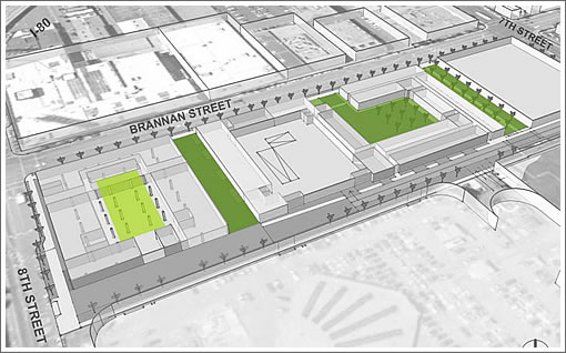
Representing a little over half the 824 housing units proposed to rise across the full project area, and as has long been massed, David Baker + Partners has posted their preliminary design work for 801 Brannan which includes a “SFMade local-food marketplace,” multiple green spaces and a redwood grove.

The last we heard, the goal was to get 801 Brannan built by 2014. And as plugged-in people know, SKS Investments is seeking approval to convert 257,243 square feet to office use “suited to technology tenants” at 888 Brannan across the street.
IS this going to replace the small convention center in that area? I’m having a hard time figuring out the location of the building when they have the Xynga building right next to it. I had no idea Xynga was on Brannan.
Zynga is not on Brannan. The rendering is looking north on 8th Street.
Ruh roh. David Baker’s buildings are like Ikea products. They look catchy out of the box but they do not age well.
I concur with stucco_sux. David Baker design become eyesores within a matter of a few years.
Could this be any more pedestrian..?
I disagree completely about your takes on David Baker’s work:
His firm has the ability to create interesting, exciting, fresh, expression forms of modern urban architecture, OFTEN for public agencies with very tight budgets and time frames. His works offers rich colors and a variety of materials used to elevate the visual status (often) of low to moderate income housing. He does an outstanding job.
Show us examples of where his projects have become eyesores, not aged well, and “look” pedestrian.
I would encourage you to learn more about what makes good urban architecture, on a budget.
^ OMG I agree with futurist!
Please name names of buildings that aren’t aging well. I have wondered about some of the colored plywood effects (I think) that he’s used, but I haven’t noticed them aging badly, but maybe I’ve missed something.
In general I’ve thought that he’s produced smart, simple, good-looking designs, many for non-profit housers on a strict budget. He seems to excel at taking pedestrian materials and making them stylish. Not an easy task.
Compared to some of the truly hack architecture in this town, I think it’s hard to single out David Baker for criticism.
Shocking isn’t is that we might agree. It happens.
And yes, I agree with what you said. The panels you mentioned, that Baker often uses, are most likely “Trespa” panels, phenolic resin panel, laminated, for exterior use. Very low maintenance and resistant to color fading and warping. Good stuff.
@oscar and @chriso…Duh…the rendering is on 8th Street looking at Zynga from the corner where the B of A bank is located. The building looks to replace the Concourse Exhibition Center.