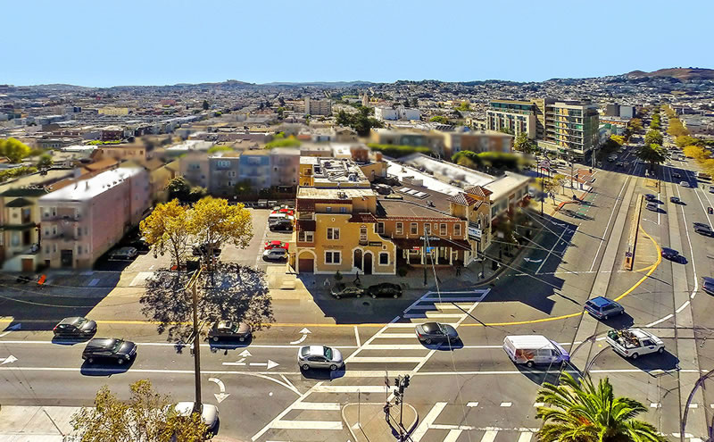
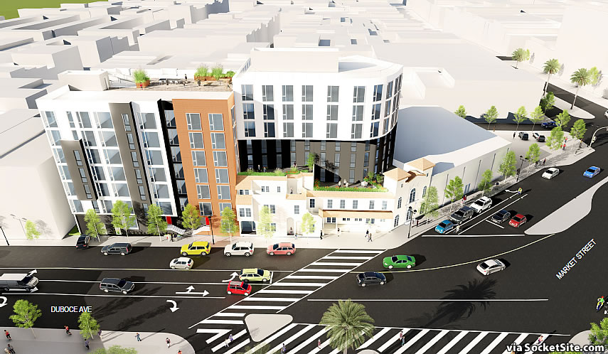
The plans for a 96-unit building to rise up to 85 feet in height at the intersection of Market and Duboce, behind the historic façade of the former Gantner Brothers’ Funeral Home building at 1965 Market Street, which was built for the funeral home in 1924 and converted to commercial space in the 1970s, have been drafted.
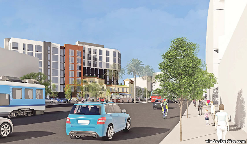
As designed by David Baker Architects for Keller Grover Properties, the proposed development, the plans for which we first revealed last year, would result in the construction of a seven and eight story building, with 96 new condos over 4,000 square feet of new retail space and underground parking for 47 cars.
While the corner portion of the 1965 Market Street site is zoned for development up to 85 feet in height, the current parking lot portion is only zoned for 55 feet, but project team is proposing to invoke California’s Affordable Housing Bonus Program in order to build the seven stories along Duboce as proposed.
That being said, the Planning Department is recommending that the height of the project behind the existing façade along Market Street be reduced to six stories in height and further setback in order to avoid overpowering “the existing spatial relationships and features” of the historic resource.
The development does not include the adjacent Pet Food Express parcel nor its corner parking lot.


Keeping that facade is a joke, well done San Francisco…
Not really. I definitely hope they keep the existing older building facades. It offers a nice scale breakdown at the street level.
I enjoy the existing facade; I’m glad it’s being incorporated.
David Baker is so bad…
For a firm who is “so bad”, they are sure designing a lot of good, urban infill projects here.
I wouldn’t say “a lot of good” projects; I’d say a couple good, a bunch mediocre and a bunch that are “so bad”.
would like to see this be a few stories higher. this area has best public transit in SF
What they should do is keep all, or a lot more at least, of the old building and let them build higher on the parking lot.
i’ll tell you what’s a joke — that monstrosity across the street, a tetris assemblage of some 25th century prison, seriously the ugliest building in SF — considering that thing is a neighbor, i’m all for keeping the old facade.
Funny, that’s my favorite building in the neighborhood and I often stop to admire it — especially the juxtaposition with the two little rowhomes and the big white older building up the hill, across from the Mint. No accounting for taste.
Agree with Scott, that building is very well done.
Looks like an IBM office building…..
Its amazing that the dreary, cookie cutter One Henry Adams Apartments are so sprawling that they reach all the way to Mid-Market.
They’re not dreary at all, but interesting, energetic with a variety of façade expressions.
Is there anything being built today in SF that you actually like?
Yea lets cut out a third of the units so we don’t crowd the fake Mexican stucco on 2 x 4’s, a precious 90-year old building. I suppose the Planning Department heard that Gantner was the undertaker for George Washington and we must kneel before this stucco pastiche forever. That would say the GW “slept here.”
Ohh, you must be from DC or VA! (’cause yeah, that type of BS is all over the place back home)
The way those upper floors jut out when looking south looks really awkward.
Lots of awkward new buildings in this area now IMO and I agree this will be another. I think it is a combination of a lot of mass next to smaller buildings coupled with the elevations and various streets coming together from different angles. some spots I just look and think it really looks ugly and I am pro-development
Not a fan of of the building the new Whole Foods is in from many angles and the Venn next to the LGBT building looks pretty ugly
Yeah, I’m usually in the “make it taller” camp, but that overhang is very strange and dwarfs the older facade in an ugly way.
Good god just let them tear down the existing crap structure
The Pet Food parcel and parking lot is what I’d like to see built on with at least 10 stories. Then this building will be nice background and aid in the cluster/peak of height at the end of Dolores St.
Too bad this is not a more comprehensive development of that block incorporating the Pet Food Express/parking lot parcel. Certainly, they are not long for this world and any future building there will be an awkward fit.
I actually think this type of development within constraints is valuable because it preserves (to some degree) a level of fine-grainedness that is important in vibrant urban neighborhoods. Developing ‘superblocks’ with sprawling developments taking over entire blocks is more straightforward but less desirable in my eyes.
It’s ugly, too tall, has what looks like a weird overhang, and makes no attempt to interact with surrounding buildings. Redesign please. Most people in SF are against these developments.
Proof, increasing government control is going in the disastrous direction predicted by Ayn Rand….. What a monstrous bastardization of a structure.
I for one applaud keeping this garish Mexican stucco. We need to save more architecture that looks like a San Jose strip mall.
Now that I think about it… might be symbolic of the current economy.
Tired of Baker’s trope of flimsy stucco & wooden buildings. This prominent site requires a more sophisticated design and materials. This design is indistinguishable from forgettable buildings like the Venn. The poor juxtaposition of the old and new building makes each look worse rather than enhancing both.
Totally unimpressive – if Baker was going for a stark and institutional look he accomplished that.
Sure, the former funeral parlor is “faux”, but it is interesting to walk past and a break from the monotony of most older SF buildings.
But, if you are going to save that building, why doesn’t the new building try to at least compliment it – instead of being a jarring backdrop?
The flat roofline is an obvious example – the architects don’t even try to do the obvious as in pick up on the two classic caps atop the old building.
The overhang of the new building, as seen in the last rendering, is pointless and more so given there is no complimentary element at the rear of the building which is a flat wall. It makes the overhang look totally out of place and pointless.
Planning needs to ask for a complete re-design.
If they can build 400+ foot at monster’s hub just a few blocks away, certainly they can go up to 150 feet here…share the wealth!
Difficult call. I wonder if much of the SF planning code needs to be rewritten. The city’s been quite guarded about it’s architectural history for about 40 years, and now it’s build build build. I’m not sure SF can move the population towards one mil and still retain all the old facades. This one is nice, and yet here the old and new do clash. Perhaps the old and new, if they do keep the old, could be the same color scheme at least. It would harmonize the old and new visually.
To be blunt, there is not much architectural history to be guarded about. Aside from Victorians and Bay windows. The brick buildings were largely destroyed by the quake and can’t be replicated today for seismic reasons. There were a few beaux art “hi-rises” such as the old Pacific Bell building, but those were very few and far between – SF was not a Detroit.
The largest collection of pre-1900 buildings on the West Coast is in the Willamette valley and its more than Victorians – there is gingerbread, carpenter’s gothic and many more styles. That to be is an architectural history to be guarded about.
The existing building on this site is “faux” but saving that façade is important. Because it adds an interesting, visual element, to the streetscape. To the neighborhood.
I agree the planning code needs to be redone – but not with the goal of squeezing a million people into SF – which I hope does not happen.
The code needs to be redone with attention to making buildings interesting, visually appealing – and not off-putting – enhancing the streetscape and greening the city wherever possible.
“Victorians and Bay Windows” make up most of the older parts of the City. I’m not sure a few scattered farm houses are that much of a legacy anyway. If you are talking about Oregon cities, most of them are not architectural treasures, either.
I’m not advocating for a million, but it does seem like the city will get increasingly dense.
Why not advocate a million? That’s easily doable without at all compromising the ambience of the cities most desirable smaller-scale neighborhoods like Noe and Hayes Valleys, Pacific Heights,the Haight/Castro and Mission etc. But the advantage of higher levels of density in the city overall would be more of what makes city living desirable: The 24/7 hustle-bustle that means in dense cities you can go out at 3 AM and find someplace open and ready to satisfy your shopping/dining wants, and also the audiences for the arts, culture and so on. San Francisco has plenty of room for all that in the downtown and along major transit corridors like 3rd St, Van Ness and Geary Blvd, if we stop under-developing parcels.
There is a whole section of SF from SOMA to Hunter Point is/was underutilized
We could have build mid-rises for miles if we so choose with transit investments while protecting every bay window
I hope there are a lot of architectural styles in the Willamette Valley, given that it is 150 miles+ long and has maybe 3 million people. Other than that, totally fair comparison with SF.
Oh there is. Starting with Eugene.
The point remains that there is a paucity of styles in SF and not many historic buildings. Partly, granted, for seismic reasons. Its why many here get upset over saving facades in SF.
The Planning code needs to be redone with the revisions that do NOT allow any and every citizen to be able to comment and critique every single building and every single design issue, ad nauseum.
OR…Why not take some of the better parts of the old facades, and turn them into a fountain, or two, which could dot the place. That way, the old would remain around, and the fountains could hopefully qualify, additionally, as the project’s public artwork. Frankly some of the other “artwork” I see around…
Hideous mish-mash of a design.
Not every building needs to be a showstopper, but this proposal just falls like a bag of quickcrete that has been left out in the rain. Baker may know its way around SF housing politicking, but projects like this make me wonder if the firm’s work will end up like the 70/80s, unadorned, single-paned, flat stucco apt buildings that blemish so many neighborhoods.
Any updates re: recent neighborhood meetings / Will design change as result of feedback? Fill us in!
UPDATE: Formal Application for Bigger Market Street Building Filed