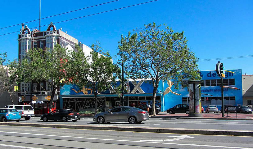
A plugged-in tipster delivers the latest renderings and inside scoop for the proposed 162-unit building to rise at 1699 Market Street, the Market Street parcel upon which Flax currently stands.
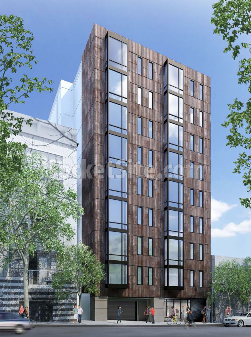
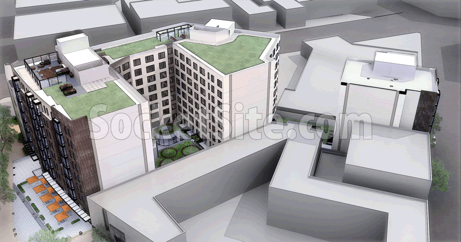
As designed by Solomon Cordwell Buenz (SCB) for the developer, Urban Communities, the nine-story building will rise to a height of 85 feet, with 4,500 square feet of ground floor commercial space and an 86-car garage accessed by way of Stevenson and McCoppin Streets.
The developer will be long-term leasing the land from the current owners of the site, so the entire development will be rentals, at least for now.
And the public hearing for the 1699 Market Street project, which was originally scheduled for this week, has been rescheduled for March 24.
Wow, could that be any uglier! Why doesn’t it address the city street in a more cosmopolitan fashion? Flax is retail and works well there.
It’ll still have street-facing retail. And it’s a clear improvement in how it meets Otis in the back, compared to the current Flax parking lot.
wow. i really like that design.
I thought for sure they could incorporate the wooden guy in the facade…would have be uber cool.
Clean, urban design. I love Flax and get all my supplies there, but times change and their suburban style building and lot is perfect for new housing. Good addition to this part of Market St.
Actually quite a refined design, especially like how it steps down to its neighbor to the left. Also appreciate how there is variability to the facade but it doesn’t look like 3 buildings jammed together like some other designs around town.
Nice reserved design, great TOD site, improves the streetscape, will greatly improve the cosmopolitan design of the neighborhood. And we don’t lose Flax! (Moving across the bay to new digs).
Really people? It looks like a mid-Florida Hilton Garden Inn.
Yes, really. There are some intelligent voices here who understand and appreciate good, solid urban architecture.
And without offering any valid commentary, you smugly choose to compare it to a suburban motel chain.
This new project uses the simplicity and quietness of 3 materials only; metal or tile vertical panels, aluminum/glass crisp, square bay windows, and metal clad panels at the top to soften the shape against the sky.
No exotic tricks, no over-design, no flamboyance: just good solid, modern design.
Hell of a lot better than the Travelodge nearby.
It’s a shame the rendering doesn’t well show how it addresses the context of the unique facade next door but it appears to do so rather well due to the brownish tile or panels.
The horror are the jail size windows, is it because they belong to two different rooms or is it two narrow windows belonging to the same room? I’ve been in a Nema studio where the only outward facing wall has two small windows, why not one huge window? It suffocated me. I’ve seen modern buildings in other countries with gigantic windows almost entire walls of windows. Oh wait, those rectangular tall windows are intended to remind people of Alcatraz…
You don’t have to go to Oakland for FLAX. They have a 5,000 sq. ft. space at Fort Mason Center, and appear to be doing a land office business.
The new Flax at Fort Mason is outstanding.
Not very pretty!
Heavy as a brick house….. (not any lighter in the ground floor retail?)
orange umbrella’s don’t make it any cheerier…..
I’m not mad at it but have always hoped that whoever redeveloped this, and the adjacent Travelodge, would subtly nod to the United Railway Powerhouse / Market St Cable Railway that once stood there.
UPDATE: Major Market Street Development Underway