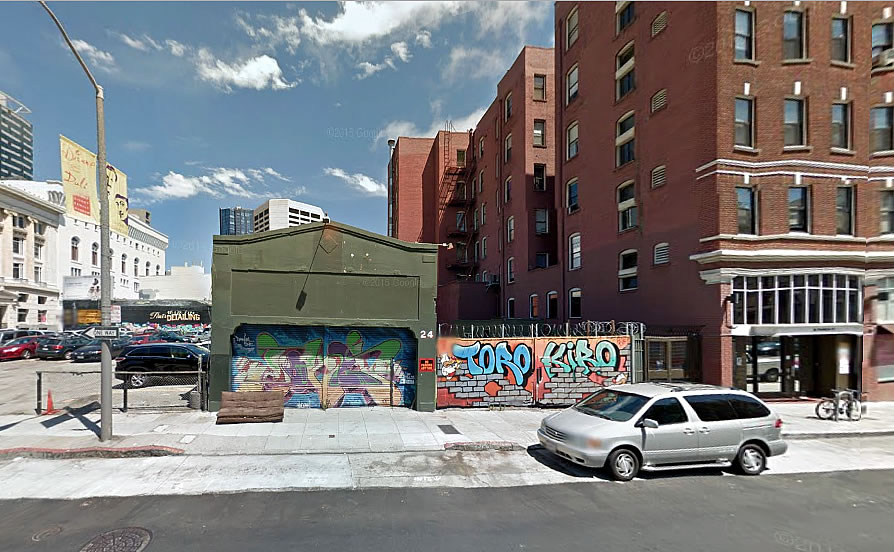
The old Jaguar with working headlights that long-adorned its façade is gone and plans to raze the former Franklin Auto Body Shop and construct an eight-story building, with 35 condos over 2,100 square feet of retail space across its parcel and parking lot at 22-24 Franklin Street, could be approved by San Francisco’s Planning Commission in two weeks time.
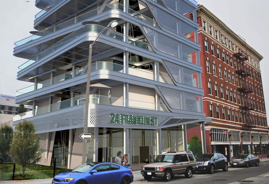
The Hayes Valley site had been on the market with a modern conceptual rendering:
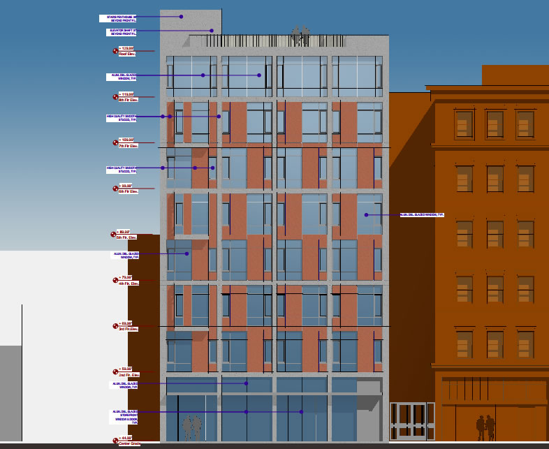
But the proposed design, which doesn’t include a replacement garage or parking, is a bit more pedestrian:
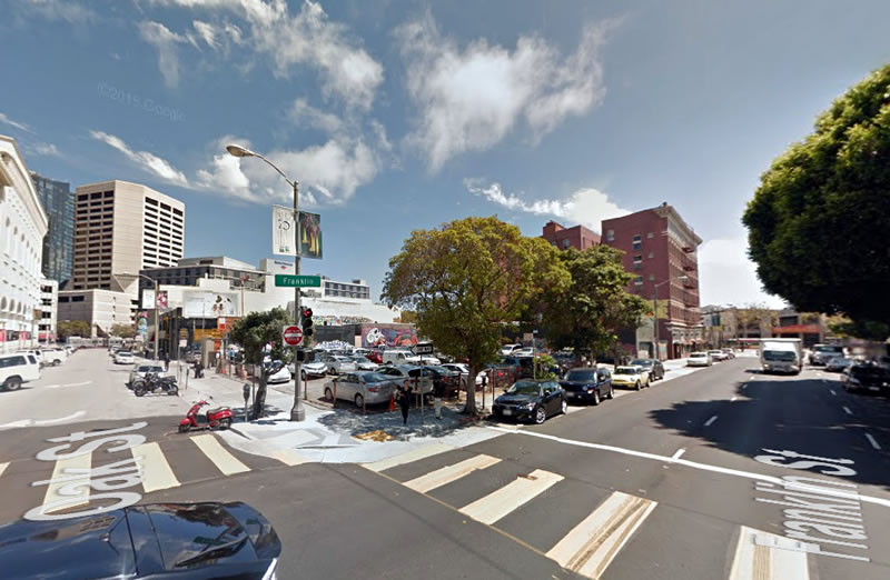
And while formal plans to develop the adjacent half-acre parking lot at the corner of Franklin and Oak have yet to be submitted to Planning, the 98 Franklin Street site is also on the market and zoned for development up to 85-feet in height.


LOLWUT on the original design. Looks like a stack of Office Depot mail drawers.
jwb – hilarious! I could not state it better!
Haha, nailed it!
Your comment just made my morning!
LOL.
Still cooler than the stack of beige cardboard boxes conceptualized below though. 🙂
I would like it: in Kobe, Oslo, Silverlake. Even Fishermans Wharf. Here. .. not so much.
Certainly this site can take more density than 85 feet, particularly since there are 400 foot towers planned just down the block!
and a block from a subway station
Yes, but unlike those towers, it’s not on Market or Van Ness, so the zoning is more “neighborhood” scale.
You might have a point if this were Oak Street or Laguna, but Franklin is a one way arterial here.
The complaint by some are the proposed towers at Van Ness/Market. Just blocks from low rise neighborhoods. Especially on the Mission side. An abrupt increase in height which is out of place here.
Exactly so, along the south side of Mission at Lafayette the building are 45 feet! and a half block down to Minna they are 40 feet!!
Then, raze them and build to a more appropriate (taller) height.
awesome design
Great design.
original design looks like a neil denari concept, the later version appears like a kwan henmi.
either way, will need to pay into the transit bucket, since the Muni and BART is overstuffed. and we need a second bored transit platform on both inbound and outbound for all this housing.
unless someone is ignoring transit conditions currently, including the congested bike lanes?
Hard to read the labels; what is the reddish material? Is it masonry or something to tie into the existing adjacent building?
[Editor’s Note: Stucco.]
The city should have hired this “modern conceptual rendering” guy for their 30 Van Ness brochure.
Just how does this awful design interact with neighboring buildings? This is a continuing trend in SF – mediocre plans like this intended to be thrown up without a nod to how they fit into their surroundings. Plus what is the point of balconies on a busy street like Franklin. The city deserves better than this.
It’s square, has four walls, and windows. What more can you want? (LOL)
Damn, that’s bland. Yet another piece of crap building draining the vitality out of the city. At least the stack of in-boxes had some character!