In listing agent parlance, this one is not a drive by.
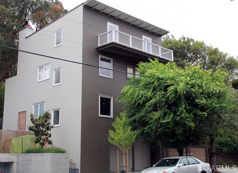
Designed by renowned architect William Wilson Wurster, the Pacific Heights home at 1641 Green Street has been by described by historians as a classic Wurster “that demonstrates that unpretentious design can be assertive,” or “as straight a house as you could find anywhere, anytime.”
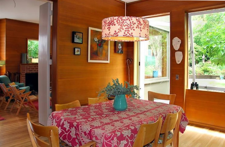
Rather than gutted and modernized, at least for now, the interior has been beautifully maintained, with big windows to overlook the oversized backyard and garden which was originally designed by Thomas Church.
Purchased for $2,500,000 in 2005, the four-bedroom home with 2,442 finished square feet of space on a 4,120 square foot lot is back on the market and listed for $3,499,000 today.


$1400psf for a Richmond Special in a great neighborhood with a wood paneled interior. I love the concept of it as a period piece and all and mostly the neighborhood will cause it to trade over over ask. To me it looks as much Don Knotts as it does Donald Draper. “Unpretentious design can be assertive”(?) Sometimes the emperor has no clothes and is maxing out his building envelope.
Also some irony that finally a house that deserves a stager’s Eames chair is presented unstaged with the Del Boca couch collection. I love how real estate works sometimes. Always Be Closing.
Buena suerte a todos!
I’m just not getting the curb appeal of this place. The interior is nice though and rises above its wood paneling.
Nice to see a few individual homes being discussed here again. This home could use a little ginger on the exterior or something to give it some character. It’s a box. The garden is wonderful.
What’s the scoop on the house built next door to this one on the vacant lot.?
Agree that it’s nice to see individual homes discussed here again.
In the photo above, what’s with the bricked-over door/window and the construction fencing? How long will this building remain “free-standing?”
This collection of homes is a famous little village, and the owner of the village was the lady who lived in this house. Over the years it was sold off, piece by piece, finally the parcel to the east with two houses. Herbert Hoover III occupied the one closest to Green.
In 2005 when this house was on the market, it struck a lot of people who prefer 1900 to 1929 houses as amazing because it was modern but appealing and even homey. Wurster was a genius of his time, as was his student Esherick.
The house is a masterpiece of its kind, and I hope it is not destroyed by some flipper with no taste.
W. Wurster also designed the Valencia Gardens (1945) public housing project.
Ditto on the individual houses returning as a topic of discussion.
To me, this one is all about the yard. The house is a gut remodel.
It is only a “gut remodel” because people like pvc see a profit in it. A normal owner could move in with only minor improvements. I hope a couple or family who understands its architectural importance buys it.
Also hope individual houses return as a topic of discussion and agree with Conifer in hoping this home is not destroyed by a flipper. If this were in Los Angeles it would be highly sought after because of its architectural provenance, for down there modern homes un-touched by flippers command top dollar, especially mid-century modern homes.
This is a wonderful, and important house in the history of California modernism, that appears to need little to make it really sing again. The original owner died in 2001 at age 99. Hopefully it will not be bought by some noveau riches clod who will try to make it look like 2014 Dwell.
It looks like a great house. Why would you do anything to it or even think about doing anything to it. Wurster designed for his clients and for the site. Check out his homes in Passatiempo. This home is site specific and looks fantastic.
Would someone who appreciates this house be able to explain the appeal of the facade here? I’m not challenging, just would like to learn what makes it so great.
Modern architecture is not about the facade. It is not about decoration. It is about space and light.
This house was designed for the quality of interior space; the exterior walls reflect the interior spaces. These houses were designed to be economical to build and maintain – there were better things to do in California than spend nights and weekends painting Victorian brick a brack. This house is what was originally stained redwood (it appears the east wall has been replaced by stucco, and all has been painted.) It would have been considerably more interesting when you could see the wood grain.
The titles of some of the books on Wurster reflect his philosophy and that of mid-century Calfornia modernism: “Frames for Living”; “An Everyday Modernism”; and “Inside the Large Small House”. And then there is the oft-repeated quote by Wurster’s wife, Catherine Bauer, who was a noted “houser” in her own right: “Bill is the only architect I know who can make a $10,000 house look like a $5,000 house.”
Thanks Jim. So this is sort of a nihilistic/apathetic attitude towards the facade with a focus on other aspects of the structure. That makes this easier to understand. I was wondering if I was missing something.
It is not nihilism or apathy. Maybe it is the fact that there is no more William Wurster to make Wurster houses any more. It would have been nice however, if the wood facade was unpainted, particularly since there seems to be an uptick in houses putting on “fancy” but modern wood facades, even on remodels.
Went to see this house on Open House today. It is far better than it looks in the photos. all the interior wood has been refinished (walls and floors), bathrooms and kitchen are original and in perfect shape. Light and spatial qualities are great – feels a lot larger than it is – as to be expected.
What happened to this place? No longer on the listing sites.
Closed at $4.2M and $1719/psf. Stunning. The sale price, not the house.
Do we know who bought it? Is it a couple or family who will live in it? Or will some flipper now come in and destroy a masterpiece?
At $4.2 its hard to imagine this is a flipper. Not to say some home owner will not “improve” it. But I have to think that someone who paid up for this place did so hoping the value of the design was/is worth keeping. Not where I would have put my $4.2, but that’s me.
UPDATE: One Year Later And Listed For $200K Less In Pacific Heights