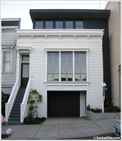
It’s not yet listed, and the website is still “offline,” but as a plugged-in reader notes a Vanguard sign has been firmly planted out front. Purchased for $725,000 in 2004, 313 Duncan has been completely transformed since (we’re talking additions, new systems and structural upgrades, and an interior overhaul and modernization).
We like. And while we wait for the photos to share, would any readers care to dish the inside scoop (architect?) or their pre-listing impressions?
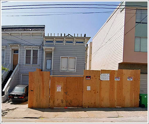
UPDATE: As two plugged-in reader’s note (and MapJack serves up), the facade of 313 Duncan prior to its Owen Kennerly transformation:


Reminds me of the Boston area. The B & W
Architect is Owen Kennerly: same guy as the pine street condos that were on SS a week or two back.
I think that is green and not black.
What took so long? bought in 2004.
Old news! It’s a dog. Totally over-priced, small, ugly, bad remodel, and not worth anybody’s time (except my client’s). Scat!
I’ve been watching this place for a while, and I really like it (haven’t been inside, though). It used to be one of those dark-and-abandoned houses, and due to the architectural rework perhaps permits and neighborhood oppo (the houses across the street are uniformly NV oldtimers) ate up a chunk of the years since purchase.
It’s two units (door to upper is just to the right of the garage door), the lower one is an open plan with some stairs that lead somewhere mysterious; and the upper is a two-level (you can’t see the crow’s nest room on top in the picture). Not sure what or which or if both are for sale. The non-white color is actually a dark slate-ish blue. At least, that’s as much as I’ve been able to surmise from walking past it.
LOL at alex. I feel the same way (except I’m not an agent). 🙂
I cant wait to see the inside!
Owen Kennerly did the “Copper Building” in the Mission. He is a rising star.
http://leblog.exuberance.com/2005/09/the_copper_buil.html
Overpriced? is there a price mentioned anywhere?
I’ve walked by many times (on my way to Incanto) and liked the old/new exterior mix, but it feels like the house is very shallow.
Timing is also terrible, I think the developer will regret not pushing the contractor harder.
Yep, always the contractor’s fault, never the owner-developer constantly changing his mind during construction (which is exactly the most expensive time to do it).
MapJack still has the “work in progress” pictures.
http://www.mapjack.com/?VZvmWQC3bF6C
This place is really wider. IMHO a big improvement and better use of the lot space. More windows as well. I can’t wait to see the inside pics.
The place took so long to complete (from purchase in 04 to completion in 08) because plans were not submitted to the planning department until June of 2006. A project of this scale and level of design modifications to the existing structure in Noe— a little over two years from start to finish is average.
If it took 18 months or so to submit plans this architect won’t be up and coming for too long.
I take that back. I looked it up. He actually submitted the plans on 5/24/05, and didn’t get the permits until March of 2007. That’s what took so long.
you’re right. It was 05. It didn’t look like any forward action started until 06. I wonder if they tried to get plans to demo.
i thought it was the planning department that caused the delays, not the developer or contractor. was going to post to that effect but then brought up the records on SF Gov and misread them.
Anyone know if it also incurred a zoning change from RH1 to RH2 to get the 2nd unit? If they did, no wonder it took so long. SF planning and SF building dept are staffed to the max, yet are slow to the max.
They got separate permits for the work on the other unit. And, it was existing, so I don’t think they did a zoning change.
Saw it today. It is very sweet.
I will say EH is pretty far off on the description of the layout though. I’d share more details, but my client is actively interested.
$900K: estimated price
I toured this house while under construction, I’m sure it’s as fabulous now as it was when I toured. Very talented architect and the developer knows it- he seems to let him loose. Likely not for everyone but certainly for someone that appreciates good design.
@spencer, if you are withing 50% of the price, consider it sold
Spencer didn’t you estimate $1.95M for a few lesser properties (location at least) the other day. Why is this one $900K.
Unless you mean the price of the cottage…
This is a very nice looking place. Excellent job by the architect on the facade, considering the design constraints. Can’t wait to see the inside.
In this age of environmentalism removing back yards (and the trees and plants that entice nesting birds who keep bugs and rodents away) and creating energy wasting open plans seems a poor choice. It doesn’t matter how “green” your building materials are if the space is really big and the traffic and air flow bad. The addition looks great from the front, but from the back it’s not so good.
A friend has a word for this style of interior and exterior design: corporate. With the recessed lighting (bad for faces), the kitchen islands (better for catering than cooking), and the intentionally featureless walls, this interior, like so many bigger developments, looks more like a hotel room than a home.
Mary
Would you have preferred for the former decrepit smaller structure to have stayed? That structure had a backyard, but the “nesting birds who keep bugs and rodents away” must have been on vacation because someone filed a complaint decrying the large amount of rodents (and their feces) on the premises. (SF Gov, 4/04)
The inside. Small main level, a little dark. Very vertical, of course.
Cottage in the rear, not much yard.