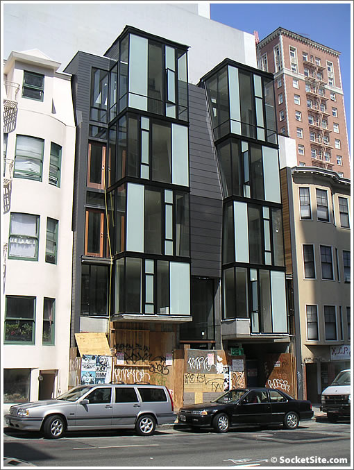
In response to a reader’s inquiry to our tip line (tips@socketsite.com) we respond: As far as we know, 1018-1020 Pine Street is slated to be eight units (condos) with seven (possibly eight) parking spaces.
In terms of any other details, we don’t know (readers?). But we will keep you plugged-in.

Horrible. There’s nothing to discuss about this one. Someone tell me one positive thing about this, PLEASE.
Would you prefer the buildings on either side of this project? It is easy to bash new developements in this city, but I always try to keep in mind the horrible state of most of the existing housing stock in San Francisco. Herb Caen used to say that most of the city looked like a wooden shanty town with gingerbread applications added to hide the peeling paint.
tell me one positive thing about this
That’s very authentic looking grafitti on the ground floor. They’ve definitely achieved an urban verite effect.
Graffiti inspired architectural elements:
The exterior fence, gate…
http://www.40bond.com/idea.html
The building looks really cheap. Sort of like one of those garages people order and build themselves.
I cant get enough of the ready-made grafitti.
Contrary to opinion this building looks cheap, fact of the matter, exterior material used are premium grade.
the more windows the face has the more expensive per square feet. Add expensive frosted glass brings window sysem up another notch in cost. Metal panels cost 2-3 times more than stucco… Example of economy grade is the next door neighbor: stucco box with small windows.
I like building. Interesting to see if interior finishes are on par with exterior.
For the most part, I like this design. The masses update the look of standard apt. bldg. in this neighborhood enough to provide a contrast without screeching “look at me!”.
On the other hand, the color scheme makes this bulding pop too much at this site. If it were, for example, green on tan instead of aqua on dark gray, it would look still attract the eye but would better in itself and more in concert with its neighbors.
I question the use of frosted glass, expensive or not. if you’re going to go through the hassle of glass, why not have it all glass so that the residents have the best view as possible? instead, these frosted glass windows obstruct half the view!
sure they add interest to passers-by, but I’d like a full wall of clear windows instead if I lived there.
as for the rest: it’s sorta dark and not my style so I can’t comment really on much else, but I’m sure that it’s very nice.
I think this looks fine. It has a mid century modern vibe. I think it will be appreciated over time, and will stand out on the block nicely. I’d be happy to live across the street and look at it.
I like it and as the poster above said, it looks very mid-century. The buildings on either side are very boring and generic in comparison.
Those windows will be curtained off 90% of the time anyway, so it really doesn’t matter whether they’re partially frosted or not.
I love it. If you want matchy matchy sameness, you have 90% of the rest of SF.
The advantage of frosted glass is that it can provide a diffuse source of light when the sun strikes it. Many people prefer a diffuse light source rather than hot constrasty direct sunlight.
But you can get the same effect and more versatility by using translucent window coverings. Open them when you want a view, close them when you want privacy and/or diffuse light.
OK. I asked for positive comments for this design. Good grafitti’s winning. Expensive materials?! True frosted glass does let in more light with some privacy. Still an overall ugly composition. Mid-modern? give you that one, but there’s good and bad mid-century. This one’s awkward token Mondrian. Like the comment about the draperies!
Like the “watermelon” synagogue, a lot of tall trees might do the trick.
I personally find something jarring and harsh about it but I am glad if it meets a minimium design standard and someone else likes it that it was built
I think it looks great! Can not wait to see the floorplans.
Let a thousand flowers bloom!
The rich variety of style is part of the charm of SF. Who wants the bland suburban monocultures of design.
Somebody will want it at some price point.
I think it’s great looking, and t his is just the type of medium density housing we need in SF. We don’t need skyscrapers everywhere, just in SOMA and at major intersections.
i can think of two positive things. 1) 8 more homes will soon be available to relieve the housing shortage in the city. 2) it’s a pretty good neighborhood.
but these are probably not as important as one’s personal taste on facades.
3 comments.
positive: I like the design
negative: Its in the tenderloin
neutral: It should be priced accordingly
nice building. handsome, fresh and very urbane.
As for using LOTS of clear glass vs. some use of obscure glass, this makes sense.
Obscure glass gives a certain balance and rhythm to the facade. it’s more interesting.
architecture is ALSO about the balance of design, function and livability, and adding style to an existing urban context.
I didn’t know Pine St. was in the tenderloin! Some people just like to hear themselves talk. Facts appreciated, uneducated opinions are not.
Looks like spencer needs a map of the Tenderloin again…
I think I saw a piece of Tenderloin in Burlingame.
@midcentfan
You couldn’t live across the street and admire this building, since that side is occupied by the Academy of Art dorms.
“I didn’t know Pine St. was in the tenderloin! Some people just like to hear themselves talk. Facts appreciated, uneducated opinions are not.”
Thanks Mussolini.
For me, the tenderloin goes from pine to mission and from Van Ness to mason.
i know its not the “standard” definition. But within 2-3 blks of the standard definition is still the tenderloin to me because you still have to deal with a lot of the same issues, especially later at night.
I am redefining the tenderloin for my purposes jsut as others(especially realtors) are calling parts of the western addition “NOPA”
@Spencer
I’m sure you meant Market, not Mission. And while the Mussolini comment was deserved (sf was a little harsh) it seems like the pot calling the kettle black. I remember you advocating something similar to a police state when it comes to folks you don’t approve of in your hood or “anyone who breaks the law” at street festivals. And considering that, I can see why you have expanded the TL for your purposes. So it makes sense.
no i meant mission.
Well, Mission is very specifically and technically south of Market so that gets a little difficult.
I can understand your point about the northern boundary of the TL because the transtion between TL and Nob Hill can sort of depend on what time of day it is. But Market is a clear boundary if for no other reason than it is referenced in the name give to areas south of there.
Because really, if your talking about the TL in terms of the environment created by the people that frequent it, a very similar environment exists in parts of SOMA so you’d have to start draggin the TL all the way to Mission Bay. And that just makes no sense. What makes you stop at Mission in your definition of the TL?
Oh, and I like the place on Pine. Even if it’s in Spencer’s TL.
If the Tenderloin is defined by whether Spencer thinks the neighborhood is sketchy, then the boundaries go clear south to Daly City, at least.
But no surprise that Spencer thinks everything south of the California St. is the TL. Too bad there’s not a freeway on-ramp at California Street (with billboard walls on each side, like in the movie, “Brazil”), so Spencer wouldn’t have to be bothered by the riff raff on his commute to the Peninsula.
Was the Tenderloin ever a desirable area? Most of the housing stock seems to have been built for lower incomes without the typical urban “furniture” like trees, parks, and public plazas. I just wonder if it could ever escape what it has always been when the conditions are so brutal?
Quite decent design here actually, especially compared to the typical cookie-cutter generic bay windowed crap SF housing design. And “mid-century” is a bit of a stretch (a very overused analogy) — this is simply contemporary architectural design with a twist on the bay window…
Looking at this from a different perspective, I would say that this is in a way an evolved victorian house for the 21st century, in a way it is very different from anything else around but there are clearly lines that make it fit into the great city. I think it is like a new model of the car, at first you think they crossed the line, later you fall in love with it and can’t get enough.
City is evolving, we should too.
I personally love the design of this building and find it quite striking and beautiful. The patterned frosted glass and interesting angular facade are bold, refreshing, and unique. It’s not for everyone, but this building will appeal to many modern enthusiasts who are looking for a distinctive style that provides an alternative to the “norm”. In a City that prides itself for its diversity, it’s refreshing to see that we’re finally embracing this philosophy in our architecture.
meier: “it’s refreshing to see that we’re finally embracing this philosophy in our architecture”
I would argue “embracing” is a stretch — I wish that were true. As it stands, this could optimistically be viewed as at least another small step in beginning to move beyond all the stripped down vics, ‘fake old’ and retrograde bad design that continues to dominate the market…
There are several harsh comments here. Geeze, let me say that Pine street is no way in the tenderloin. Also, this building is very high end. I actually went inside and looked around, the doors are all combo locks and the garage is very big. Easily 8 parking spots, possibly more. The garage is fitted with those car elevators to help you fit a few extra spots.
Anyways, just my two cents.
Paul